




The Sign That Listens
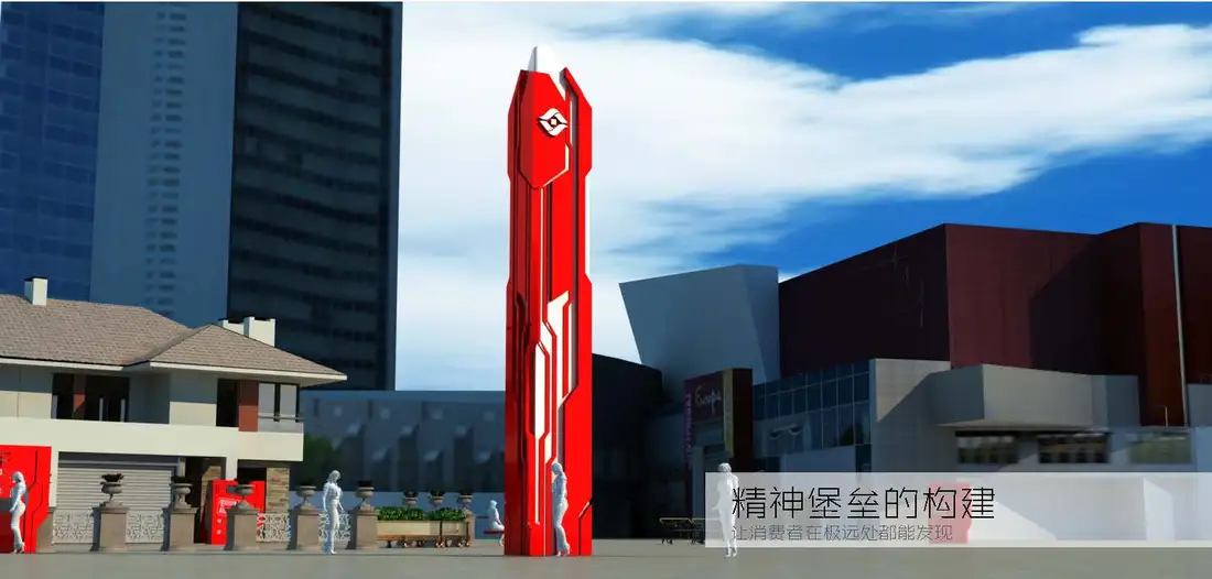
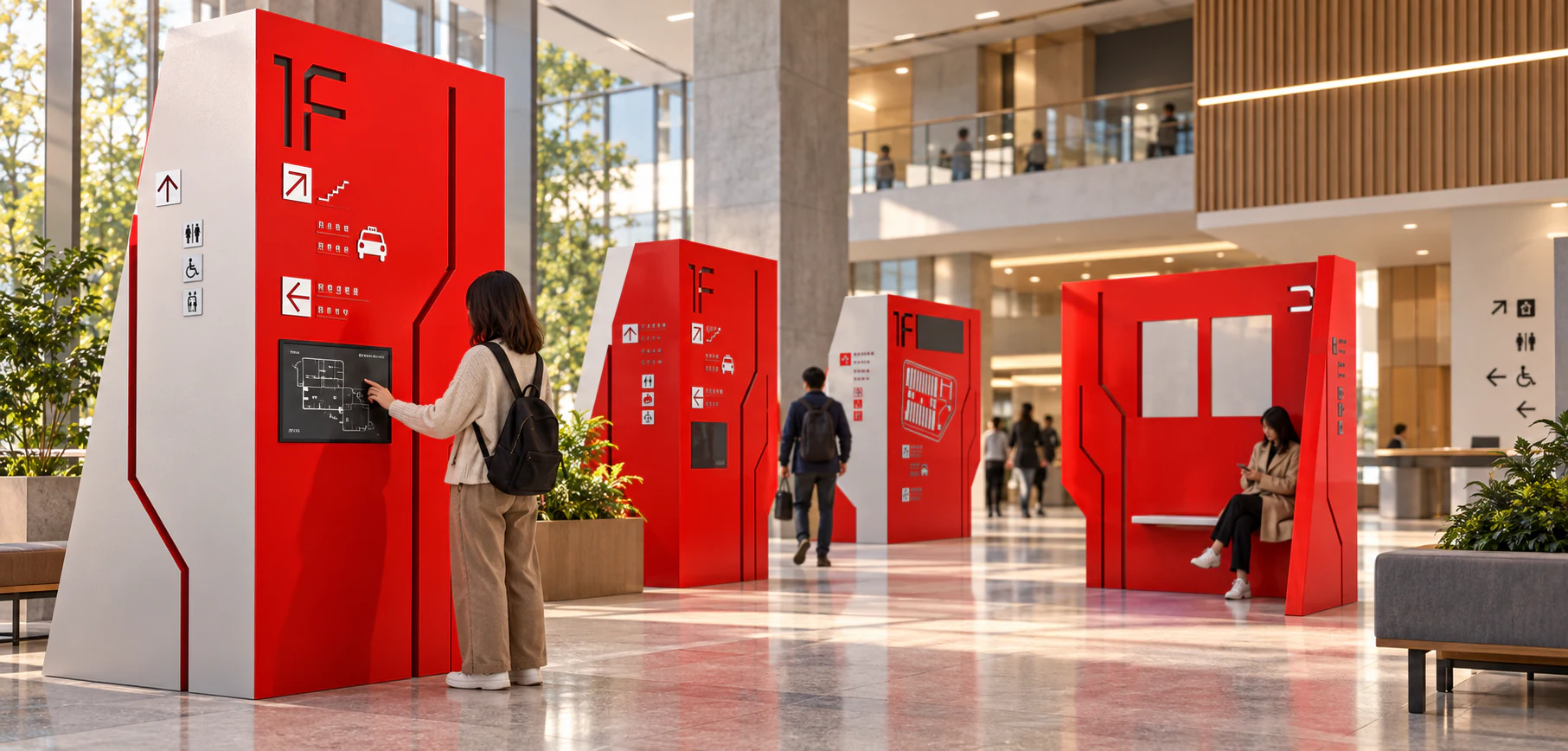
Wayfinding succeeds when people stop thinking about the sign and start trusting the journey. This independent prototype brings the original interface logic into a public building as a family of physical totems. High contrast establishes distance reading, tactile surfaces support closer inspection, and a restrained digital strip allows information to change without turning the whole object into a screen. The red form is intentionally architectural: it creates a place to approach, touch, wait and reorient. Accessibility is not added as a final icon row. It shapes scale, reach, contrast and sequence from the beginning. The result is a sign system that does more than point. It quietly notices how different bodies find their way.
The Colourful Life Event: AnalysisNext project