
Eleven Eleven, Packed Better
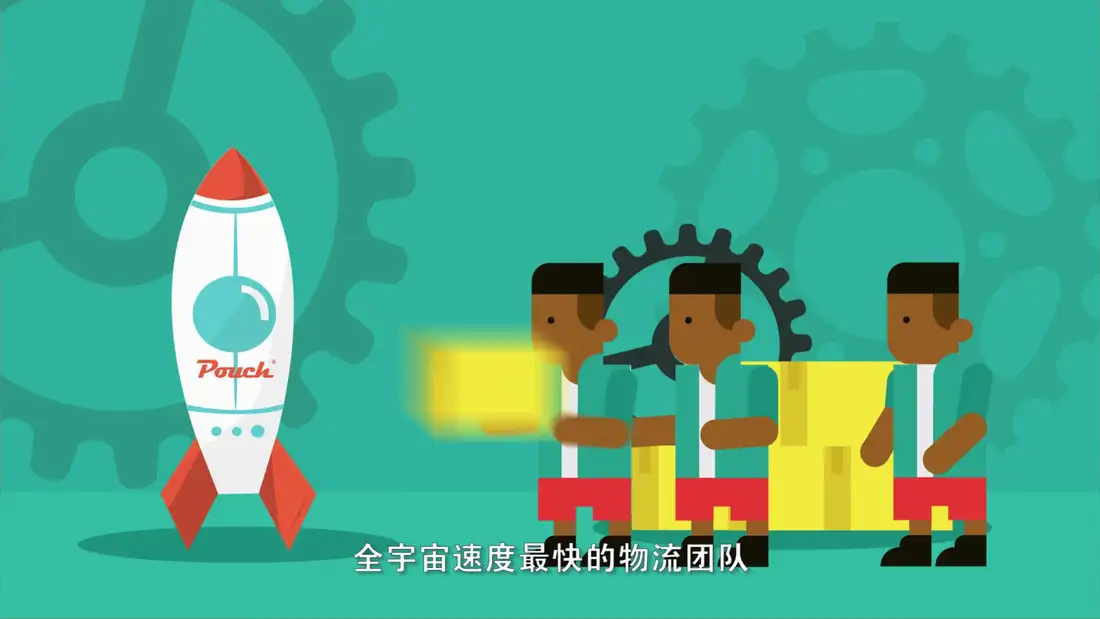
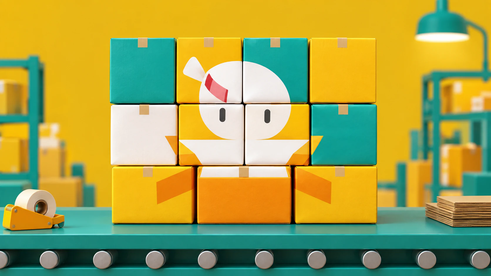
This independent extension turns the sale event into a modular parcel mosaic rather than another field of discount numbers. Packaging units form patterns at warehouse, counter and screen scale, making logistics part of the visual idea. Commerce is still present, but the design gives it a little dignity and much better spacing.
Look, Touch, Ask
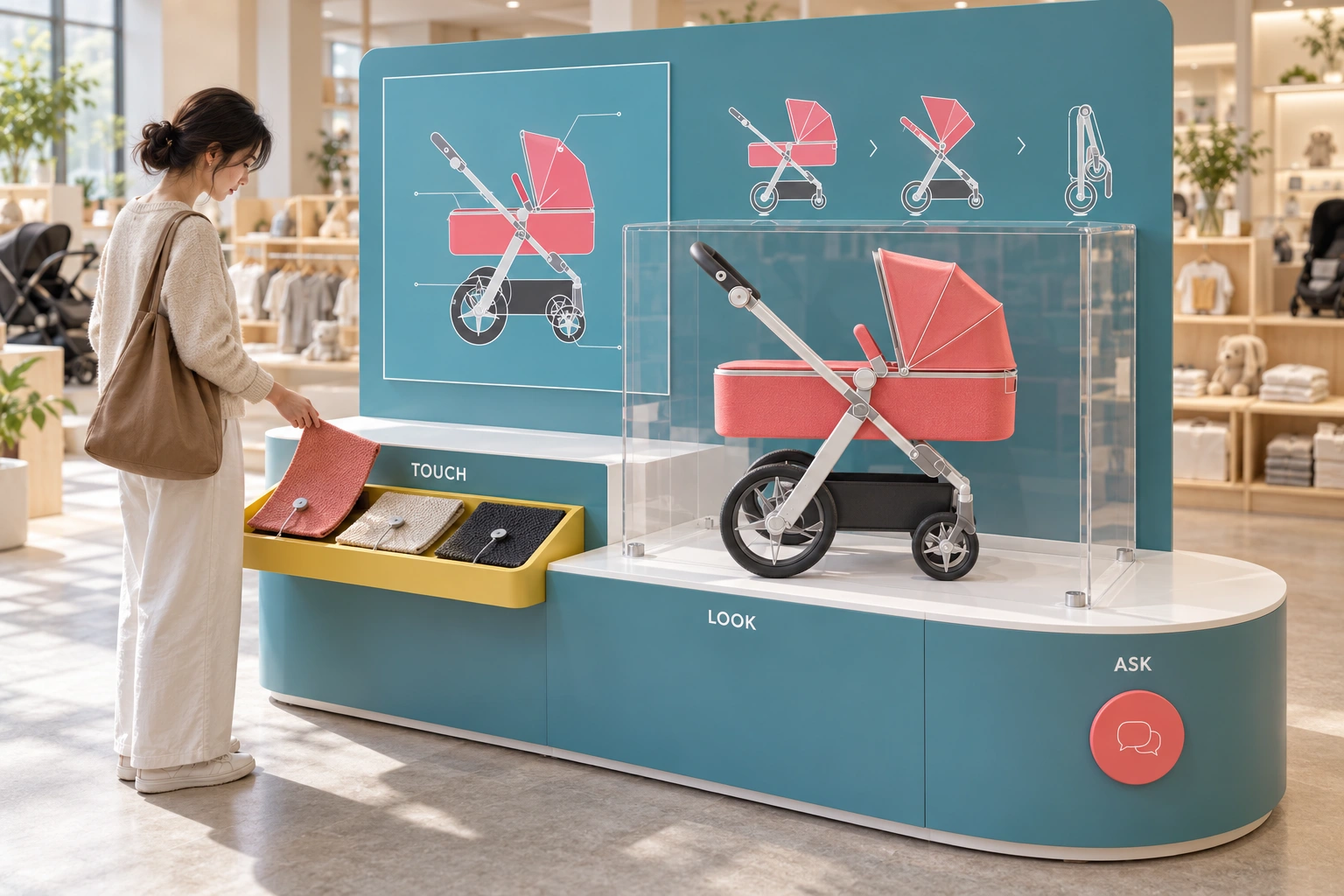
The original animation explains a product through shape, sequence and a little theatrical timing. This independent Studio Extension brings that explanatory instinct into a shop: a protected display model, a tactile sample tray and a place to ask better questions. Less sales volume, more useful conversation. This is an unbuilt retail-learning proposal, not a new stroller design or a commissioned Pouch installation.
Begin with the film, not the parcel
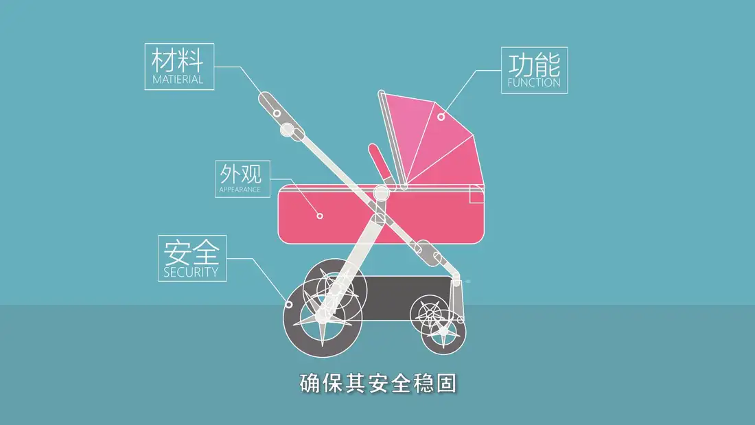
The source archive includes animated studies, a film, technical illustrations and a hand-drawn shot plan. Its strongest anchors are teal fields, coral product surfaces, yellow accents, white construction lines and the side-profile stroller with a diagonal silver frame, large rear wheels and smaller front wheels. The earlier parcel-mosaic extension remains above. This chapter returns to the source's product-explanation language rather than treating the campaign as packaging alone.
Three verbs, one visitor journey
Look separates the main silhouette from the detail. Touch gives material questions something physical to refer to. Ask turns the encounter into a discussion with a trained adviser. The three stations can be approached independently; the design does not require a visitor to complete a prescribed sales funnel. A protected scale model anchors the island, while a lower sampling ledge makes browsing possible without reaching over the display.
Make the graphic grammar spatial
The teal panel becomes a quiet technical field; thin white lines connect features without covering the product; coral identifies the object; yellow marks the part the hand can approach. The circular callout becomes a conversation marker, not a claim of an installed electronic button. The inset print and three silhouettes in the scene are illustrative reinterpretations. The source image above remains the authority; no mechanical accuracy is inferred from the generated panel.
A material sample is not a product promise
Three large, replaceable fabric swatches are retained on a pull-out tray so the visitor can compare texture without loose small samples. Their colours echo the campaign, but they are not specified as actual Pouch materials. A future installation would use manufacturer-approved samples, labelled compositions and cleaning guidance. The display enclosure is proposed in clear impact-resistant sheet with rounded edges, with access reserved for staff; material choice and fixing details need specialist review.
Let motion explain a change, not manufacture a fact
The source shot plan uses turns, close-ups and successive poses to reveal information. The rear-panel sequence translates that rhythm into a static reading path. It is not a fold instruction: the intermediate and folded silhouettes must be replaced with verified manufacturer geometry before retail use. A later screen loop should show one approved action at a time, pause on the result and provide a user-controlled replay. No new animation or functioning demonstration mechanism is claimed in this release.
Prototype the conversation as well as the island
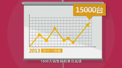
Start with a full-size card layout and observe whether visitors can distinguish looking, touching and asking. Test seated and standing reach, approach clearance, tray force, cable snagging, edge comfort, enclosure stability and staff access. The illustrated scale model is a non-load-bearing exhibit, never a child-carrying product. Confirm all product copy and instructions with the manufacturer; do not carry historical sales figures, certification marks or superlatives into a new setting without evidence. A useful display should answer questions, not quietly invent the answers.