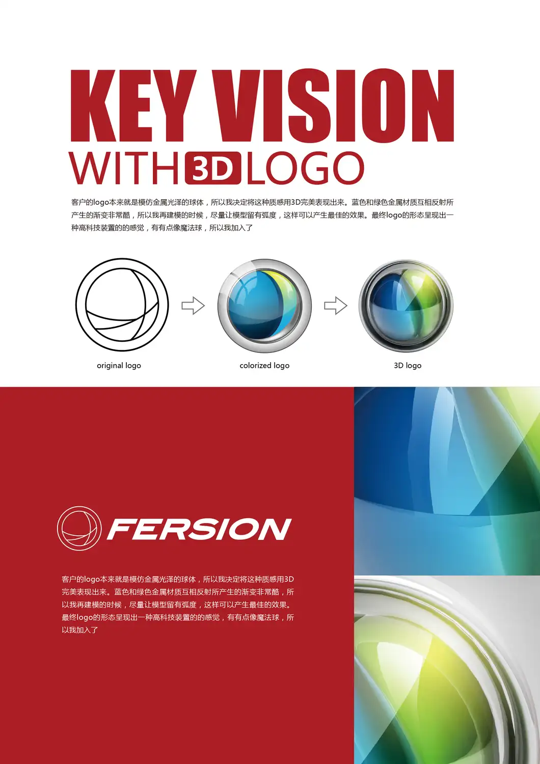
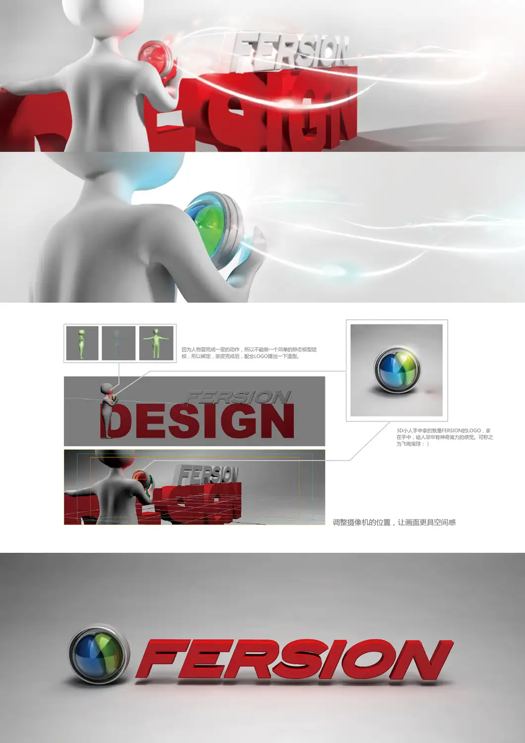
The lens becomes a world
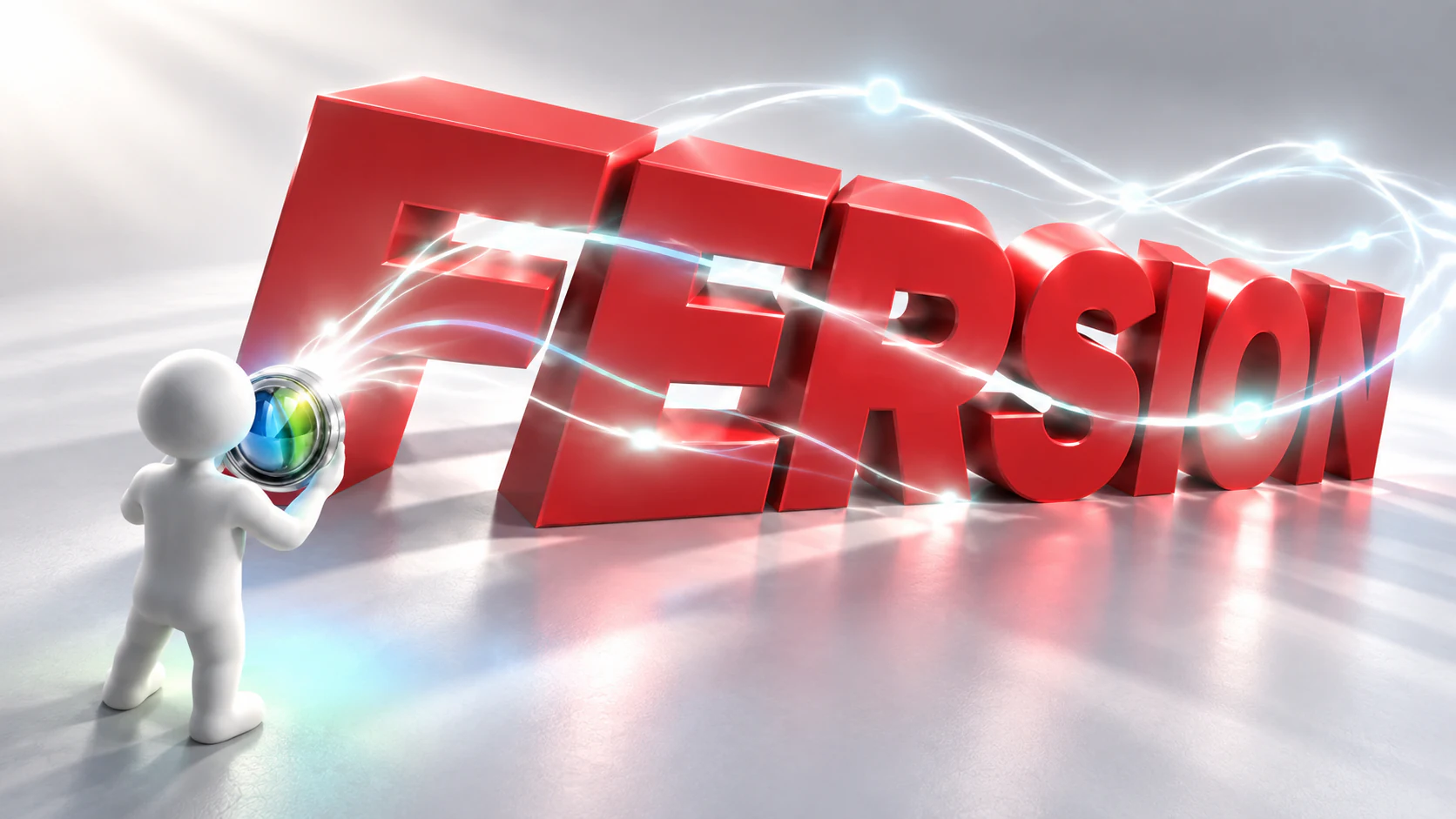
The 2016 design turned an outlined circular mark into a silver lens with segmented blue-green glass, then placed it in a white character's hand before a monumental red FERSION wordmark. This three-shot motion study carries those exact relationships forward. Refraction, luminous paths and changing camera distance form a repeatable visual grammar; the letters can grow into architecture while the lens remains the recognisable source.
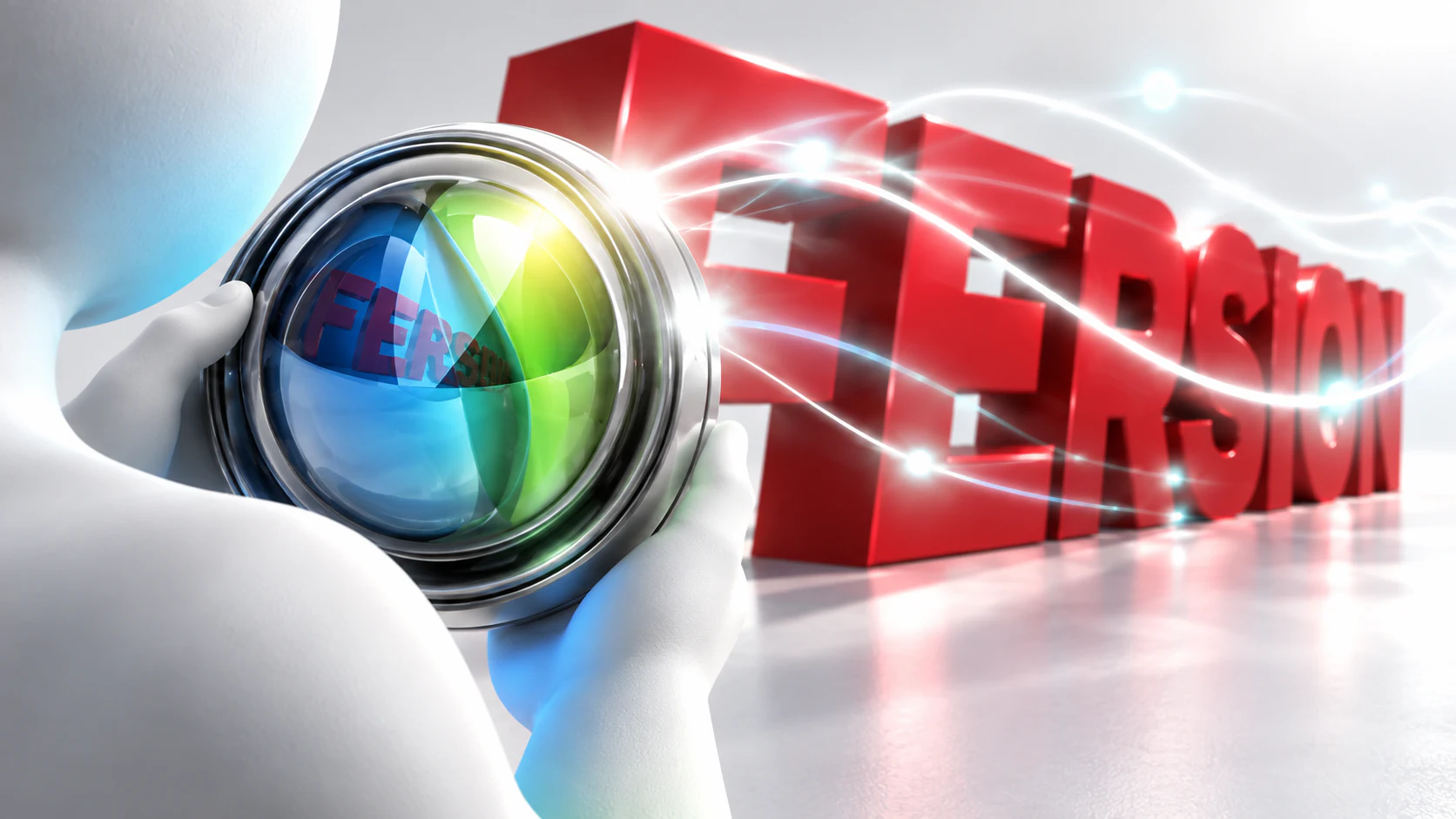 01 / The lens
FERSION / Through the lens
The original silver housing and blue-green segmented glass stay recognisable. The red spatial type appears through the lens before it appears in the room.
Keep the silver concentric housing and the curved blue-green glass divisions. Refraction provides variation.
Preserve the italic red FERSION lettering as a physical volume. Camera scale changes its role from title to architecture.
The lens is the source of the fine white trails. The figure, letters and room react to one continuous movement.
FERSION: Through the Lens
An independent three-shot continuation of the 2016 key vision. The original silver-rimmed, blue-green optical mark remains the source of the luminous paths. A white figure carries it through a clean studio while the extruded red italic wordmark shifts from title to architecture. Refraction, scale and camera distance provide the rules for a larger motion system; these images are new concept frames, not historical client deliverables.
A lens, not a new logo
The concentric silver body and curved colour divisions remain the visual anchor. A close view allows the wordmark to appear as a reflection before the camera reveals it in space.
One source of motion
Fine white trails originate at the lens and travel across the character and lettering. The same event can be filmed close, over the shoulder or at architectural scale.
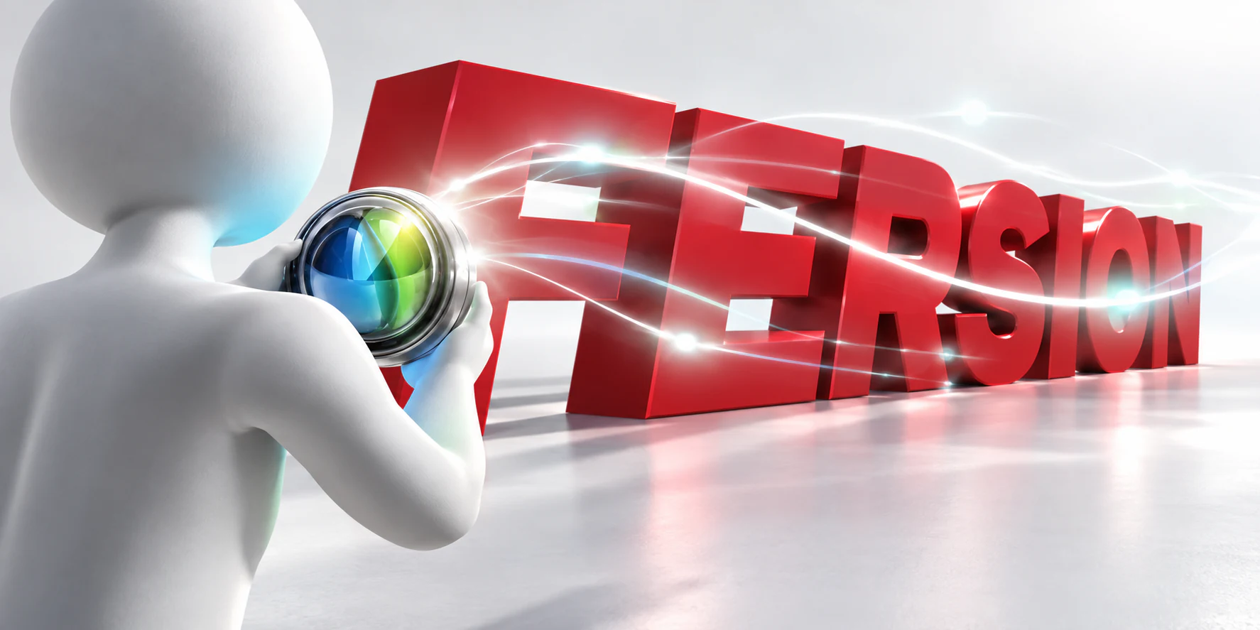
FERSION / Lens Lab
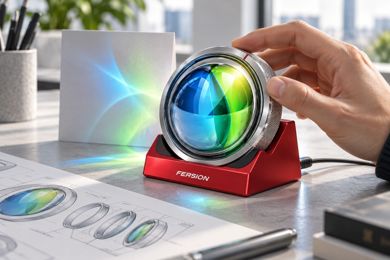
A logo usually asks to be recognised. This one asks for a thumb. Lens Lab develops the original optical mark into a palm-sized desk object: a silver collar turns a blue-green filter assembly, while a red dock supplies a stable home and a proposed white-light source. It is an independent, unbuilt product concept, not a new FERSION commission or a tested optical instrument.
The mark already contains the product
The 2016 source explicitly moves from a flat circular logo to reflective blue-green material, then puts that object into a figure's hand. Rather than invent another mascot or decorative shell, this extension takes the hand-held optical object seriously. The concentric silver rim, three curved internal divisions and red italic wordmark remain the recognition anchors. The earlier monumental lettering and light-path studies stay above as a separate development chapter.
A small observatory for the desk
The intended audience is adults who enjoy tactile design objects, with a secondary use as a guided design-studio or exhibition demonstration. A compact object invites a short physical pause: turn, look, compare, return. A fixed figurine would preserve the silhouette but offer little discovery; a sensor-heavy electronic version would add complexity before the optical idea had earned it. A single rotating assembly is the chosen first experiment.
One moving assembly, a quiet exterior
A knurled outer collar is proposed to drive a captive carrier containing the blue-green filter pair. The plates move together; this first concept changes orientation rather than claiming independently variable colour mixing. A fixed clear front guard separates fingers from the moving carrier. The section study highlights the conceptual support track and rear light path, but it is not dimensioned manufacturing CAD. Retention, friction and pinch clearance still need to be designed and tested.
Three materials, three jobs
Satin red anodised aluminium gives the dock weight and a clear visual role. Polished silver surfaces keep the optical mark recognisable, while a finely textured collar signals the part to touch. The internal colour layers would begin as replaceable optical-polymer experiments behind a protected face; soft cradle pads isolate the puck from the base. Finishes are proposed material directions, not a validated bill of materials.
Use is the storyboard
The sequence is deliberately modest: lift the puck to inspect it in ambient light; return it to the inclined cradle; turn the collar; compare the changing field on a white card. The dock keeps power away from the rotating part. A provisional 90 mm diameter and 28 mm depth establish the scale in the render, not final tolerances. A low-voltage white LED is the starting hypothesis, never a laser. Optical efficiency, temperature and eye safety require qualified evaluation.
Twelve positions, not twelve invented cameras
The working browser study samples the collar at 30-degree intervals across one complete revolution. The curved colour partition rotates inside a fixed circular housing; the axial section remains still so the proposed relationship is easy to read. Manual stepping, a position slider, play, pause and reset expose the rule. This is a kinematic diagram, not a rendered 3D turnaround or a ray-traced prediction of the light patch.
The first prototype should answer one question
Can this curved colour assembly produce an interesting, comfortable-to-view light field at desk scale? Start with an optical breadboard, a white LED and sample filters before tooling the silver shell. Then test seated and standing reach, thumb grip, collar torque, retention after drops, heat, cable routing and stability on the inclined base. The generated scene illustrates the ambition; its bright projection is not measured evidence. Better to disappoint a prototype than a customer.
One turn. A different way of seeing.


Silver: fixed housing. Red: captive drive collar. Blue + green: proposed filter pair. Amber: conceptual support and light path.
Kinematic illustration, not optical simulation, a 3D turnaround or manufacturing CAD. Dimensions and retention remain subject to prototyping.