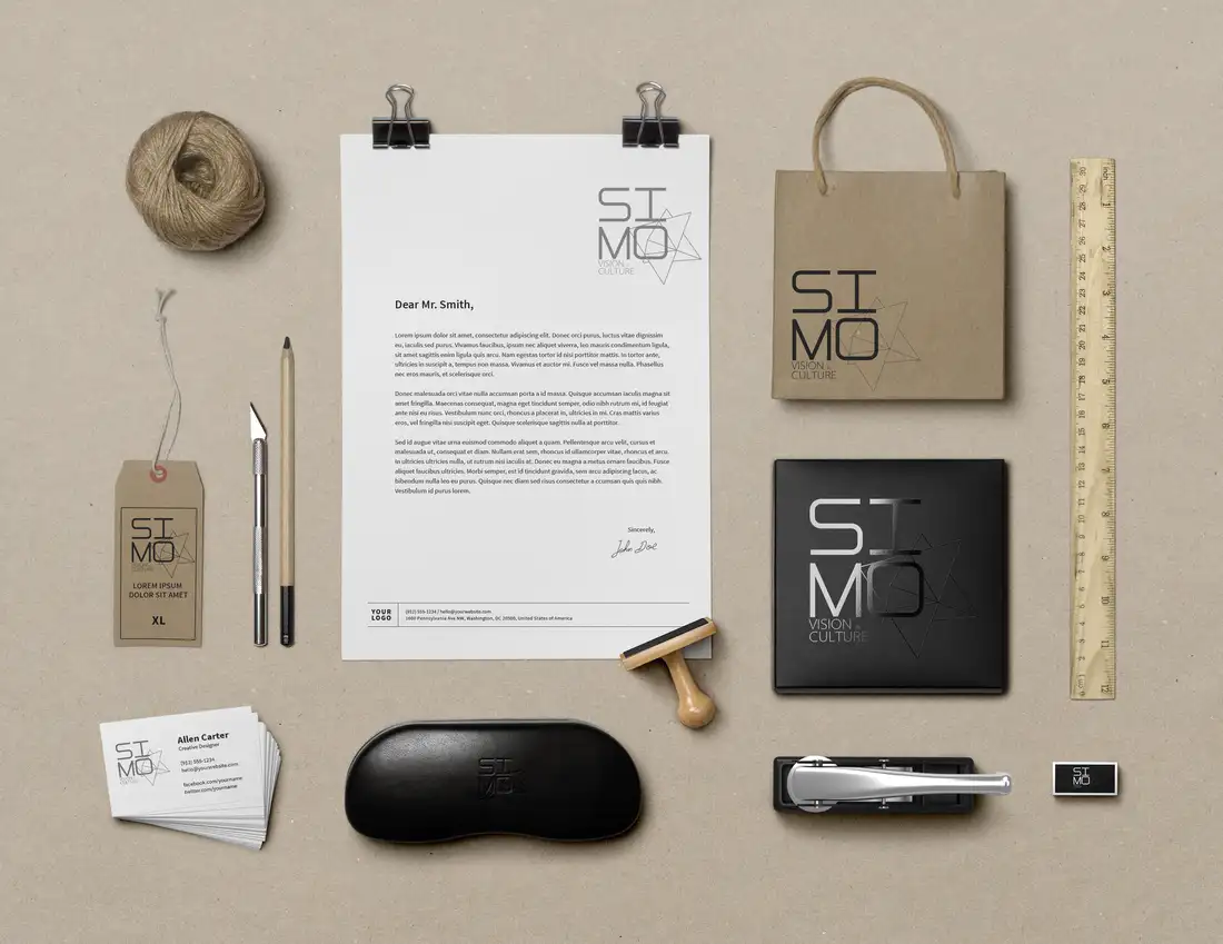
The Field Studio Kit
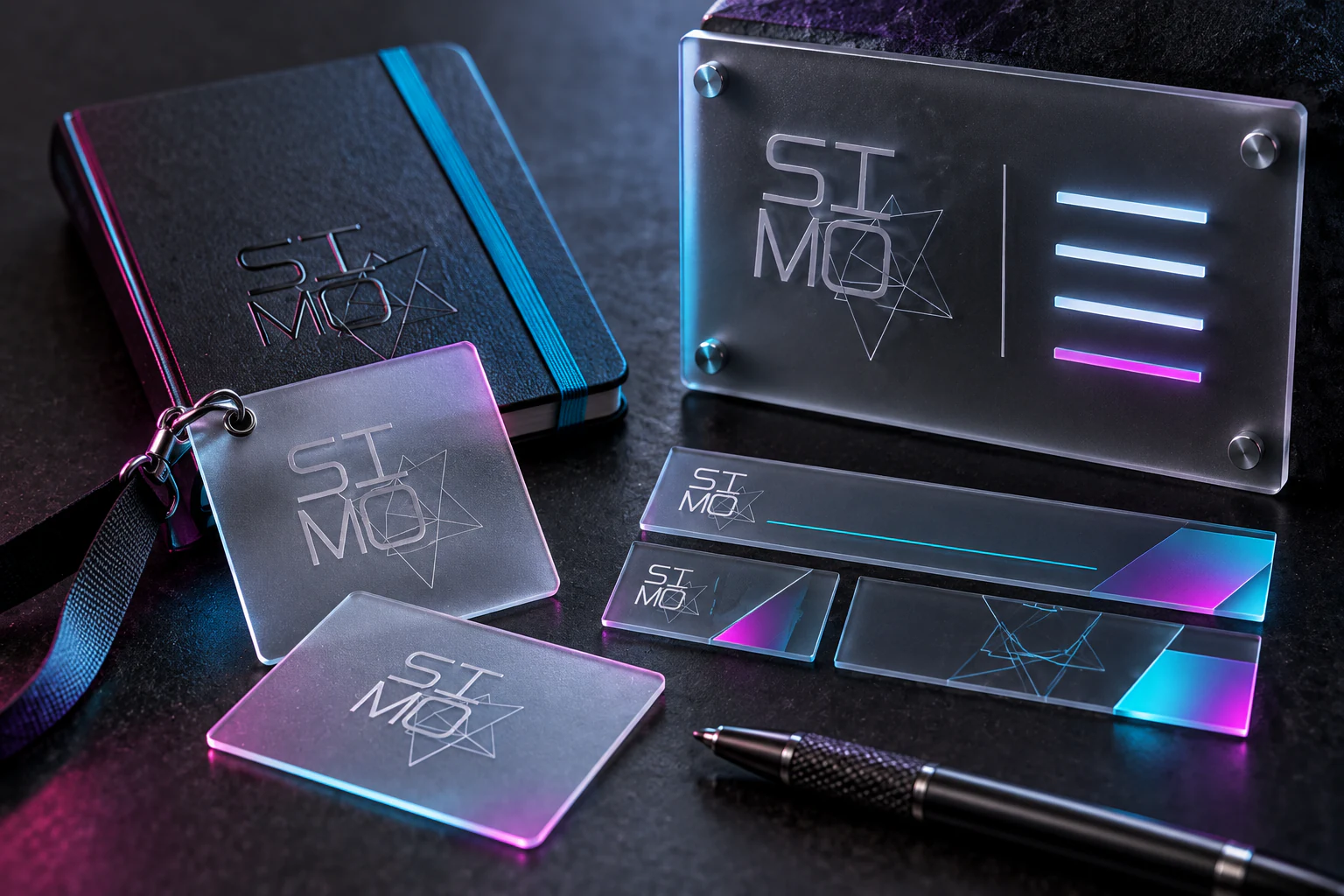
SIMO's identity was built to move between culture, media and vision, so this independent extension gives it objects that travel. Credentials, notebook, interface strips and an entry panel share the same fine-line geometry, while cyan and magenta behave like signals caught at the edge of dark material. Transparency is useful here: layers overlap without becoming a single fixed emblem, echoing a studio whose work changes with every subject. The kit avoids a conventional stationery parade. It feels closer to portable studio equipment, precise enough for production and strange enough to invite a second look. A media identity should not merely label the work. It should arrive already tuned to its frequency.
Seeing in Layers
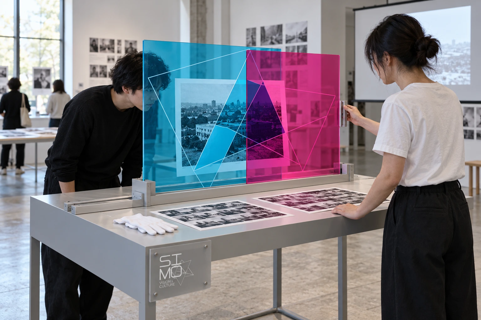
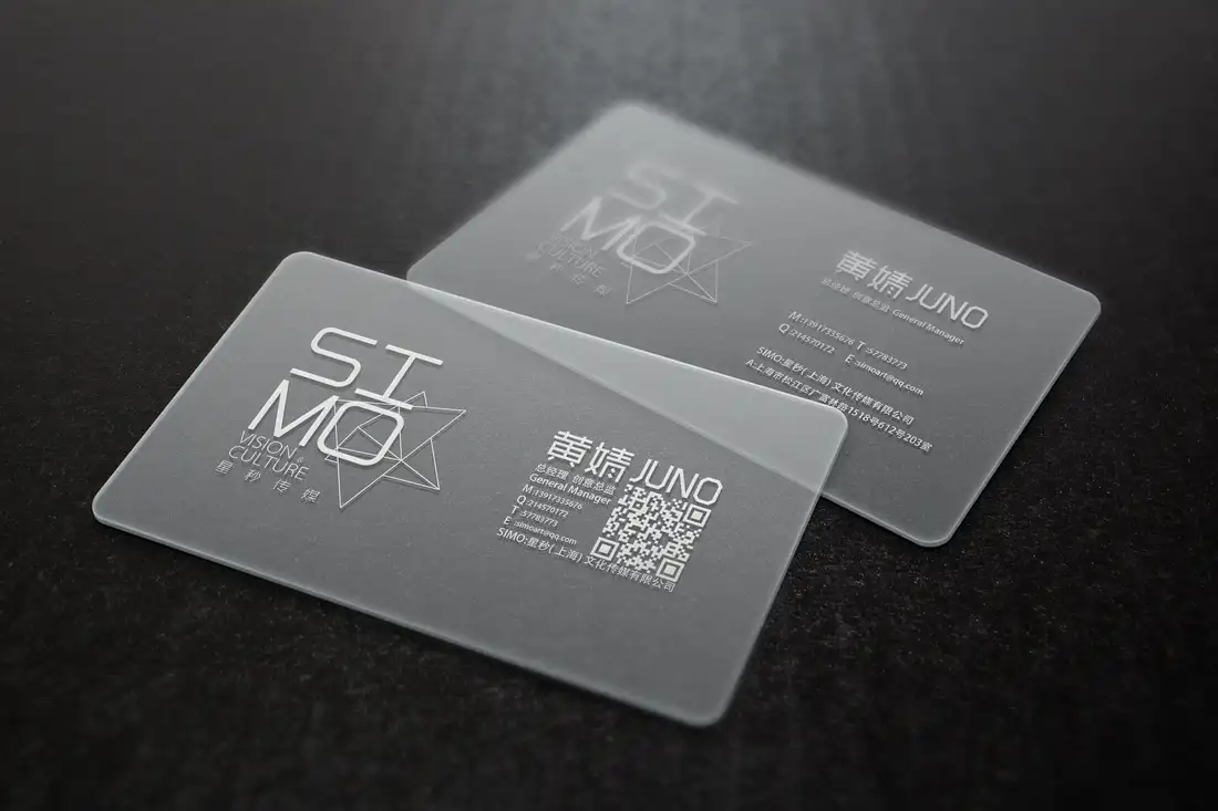
SIMO's transparent cards and intersecting line work suggest a useful question: what happens when the identity becomes something to look through? This independent open-studio proposal turns its cyan and magenta geometry into a shared image-review table. One layer stays put; the other slides. The photograph changes its frame without the brand changing its mind.
Start with what was already there
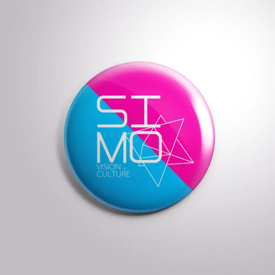
The 2014 work combines a thin, two-line SI / MO wordmark, offset triangular line work, frosted transparent cards and a cyan-magenta badge. Those are the anchors, not permission to cover a room in neon. The original wordmark stays on a fixed plaque; its angular framework supplies the larger viewing frames. This is a new spatial interpretation, not a recovered element of the historical commission.
Make the overlap do a job
At an open studio, two visitors examine a print through paired transparent panels. The cyan layer is fixed and the magenta layer travels sideways. Their intersection changes the crop, colour and emphasis, making framing a shared physical decision. A pair of broad, retained guides and a side handle are prototype intentions; the generated use scene does not prove safe retention, optical performance or a manufactured installation.
One rule, not three unrelated applications
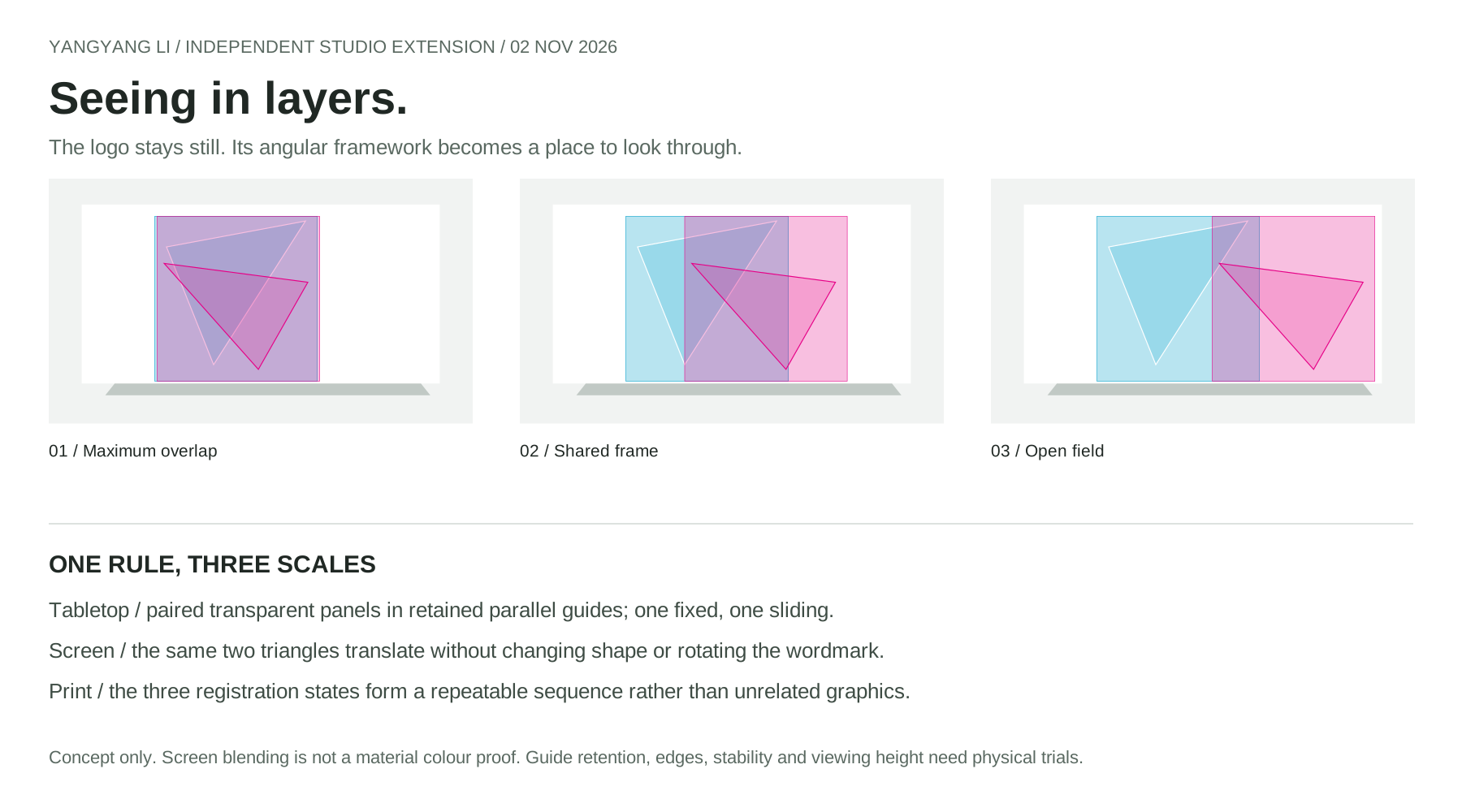
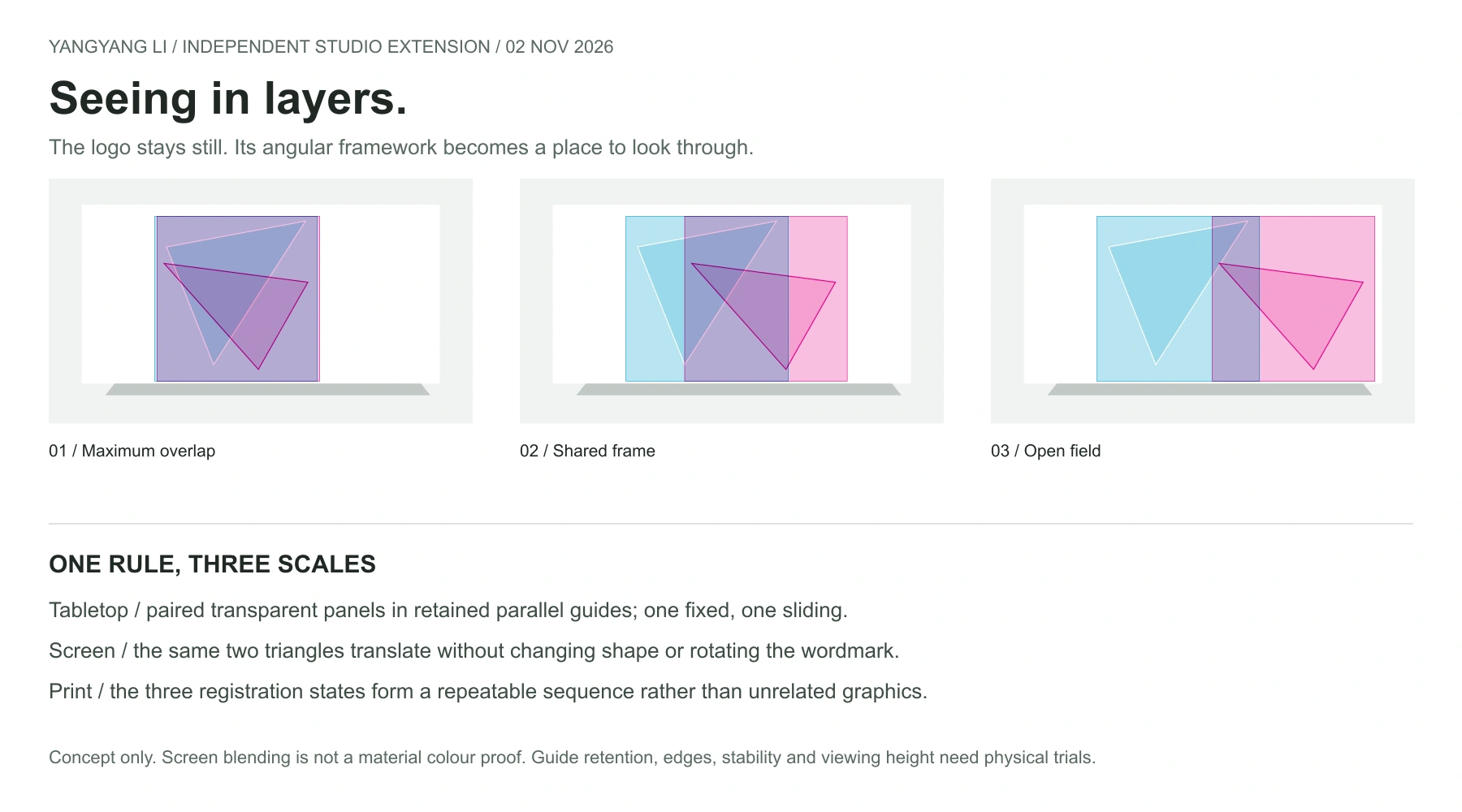
Keep both triangles intact and move only one layer along one axis. That rule gives the table a spatial action, the screen a motion grammar and a printed sequence a clear rhythm. Maximum overlap, shared frame and open field are three states of the same system. The earlier portable studio kit remains intact; this chapter develops an encounter rather than another collection of branded objects.
The screen is a proof of behaviour
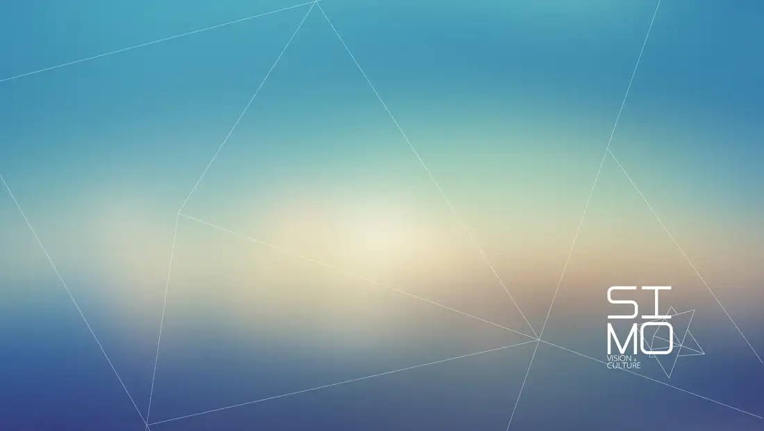
The playable study below uses the original stationery sheet as its backdrop. Play follows an eight-second out-and-back translation; pause, reset and the keyboard-operable slider expose the same movement directly. It starts still and pauses when the page is hidden or the reduced-motion preference changes. The triangle framework is derived from the source, not presented as an exact vector reconstruction of the logo. Screen blending is not a material colour proof.
Prototype the encounter before the furniture
Start with an adult-supervised tabletop trial, approximately one metre wide, using small replaceable transparent print samples before selecting panel material. Compare spectral colour, glare, scratches and cleaning; test a seated viewing position as well as a standing one. Confirm captive travel stops, finger clearance, edge treatment, panel retention, table stability and the working area with physical samples. No verified CAD, load rating, accessibility compliance or final manufacturing dimensions are claimed.