

Five Points, Many Stages
The five-pointed star becomes a spatial instrument rather than a single emblem. This independent extension breaks its geometry into screens, light planes and stage markers that can recombine for different performances. Consistency comes from the rule of construction, leaving each event free to change its mood.

Five Takes / Roadcase Archive
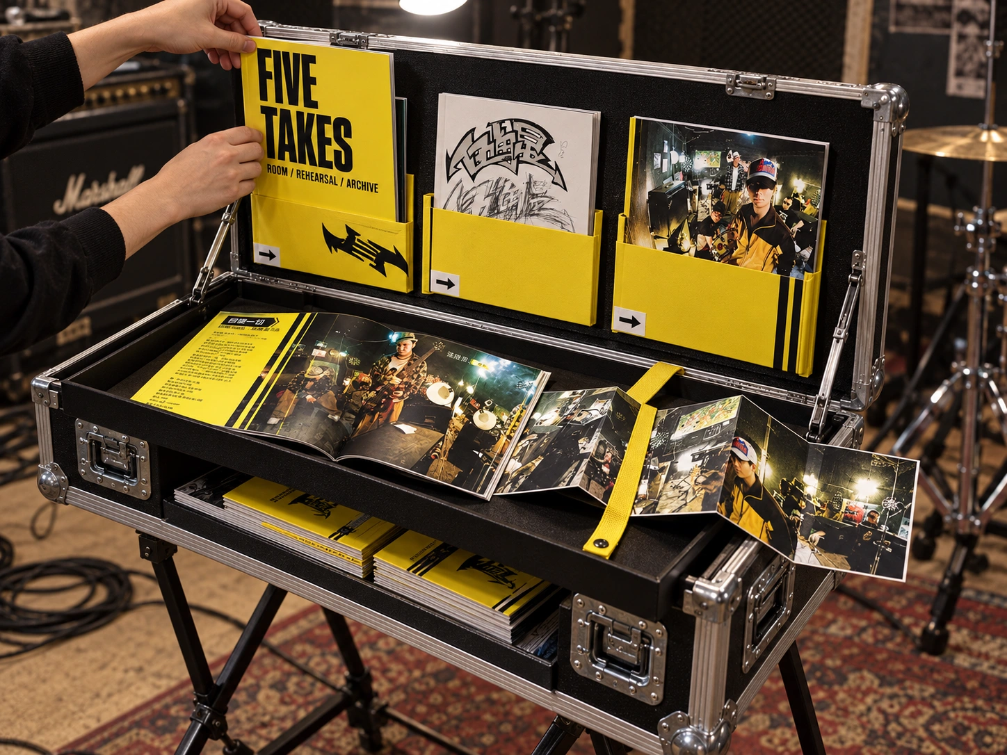
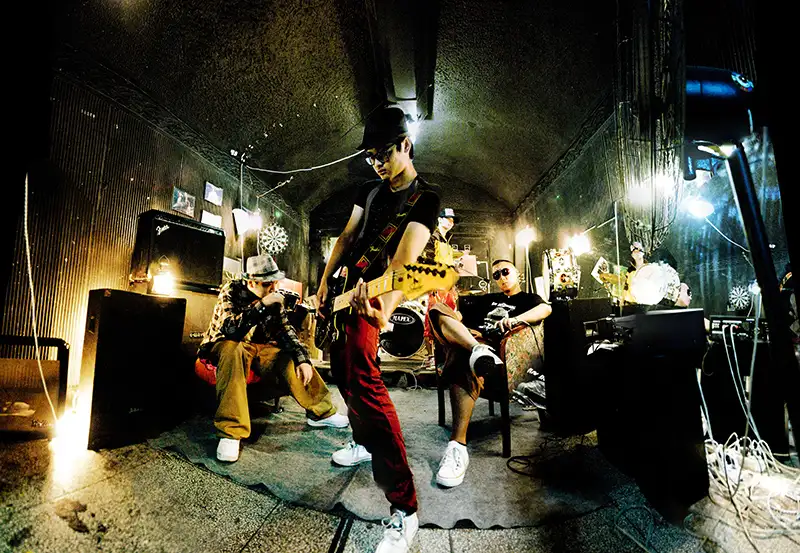
Before the stage comes the room: amplifiers, cables, close quarters and people who know where to stand. This independent extension turns the original rehearsal portraits into a portable publication system. A roadcase opens into a reading counter, the yellow-black editorial rhythm becomes an index, and the photographs remain the main event. The case travels; the people do not need reinventing.
Read the room before drawing the star
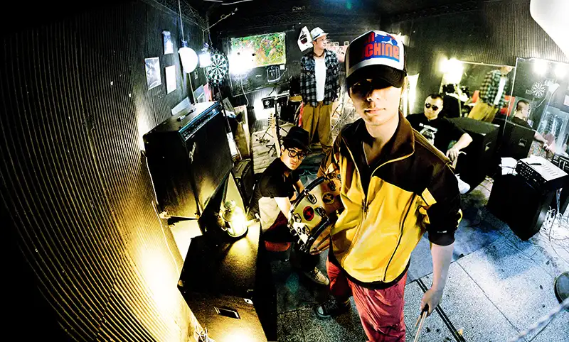
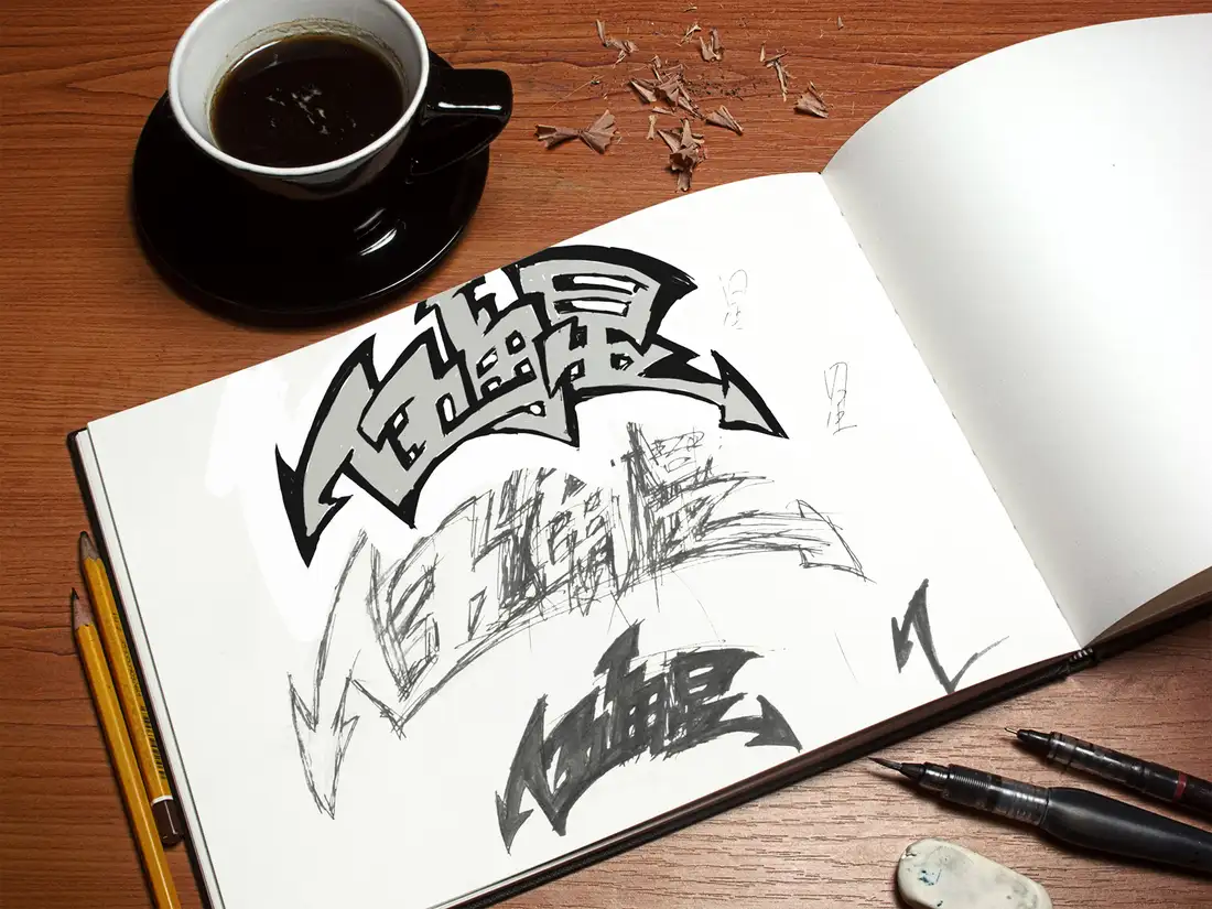
The source is a band-photography and lettering project, not simply a five-point symbol. Its concrete anchors are the near-field wide-angle portraits, dark rehearsal-room surfaces, instrument clutter, black-yellow contrast and jagged hand-drawn name. The earlier stage proposal remains intact above. This chapter returns to the original photographic and editorial evidence rather than carrying its invented red star into every new object.
An archive with a load-in plan
The intended setting is a small gig, studio open day or music-book fair. A compact flightcase protects the editions in transit and becomes their display on arrival. Three lid pockets separate the photo-zine, lettering study and image cards; a supported tray forms the reading surface, with stock underneath. The system is a sequence of transport, display, browse and pack-down, not a logo applied to a box.
The graphic rule is directional
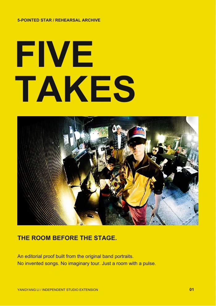
Yellow defines entrances, tabs and editorial pauses. Black holds the photographs; white gives the eye somewhere to rest. The arrow-like energy of the hand-lettering becomes a small indexing device rather than a replacement logo. Five Takes is a working editorial title for the extension, not an assertion about a release, track list or tour. No invented lyrics, dates or performance statistics are added.
A book that keeps the photograph honest
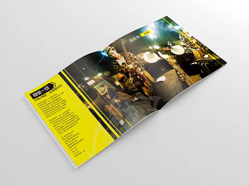
The downloadable four-page A5 proof uses the original image files directly, preserving the musicians, perspective and full image boundaries. A yellow cover opens into a white narrative page, a black double-image sequence and the lettering sketch. This is a real layout artifact, not a set of generated pages hidden inside a render. The physical scene is illustrative; the PDF is the source-faithful editorial proof.
Materials should survive the second gig
Textured black plywood, aluminium edging and replaceable hardware borrow from the equipment already present in the photographs. Matte yellow pockets keep the graphic system visible without glossy reflections. Soft tray lining protects the books, and the accordion sequence remains supported by the tray rather than hanging into the aisle. Paper, pocket stiffness and hardware are proposed directions, not a validated construction specification.
Prototype the awkward moments first
The case and folding stand are unbuilt concepts. A full-size cardboard mock-up should test seated and standing reach, lid-stay clearance, tray retention, case-to-stand locking, uneven-floor stability and safe pack-down. The A5 proof has no bleed or imposition and retains the resolution limits of the original archive. Recover higher-resolution photographs and confirm print permissions before a commercial edition. A good archive should preserve the music, not drop it on someone's foot.