


Prima in Material
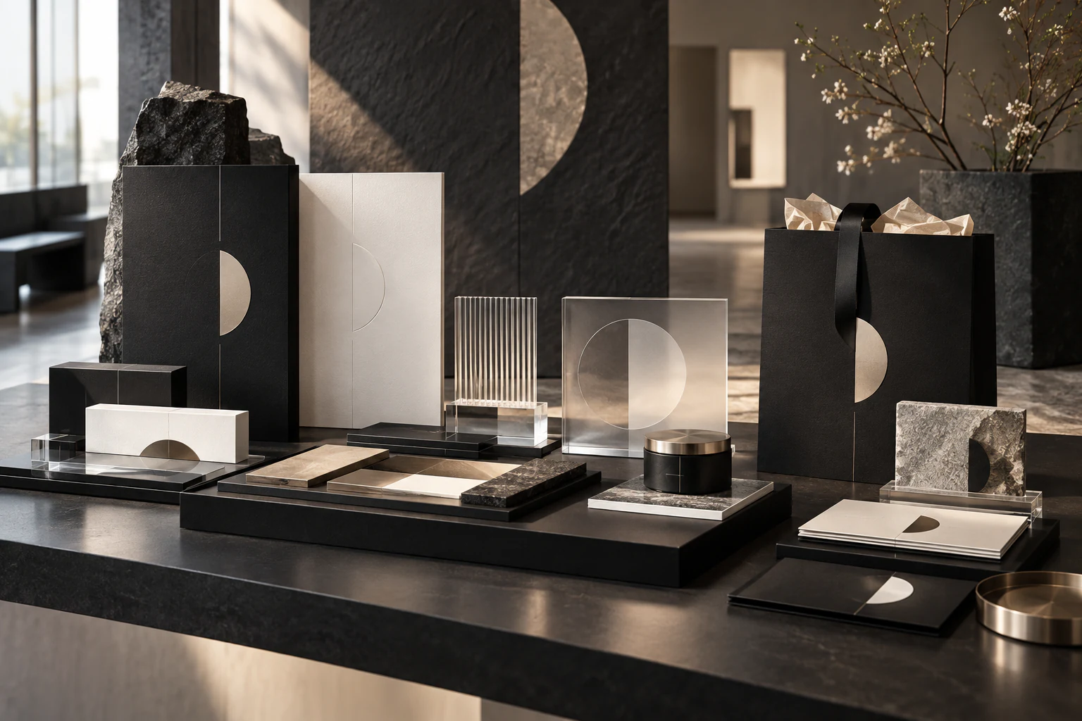
This independent extension develops Prima through touch: textured paper, stone, transparent acrylic and precise metallic details. The identity holds across packaging, stationery and display because its geometry is structural rather than ornamental. Luxury appears as control of proportion and finish, not as an outbreak of gold foil.
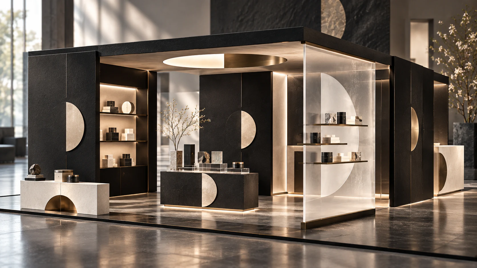
A Room Drawn by a Semicircle
This independent retail pavilion grows from the original semicircular mark. Repeated arcs organise display, circulation and moments of privacy, allowing the identity to be experienced spatially before it is read. Soft surfaces balance the precision of the geometry. The result is elegant without becoming precious, with the logo acting as a plan rather than a stamp.
Juno's Itinerary: Thousand Island LakeNext project