Mobility Architecture
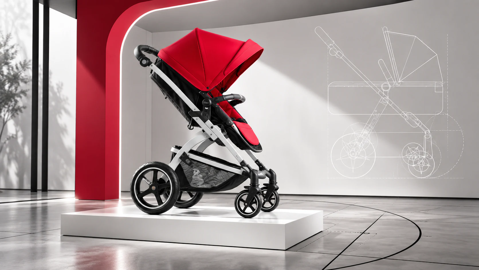
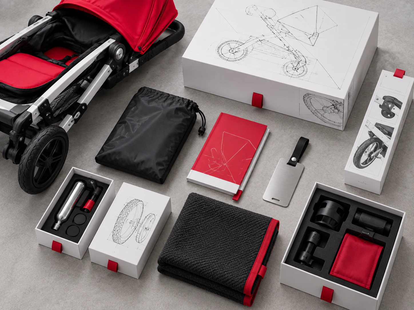
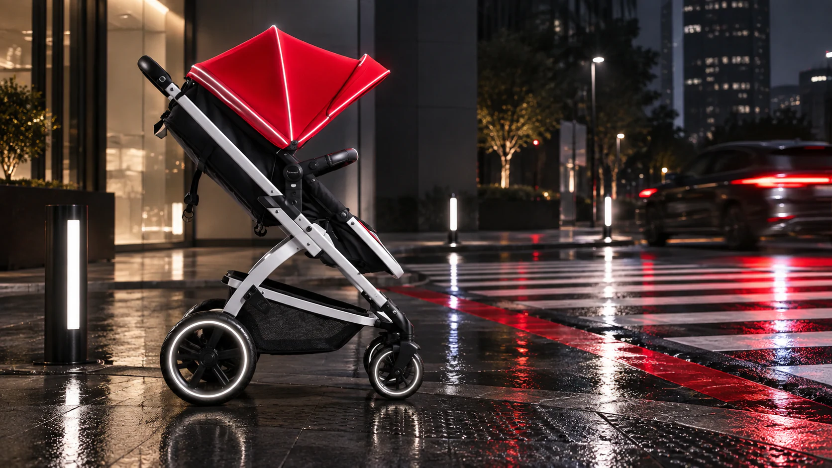
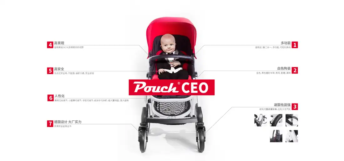
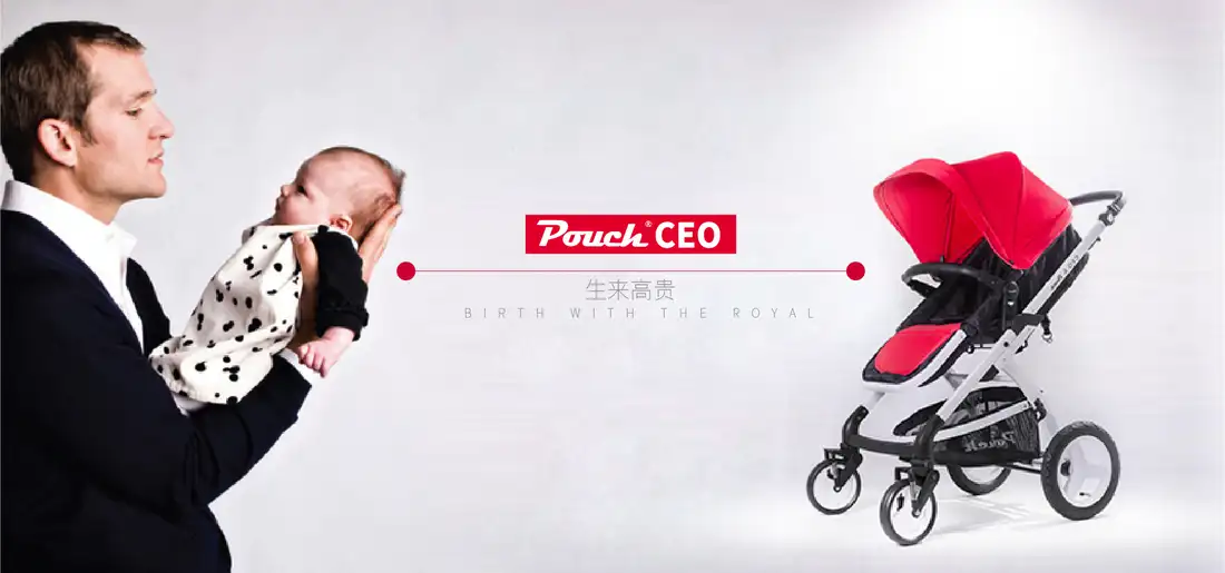
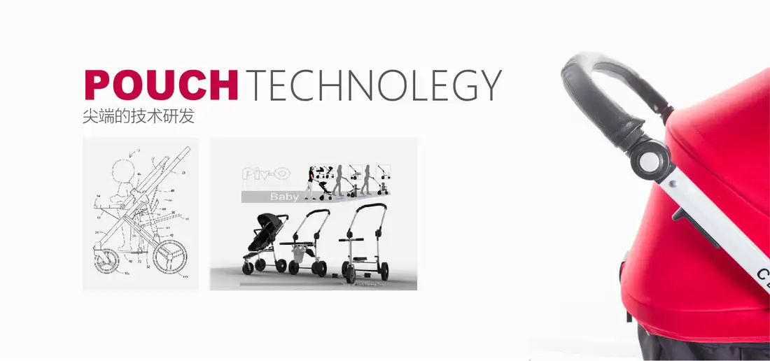
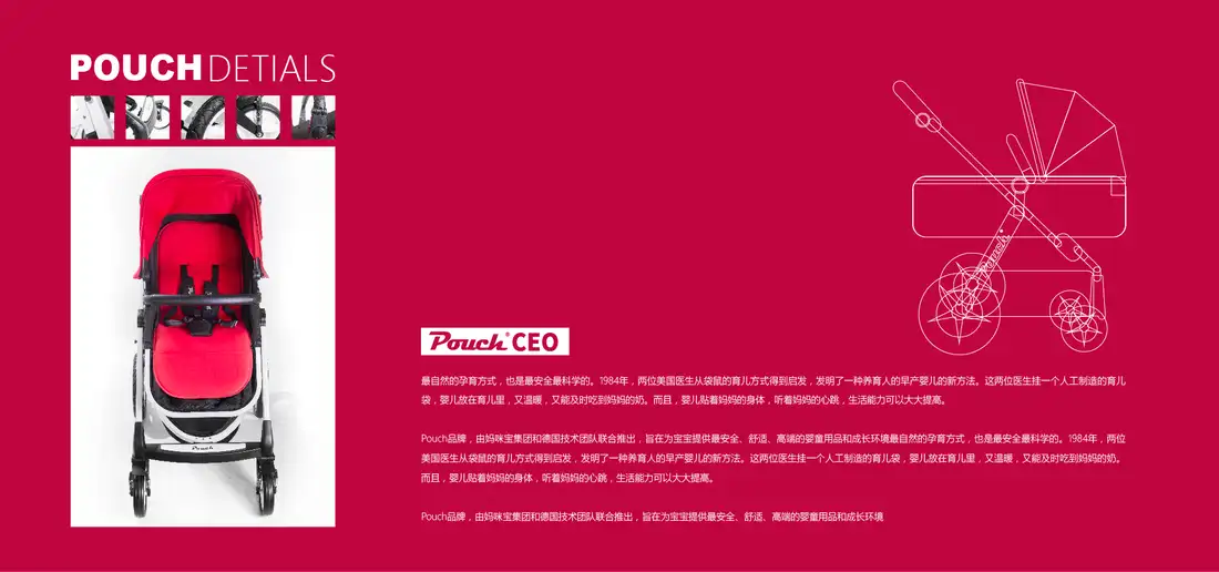
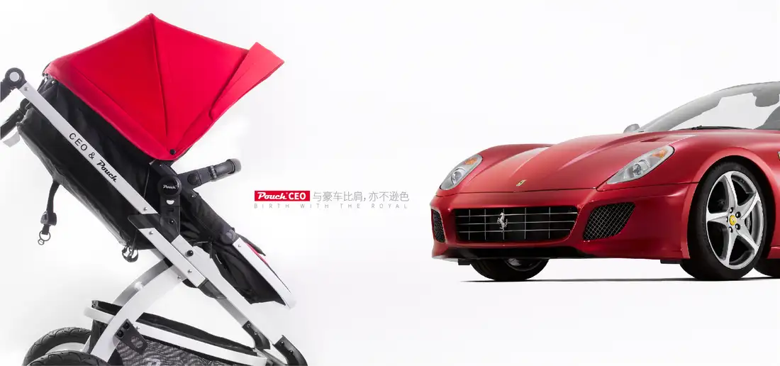
This independent extension moves the campaign beyond status imagery and treats the stroller as a product system that continues after purchase. The showroom translates its folding geometry into architecture: one red structural arch frames the object, projected linework exposes the mechanism, and the floor carries the drawing into physical space. The travel-service kit applies the same logic at hand scale. White boxes, black diagrams and red pull tabs organise maintenance tools, weather protection and service records without drifting into nursery decoration. The night study develops visibility as part of the identity rather than an added safety badge; reflective piping follows the canopy seams and wheel circles already present in the design. Across all three applications, red is not used as generic luxury shorthand. It identifies the parts that open, move, protect or need attention. The original campaign compared the stroller with executive and automotive worlds. This development asks a more useful question: what would premium care look like in the showroom, in the boot and on the street after dark?