Make the Identity
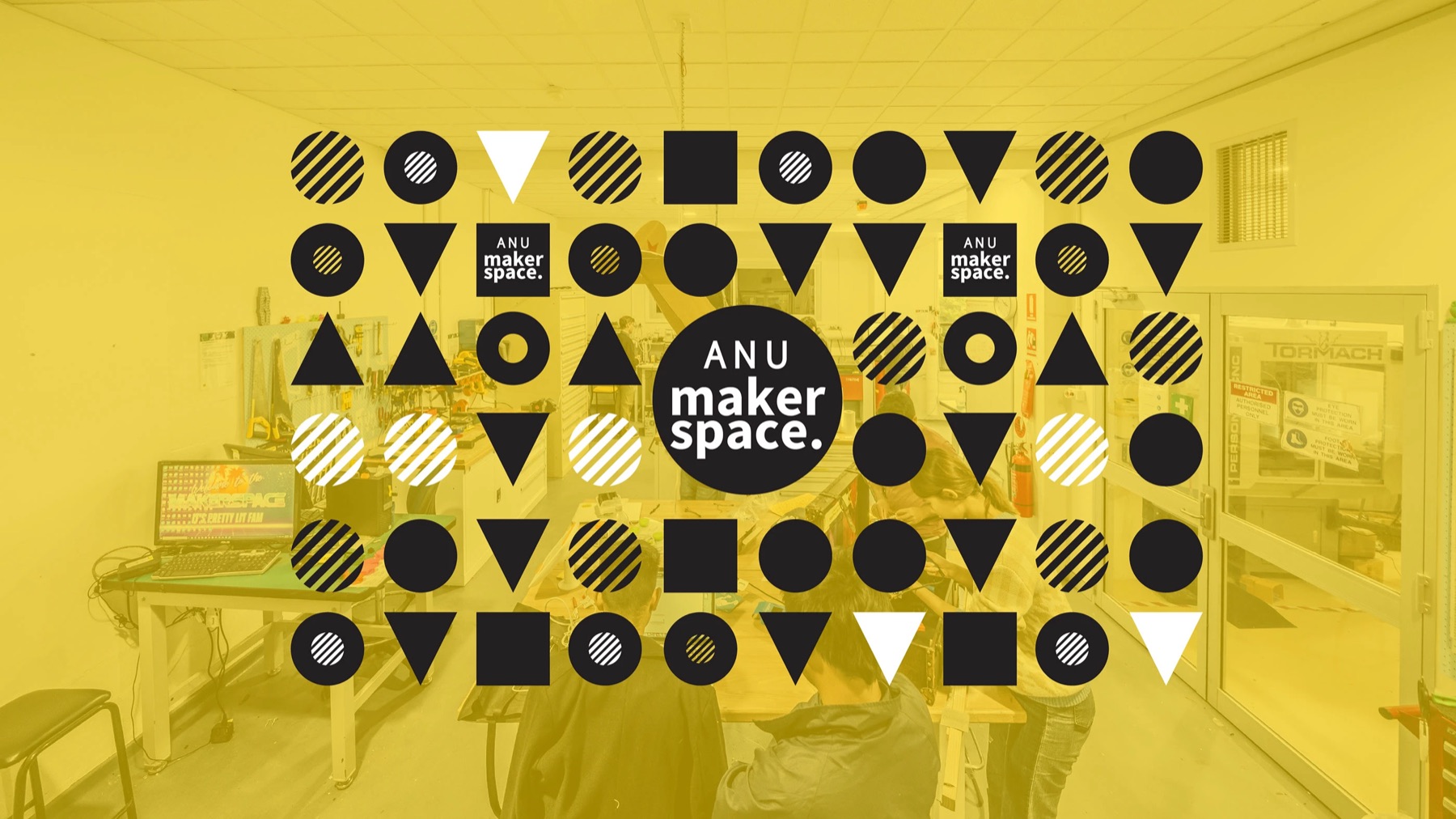
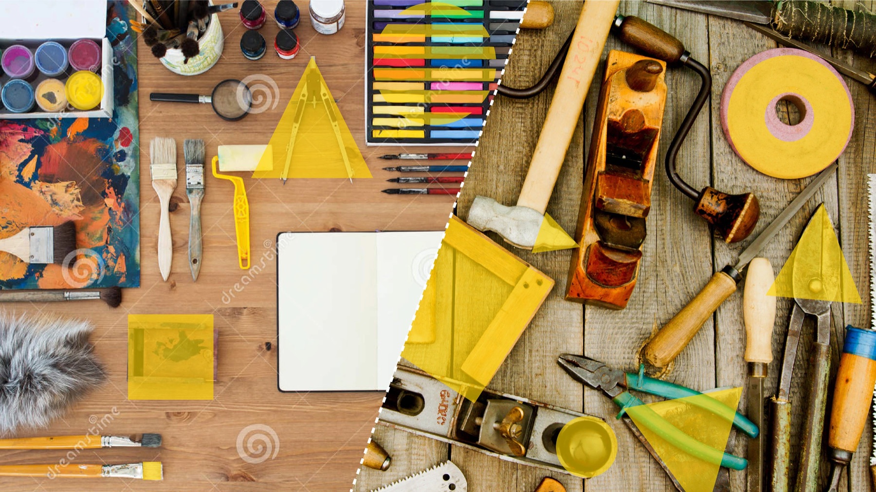
The identity was designed as a grammar, not a finished sentence. In 2019 I wrote a small p5.js program so the Maker Space community could combine the same circles, squares, triangles and striped forms without needing to imitate a fixed composition. The tool made authorship part of the identity: the designer established the rules, while each maker could produce a legitimate new result.
This edition preserves that idea while making the system more deliberate and useful. A stable random seed keeps every composition reproducible; density, grid, palette and logo controls expose the decisions behind the visual language; optional evolution shows how variation can remain coherent over time. Vector and high-resolution exports move the experiment beyond the browser and back into the workshop, ready for posters, labels, screens or stencils.
Pattern 0083427867
Maker Space Toolkit
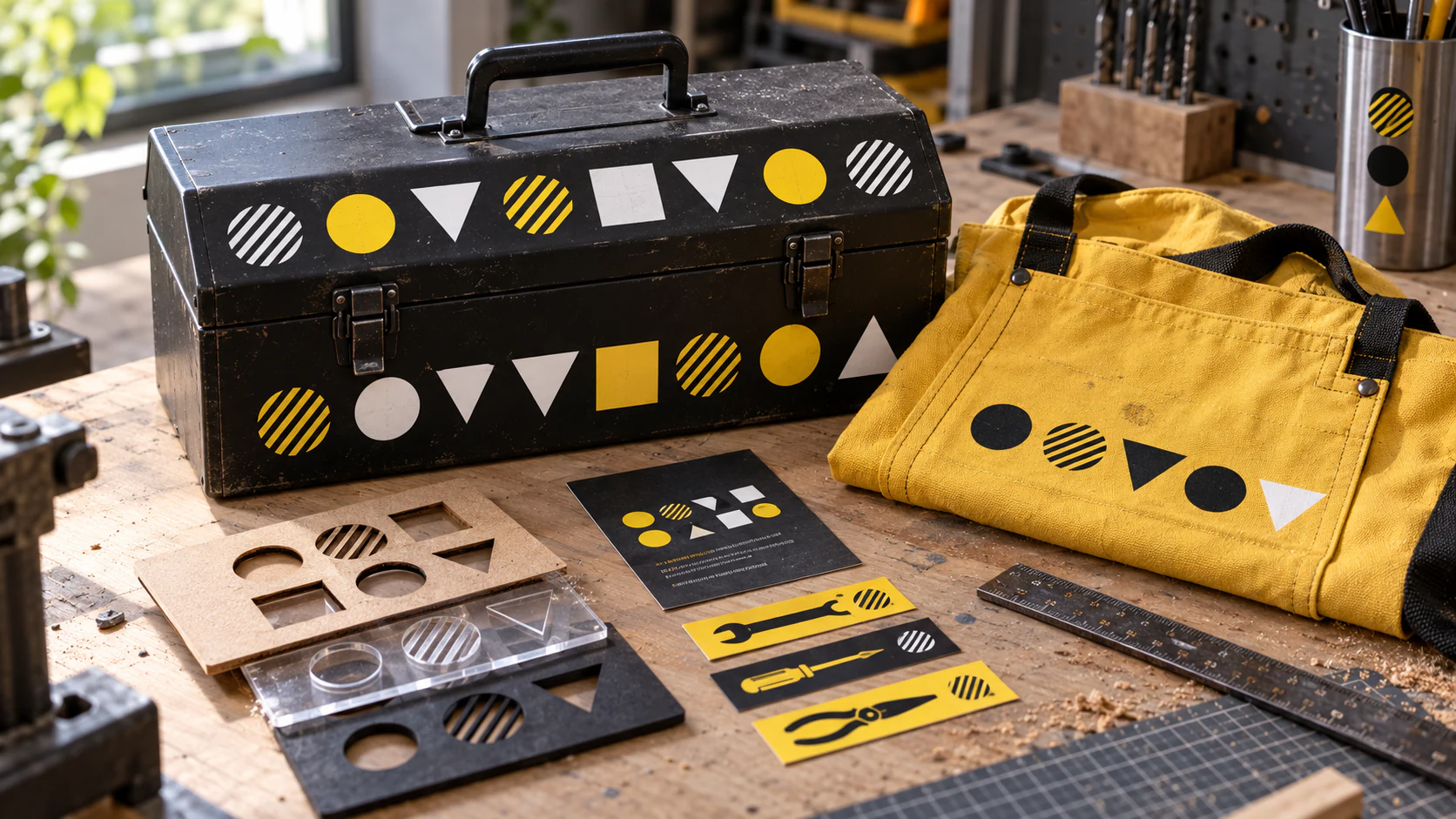
An independent application study that carries the original modular shapes onto a practical workshop kit: a tool case, canvas apron, material stencils and tool labels. The original identity works because it reduces a visually noisy environment to a few parts that can be endlessly recombined. Here, that same economy becomes a production principle: marks are screen-printed, cut, stamped and repeated across surfaces that will acquire scratches and fingerprints. The design is allowed to look better after use, because making is not a clean-room activity.
A Room That Explains Itself
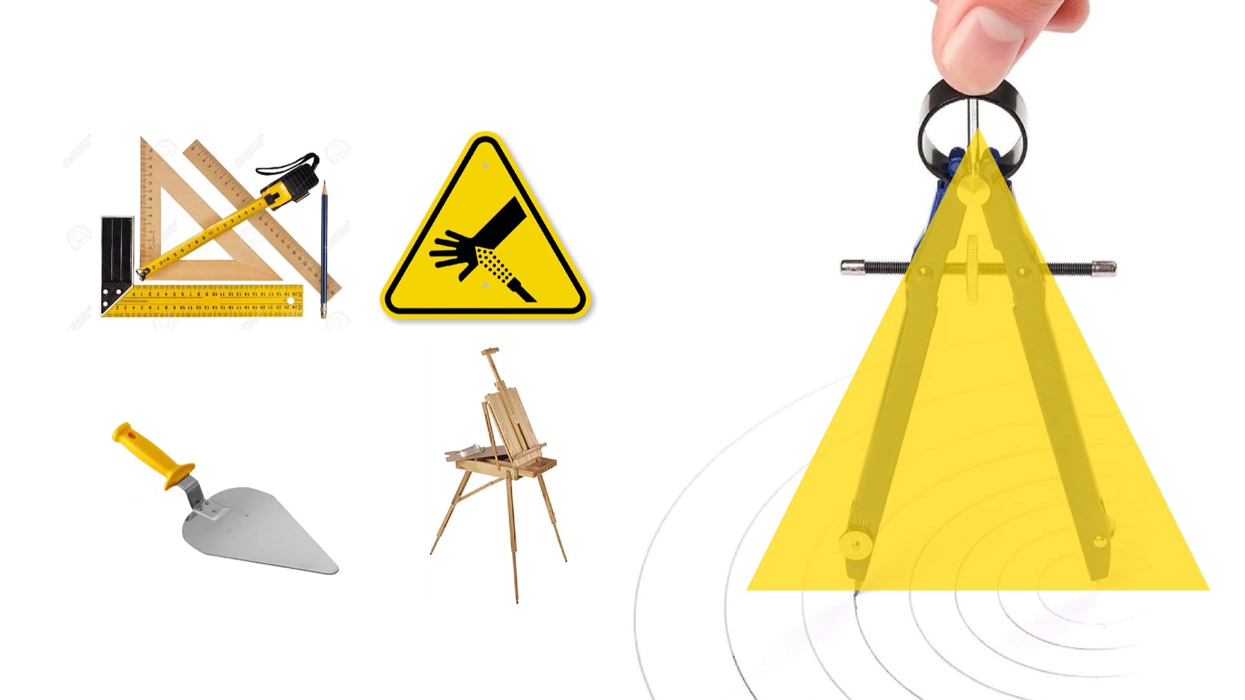
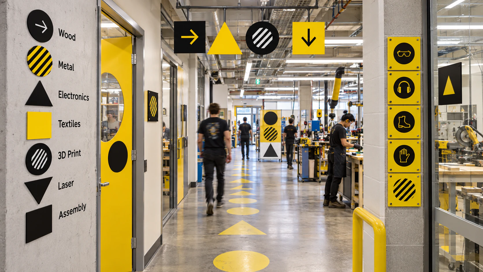
This independent spatial study asks the identity to solve a real workshop problem: people need to understand a busy room before they can safely use it. Circles identify shared resources, squares mark fixed stations, and triangles indicate direction or caution. Yellow is treated as an action colour rather than a background colour, so it appears where a decision is required. The system scales from a suspended sign seen across the room to a door plate read at arm’s length. Its personality comes from rhythm and recombination, while its usefulness comes from keeping the visual grammar small enough to learn almost unconsciously.
The Maker Passport
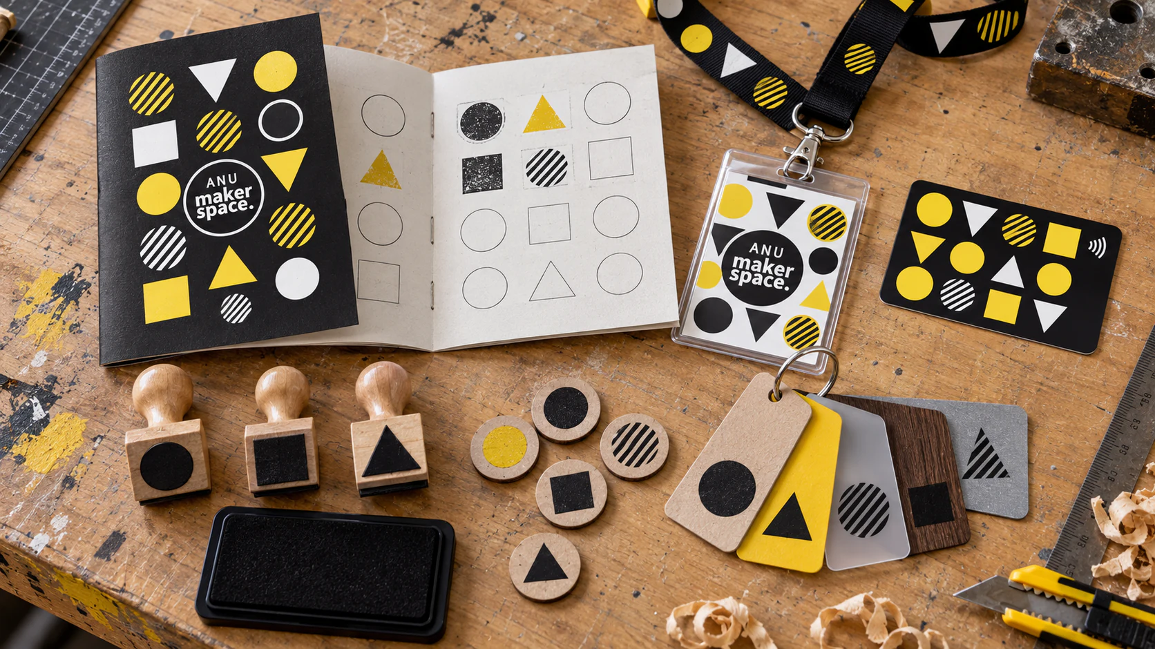
A maker space is partly a room and partly a sequence of small acts of confidence: first induction, first tool, first failed prototype, first useful object. This independent experience-design study turns the identity into a record of that progression. Rubber stamps and material tokens let members build a personal pattern as they complete activities, so the visual system changes through participation rather than being handed down as decoration. The passport also gives the digital p5.js logic a satisfying analogue counterpart: the same limited pieces produce a different composition for every person. Identity becomes evidence of learning, not simply proof of membership.
The Open Tool Library
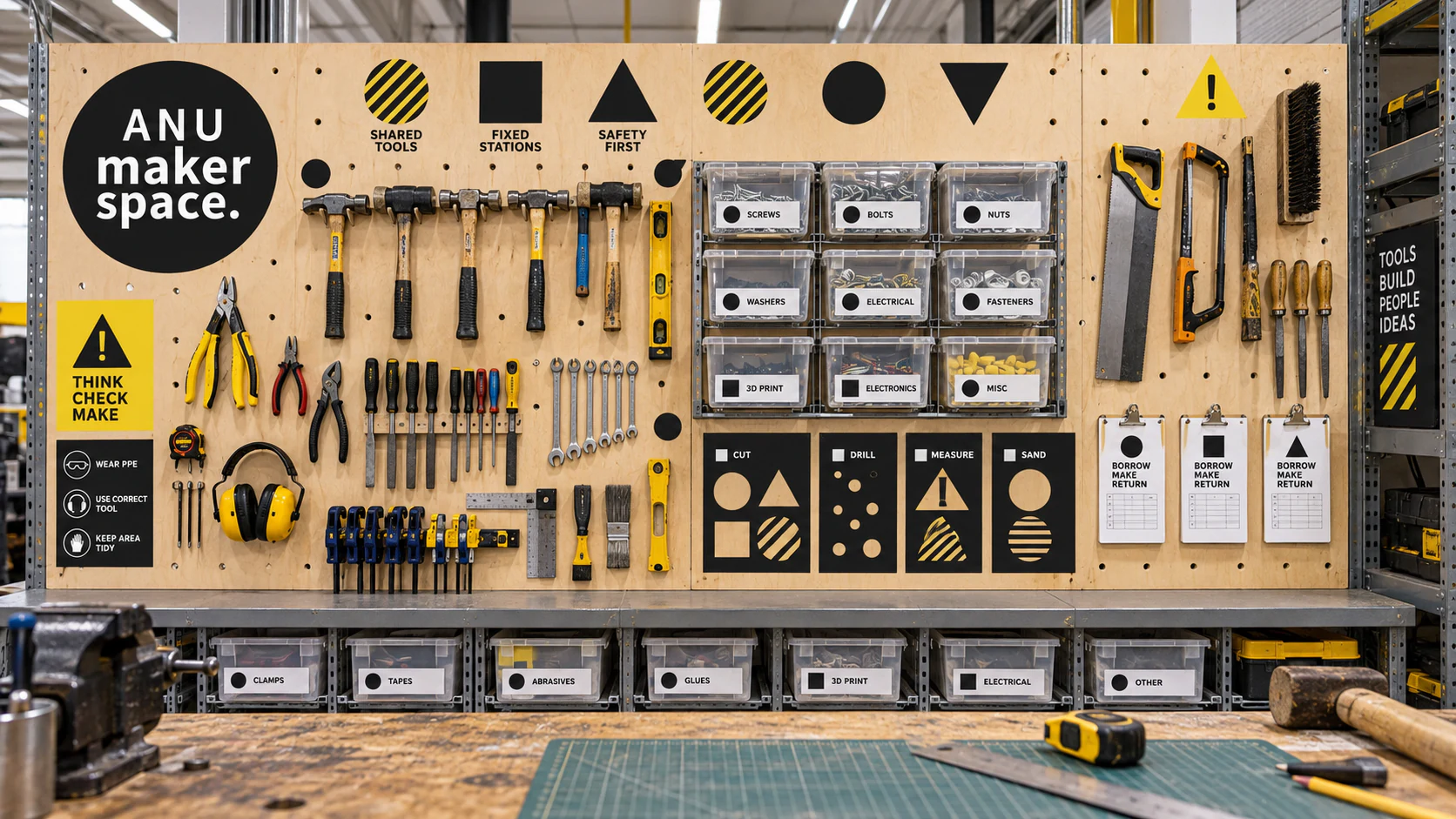
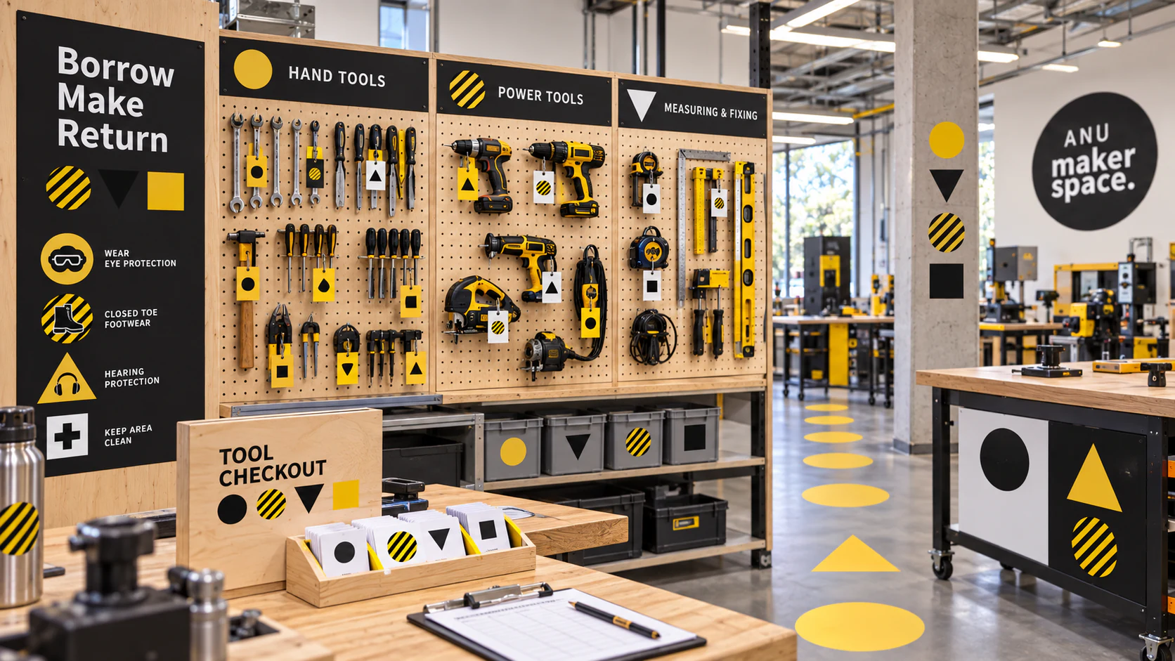
This independent information-design study brings the modular language to the place where clarity matters most: the tool wall. The same geometric code operates at three distances. Large marks divide shared tools, fixed stations and safety information; medium labels organise bins and check-out points; small tags travel with individual objects. Plywood, steel and transparent boxes remain visually dominant, with yellow reserved for moments that need attention. The goal is not to make a workshop look branded. It is to make returning a drill bit almost as obvious as borrowing one, proving that a flexible identity can reduce friction without becoming another layer of visual noise.
Identity as a Live Material
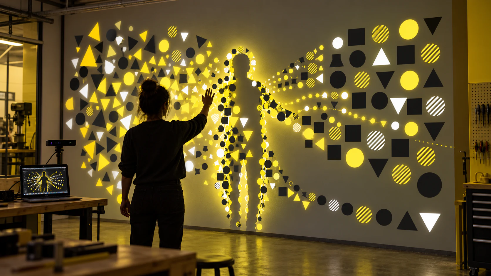
The original project used p5.js because a maker space should not have one frozen hero image. This independent interactive study develops that idea into a responsive projection. A depth camera reads movement as a temporary force: shapes gather around a body, separate as a hand moves, then settle into a new arrangement when the visitor leaves. The system never abandons its circles, squares, triangles or striped texture, so variation does not become randomness. The design philosophy is simple: in a place devoted to experiments, identity should behave like a material under test. It can stretch, collide and recombine while its underlying rules remain visible.
Open House, Open System
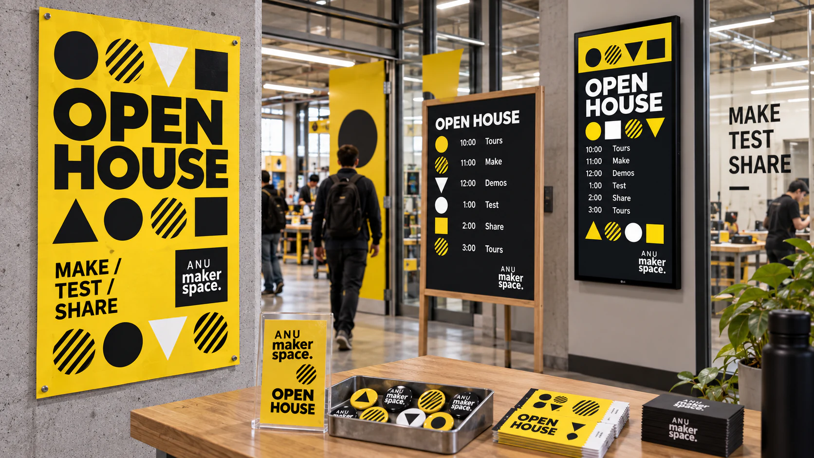
This independent campaign study asks the identity to coordinate a public event without turning every surface into the same poster. The generator supplies a shared visual grammar; each workshop, talk and demonstration receives its own arrangement, while the yellow, black and white palette keeps the day recognisable as one programme. Large geometric fields work at street distance, striped circles signal live activity, and compact modules carry schedules into badges, tickets and screens. Variation is treated as information rather than decoration: difference helps visitors see that many kinds of making can coexist under one roof. An open day should not only advertise the Maker Space. It should behave like it.
Built to Be Worn
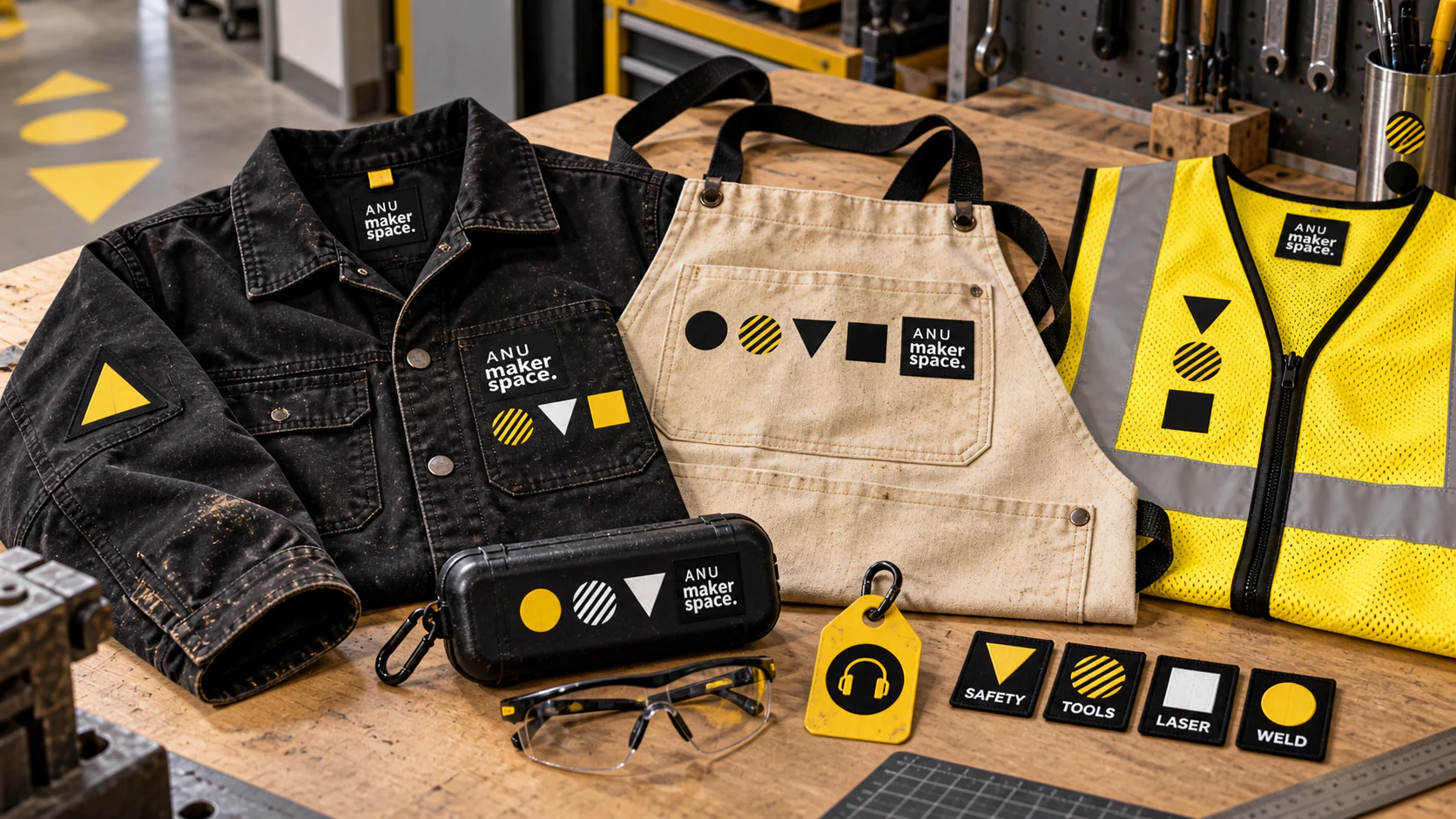
This independent workwear study moves the identity onto objects that are folded, stained, repaired and used at close range. Rather than printing a large logo everywhere, the geometry becomes a practical code: triangles mark caution and hot-work zones, squares identify fixed stations, and circles indicate shared equipment. Screen print handles broad shapes; embroidery and woven labels protect small information; replaceable patches allow roles and inductions to change without replacing a garment. Yellow remains an action colour, with black and undyed canvas carrying most of the wear. The aim is clothing that becomes more convincing through use, proving the identity can belong to workshop culture rather than simply sitting on top of it.
Made Here
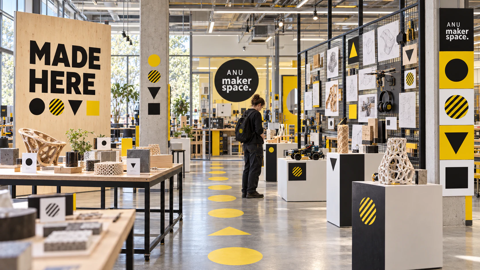
This independent exhibition study gives member projects a public stage while keeping the Maker Space identity in a supporting role. A modular rail and plinth system borrows the original circle, square and triangle proportions, then uses them to index process, material and level of completion. Yellow traces the visitor route and marks moments of interaction; black frames establish hierarchy; generous white space lets prototypes remain visually dominant. Labels pair finished objects with sketches, tests and useful failures, because making is rarely a straight line. The identity does not make every project look alike. It creates a common rhythm in which very different work can be compared, understood and celebrated.
Borrow, Make, Return
This independent service-design extension applies the original geometric language to borrowing, induction and safe return. Circles identify shared tools, squares mark fixed stations, and triangles carry direction or caution. The system joins signage, mobile check-out and workshop prompts without turning the room into an advertisement. It develops the p5.js logic into a practical behaviour: many outcomes, one small set of rules.
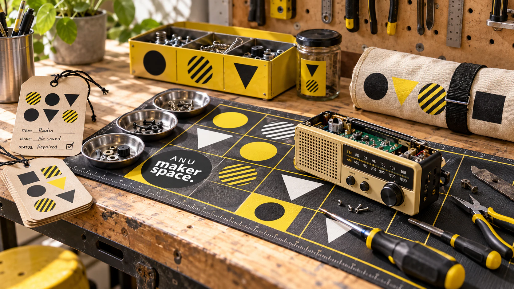
The Repair Table
This independent concept extends the original geometric identity into the patient work of repair. A gridded mat gives loose components a temporary address; magnetic trays and reusable tags carry the same circles, triangles and striped marks between workstations. The canvas roll brings the system home in a form that can crease and acquire evidence of use. I like the idea that a visual identity can help someone remember where a tiny screw belongs. Recognition becomes useful at the scale of a hand, while repair gives the Maker Space philosophy a longer life: making includes keeping things working.