The Gentle Plan
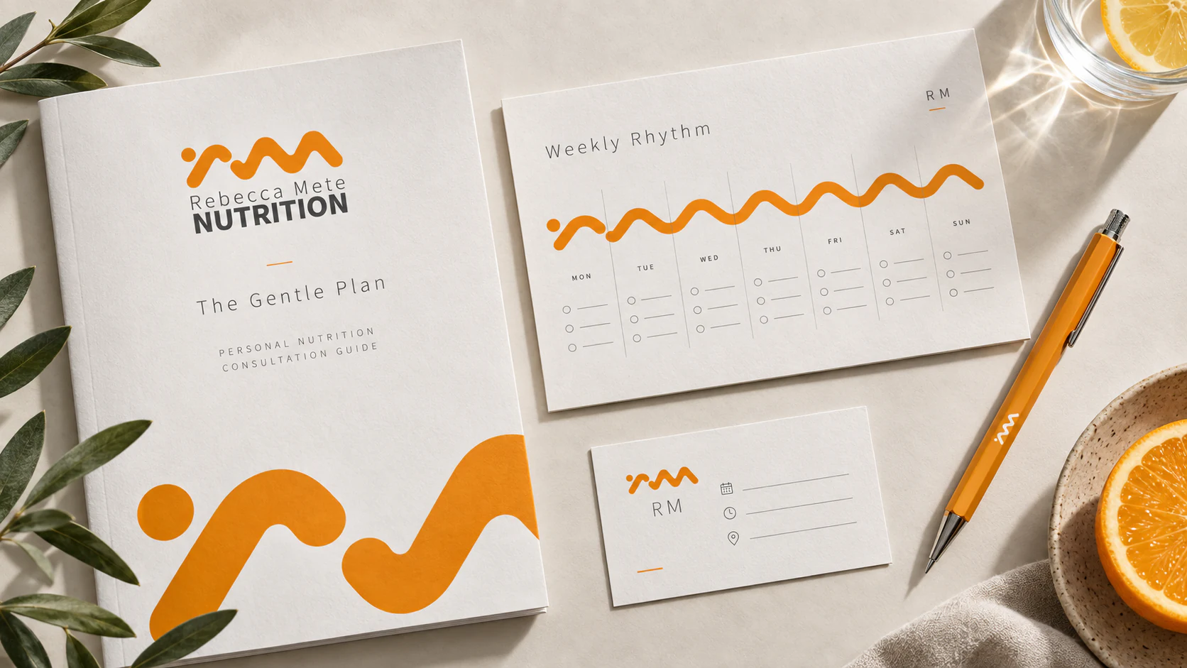
This independent consultation study takes the original mark seriously as a rhythm rather than a decoration. The dot and continuous curve become a weekly sequence: enough structure to give a client somewhere to begin, enough empty space to leave room for a real life. An intake booklet, appointment card and small planning sheet use warm paper, quiet charcoal type and a single orange line to make nutrition advice feel considered instead of clinical. The system does not promise a perfect routine. It makes the next useful decision easier to see.
The Pantry Signal
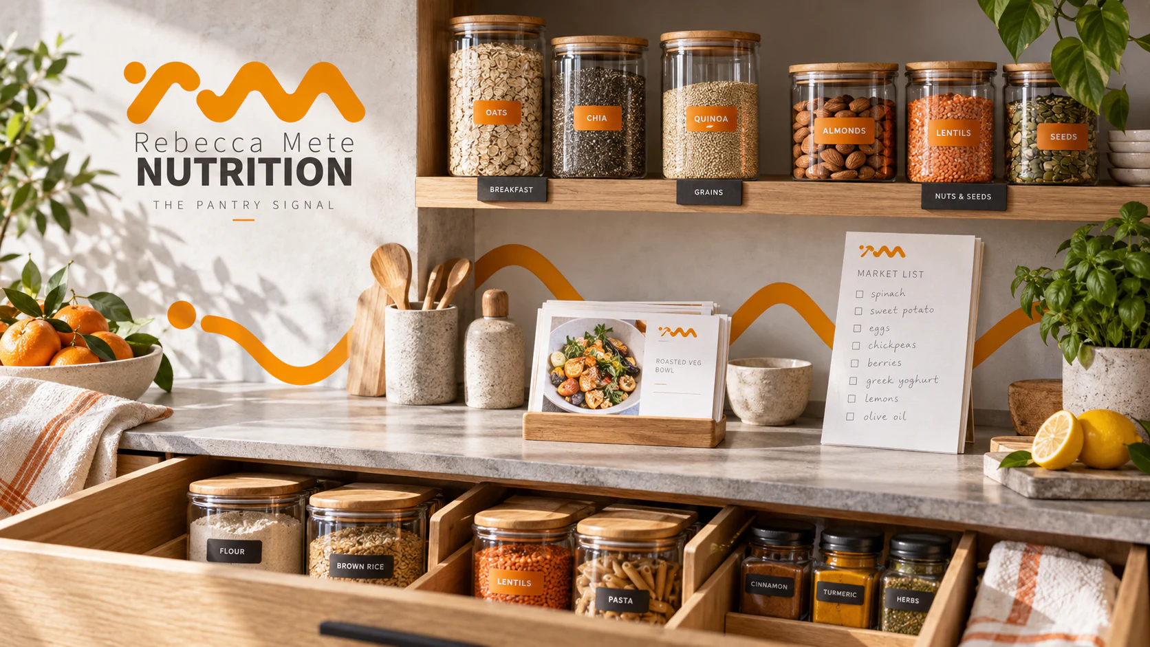
A good nutrition identity should have a life after the consultation. This independent home-system study applies the orange wave to the overlooked decisions that happen in a kitchen drawer: what is within reach, what is running out, what can become dinner without turning into a spreadsheet. Clear jars, charcoal shelf tabs, a market list and a small recipe stand form a visual hierarchy that is friendly to use from the corner of an eye. The wave runs across the room like a long, unbroken gesture, quietly connecting ingredients to routine.
Fuel for the Long Day
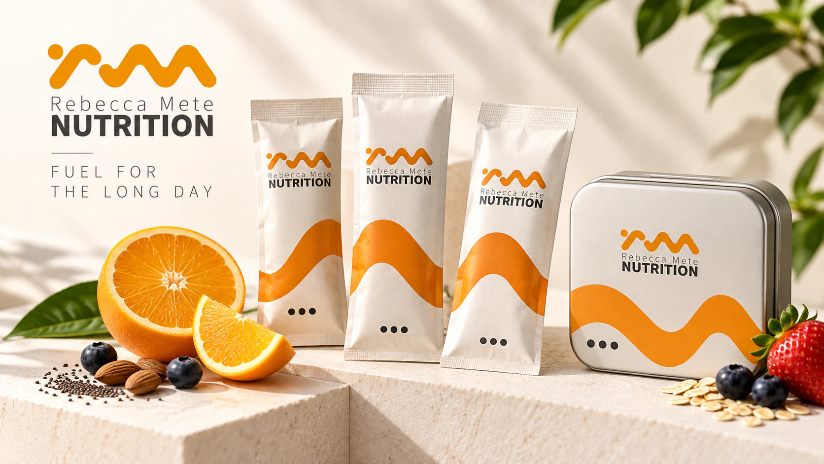
This independent packaging study imagines a practical companion for the gap between meetings, school pickup and whatever dinner becomes. The original symbol is enlarged into a wide orange horizon across tactile paper sachets and a reusable tin, while a short row of dark dots offers a restrained information cue. It deliberately avoids the macho visual noise common to wellness packaging. The result is warm, legible and adult: a small object that can sit on a desk or in a bag without announcing a lifestyle change to the whole room.
The Table is Evidence
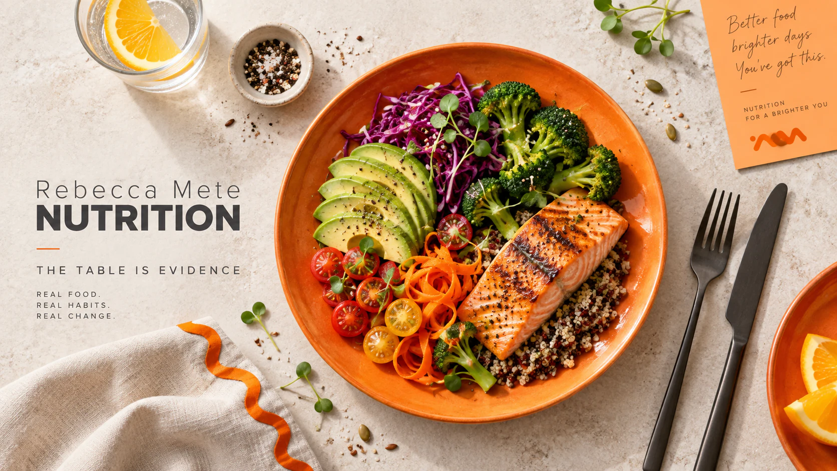
For this independent editorial art-direction study, the plate is allowed to do most of the talking. The rich orange of the identity reappears as ceramic, napkin edge and a compact note card, holding a lively meal within a calm photographic frame. The composition uses the discipline of a still life rather than the shiny theatre of diet advertising: texture, colour and proportion are evidence of care, not a performance of virtue. The mark becomes a small visual signature around a broader idea: a healthy relationship with food should still look like food.
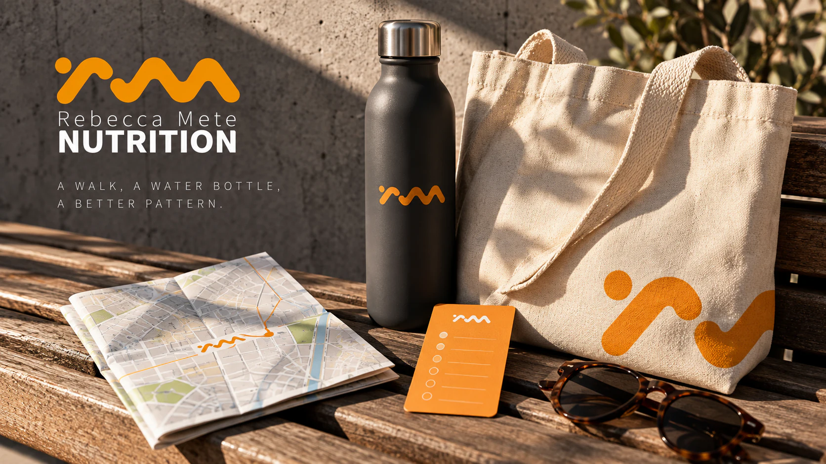
A Walk, A Water Bottle, A Better Pattern
This independent object study moves the identity outside without turning it into sports branding. A matte bottle, canvas bag and folded walking map use the orange curve as a route, a fill line and a quiet reminder that habits are built by returning to them. Late-afternoon light and concrete give the objects a little city gravity; they feel useful rather than aspirational. The visual proposition is simple: wellbeing is not a grand reset. It is a series of modest, repeatable movements through an ordinary day.
A Practice You Can Carry
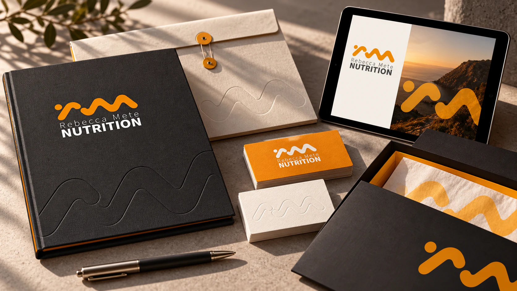
This independent application study asks how a quiet professional identity can travel between consultation, correspondence and presentation. Restrained typography, tactile paper and a compact portfolio system create authority without impersonating a large institution. The design leaves deliberate space for the practitioner’s own voice, making the identity feel precise, personal and easy to use.