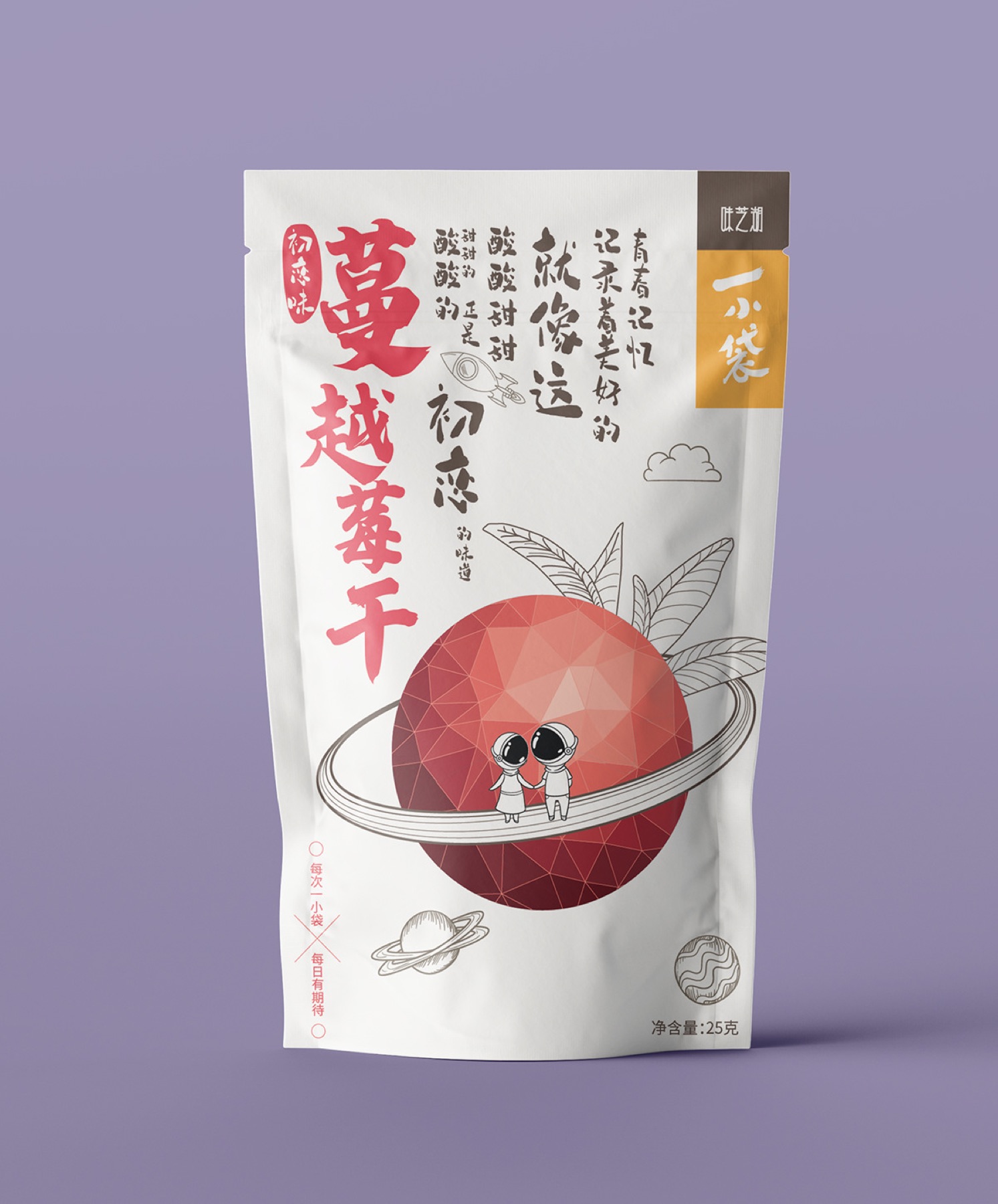
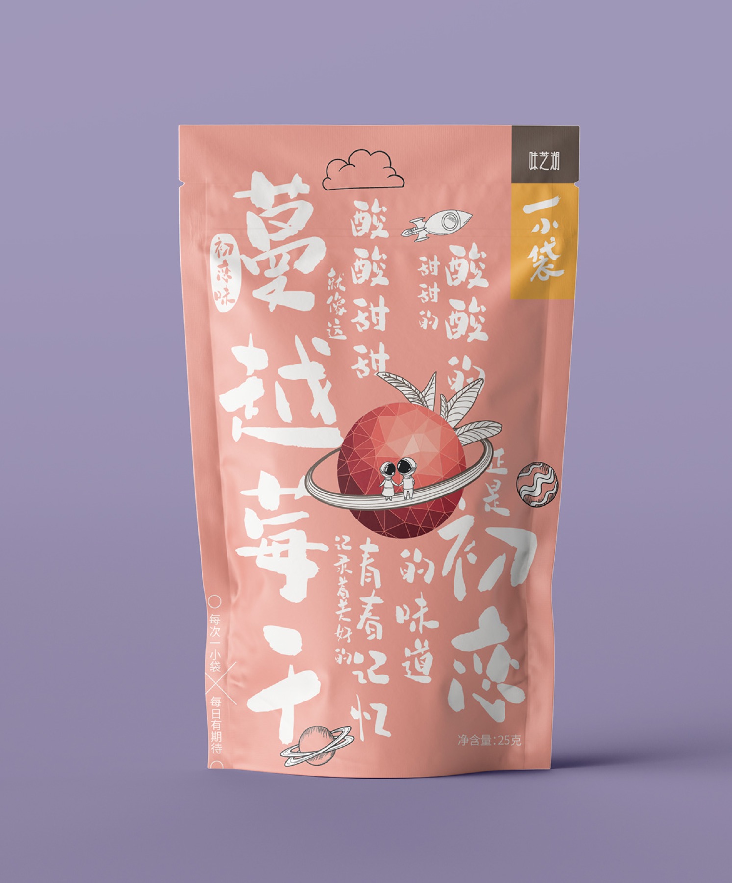
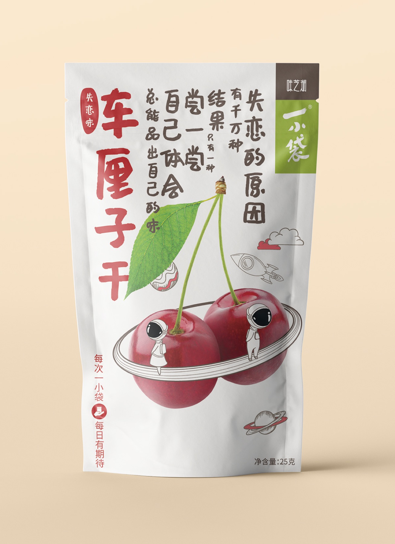
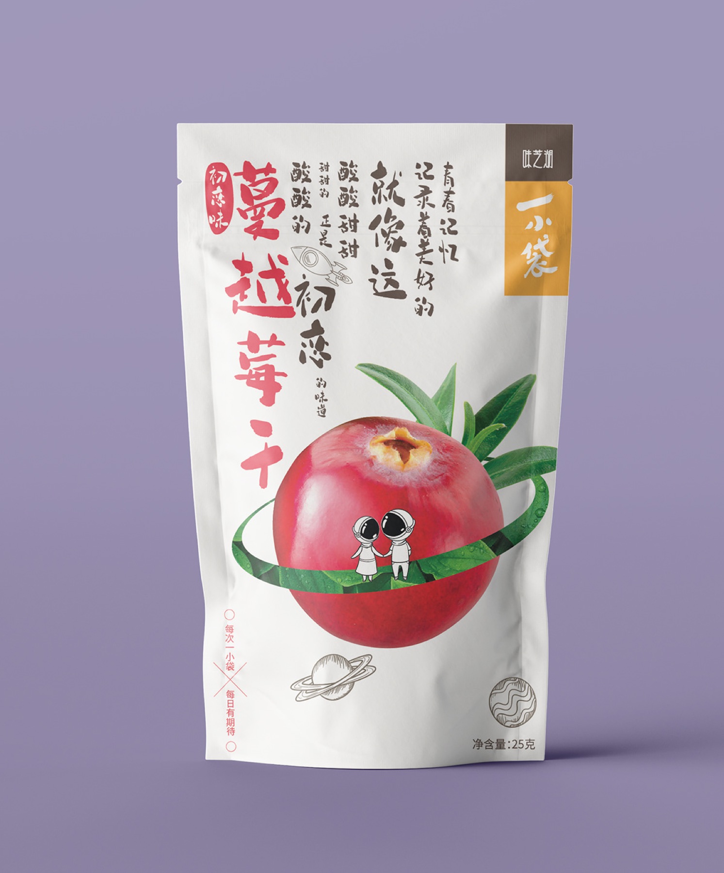
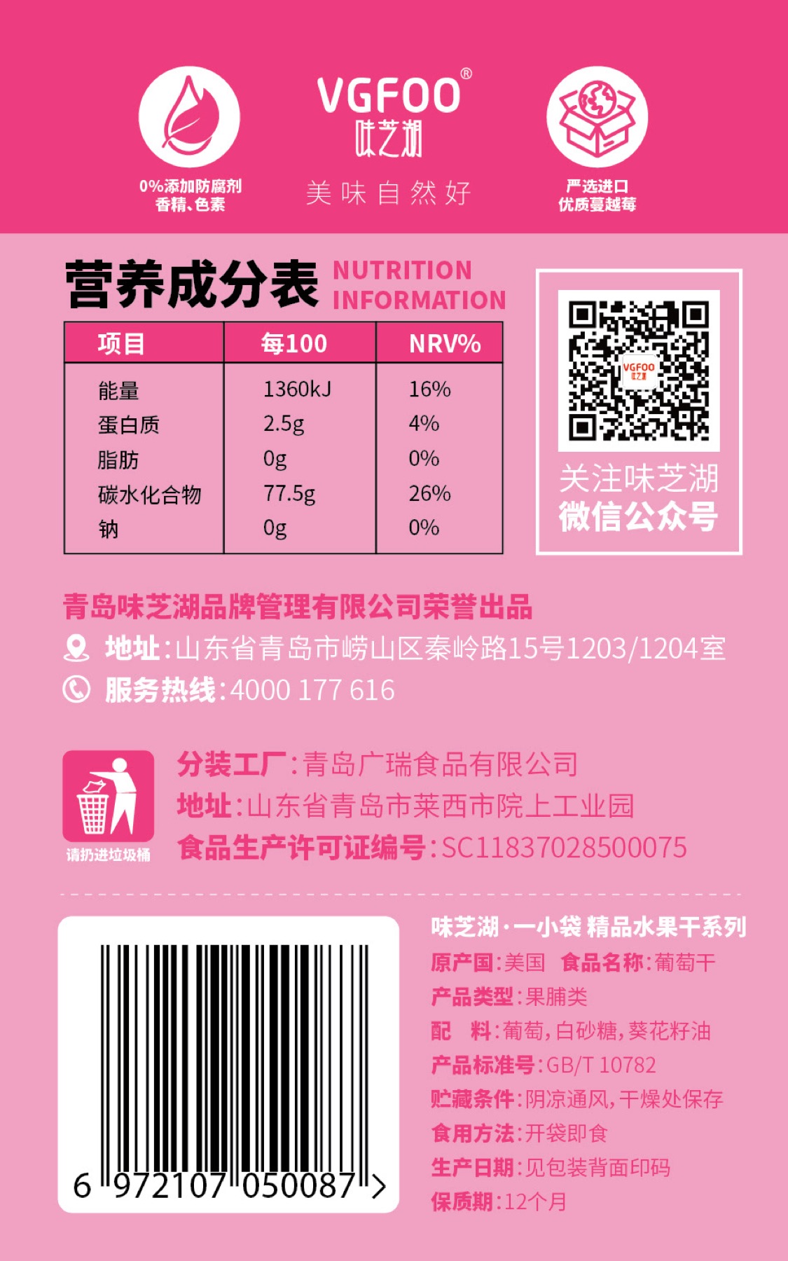
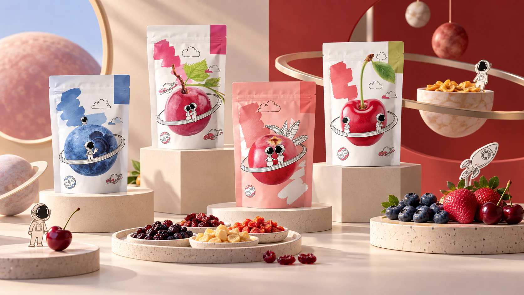
Fruit Orbit Market
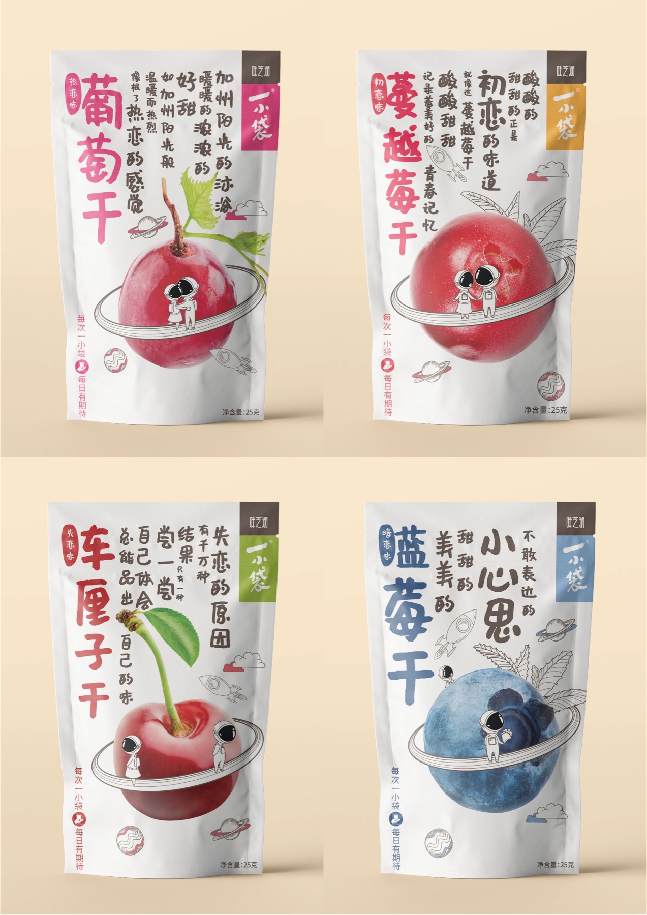
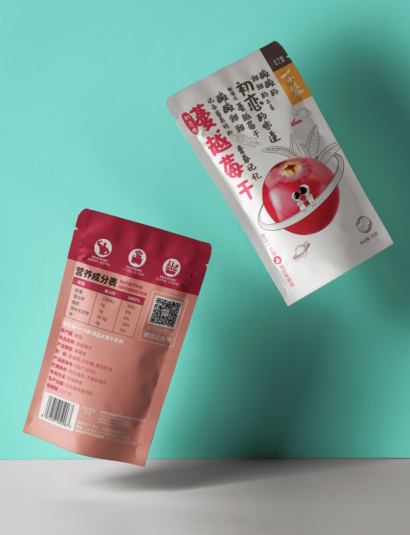
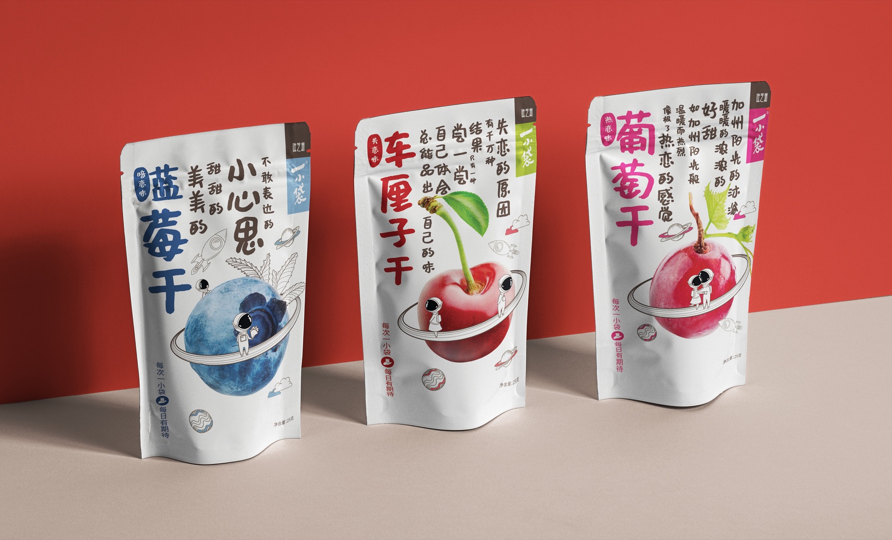
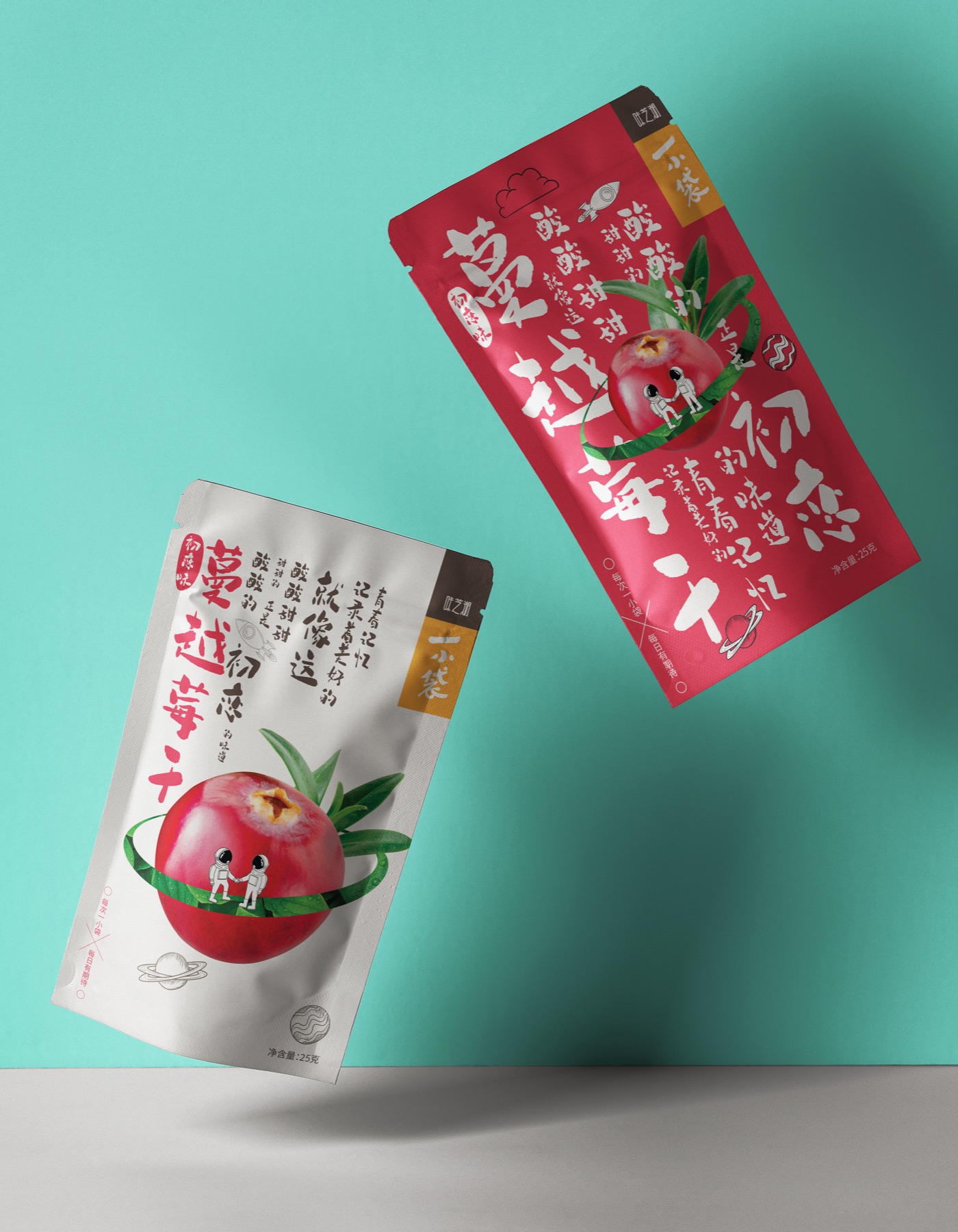
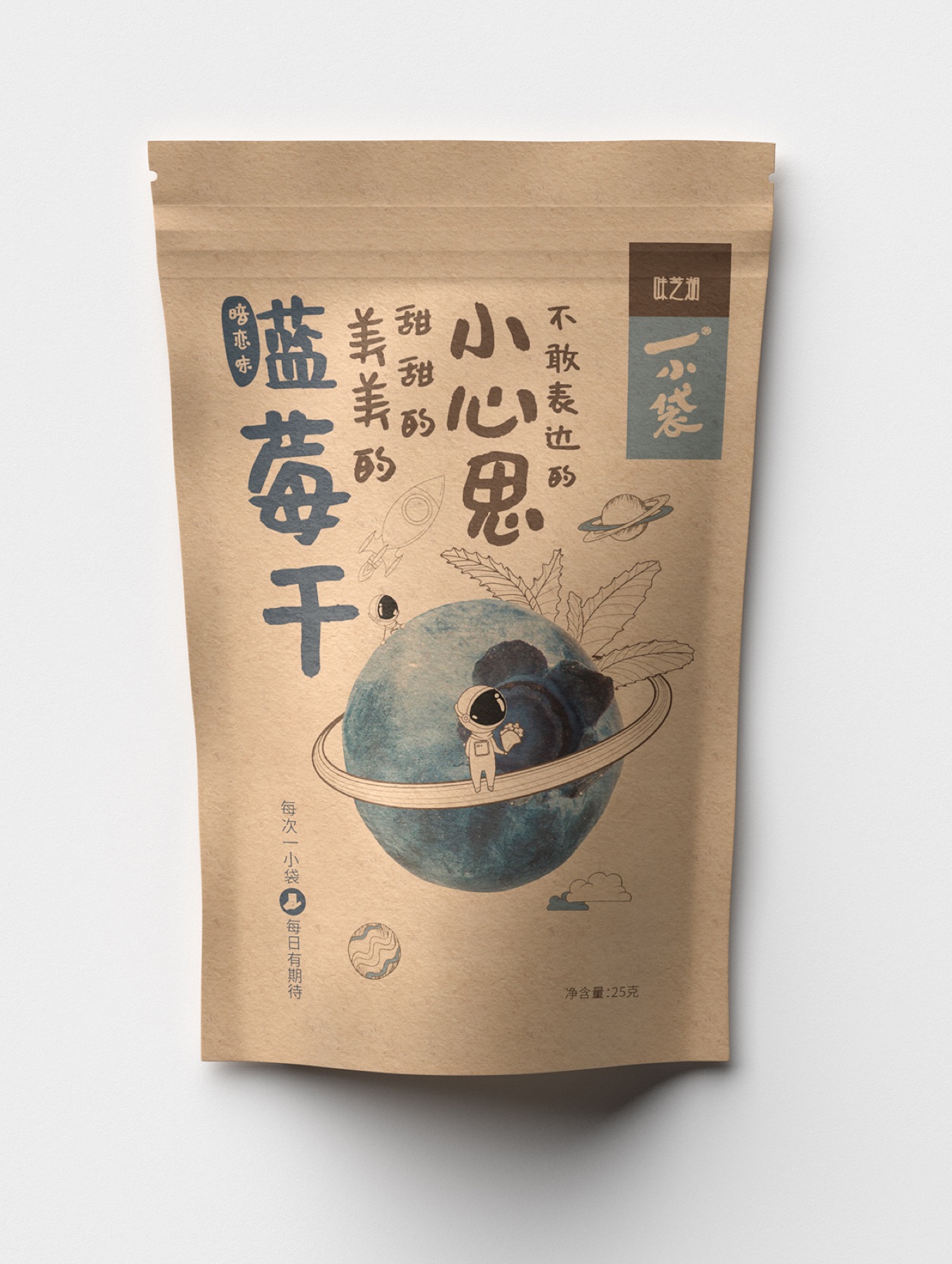
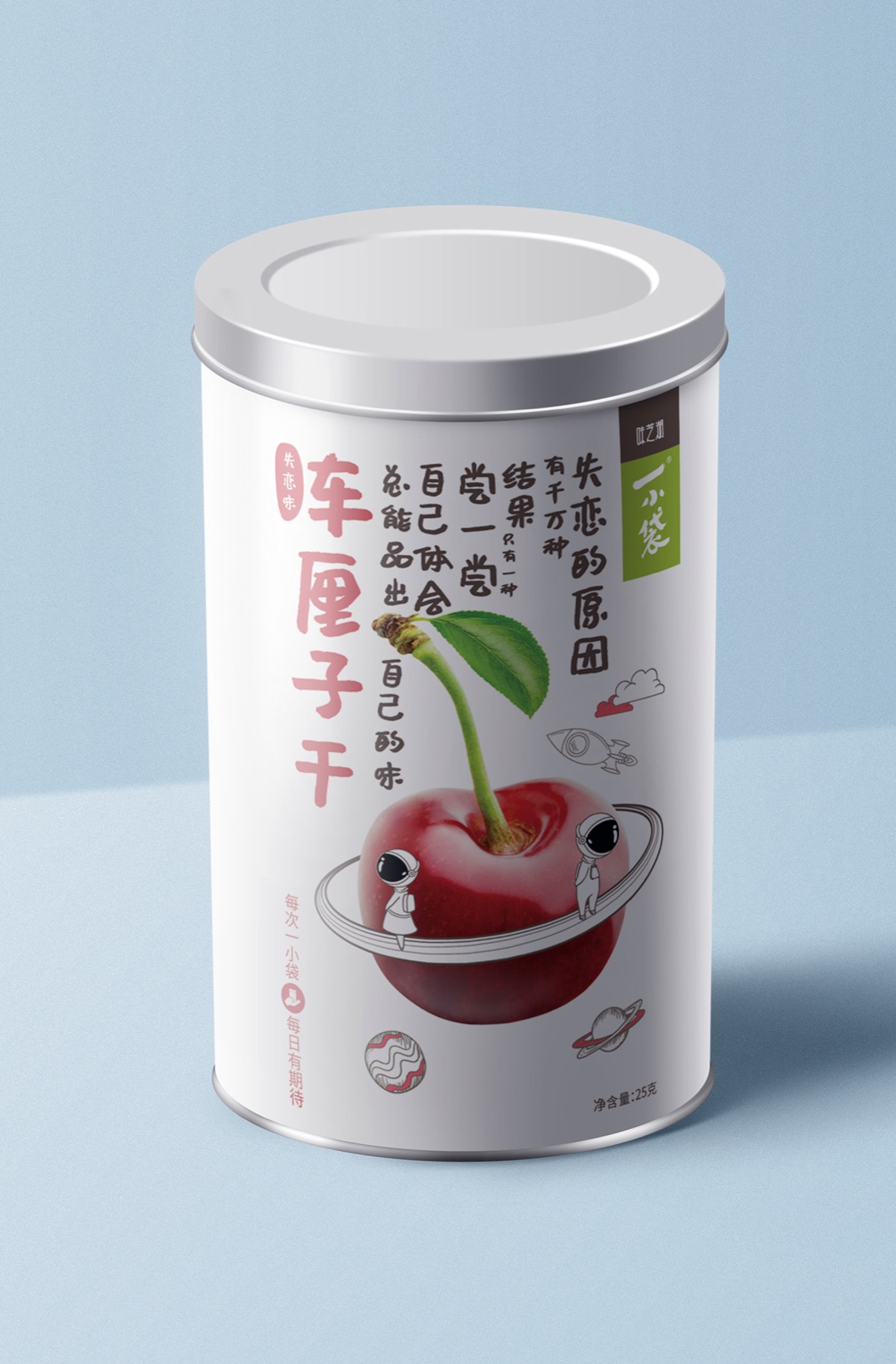
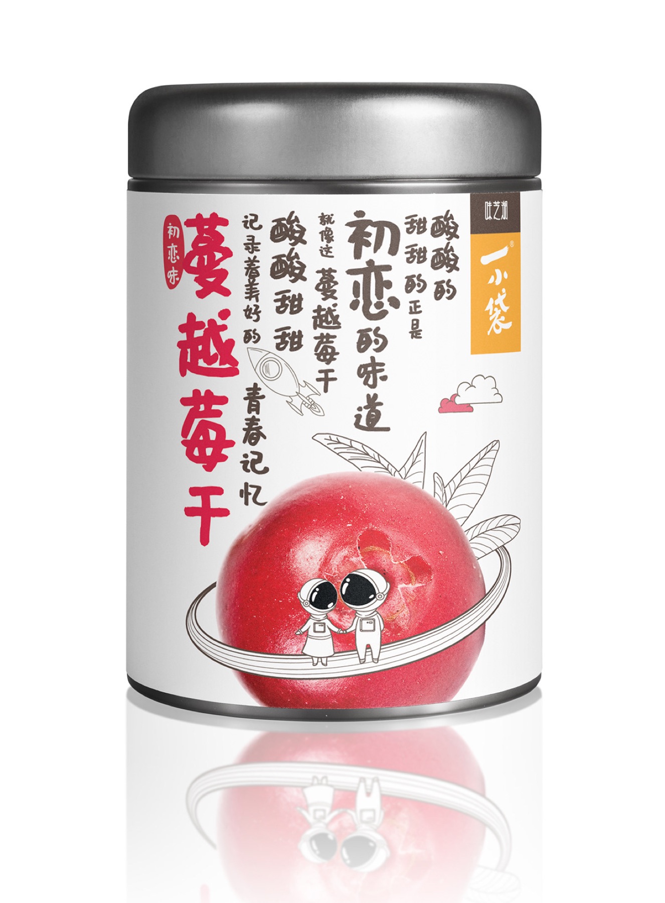
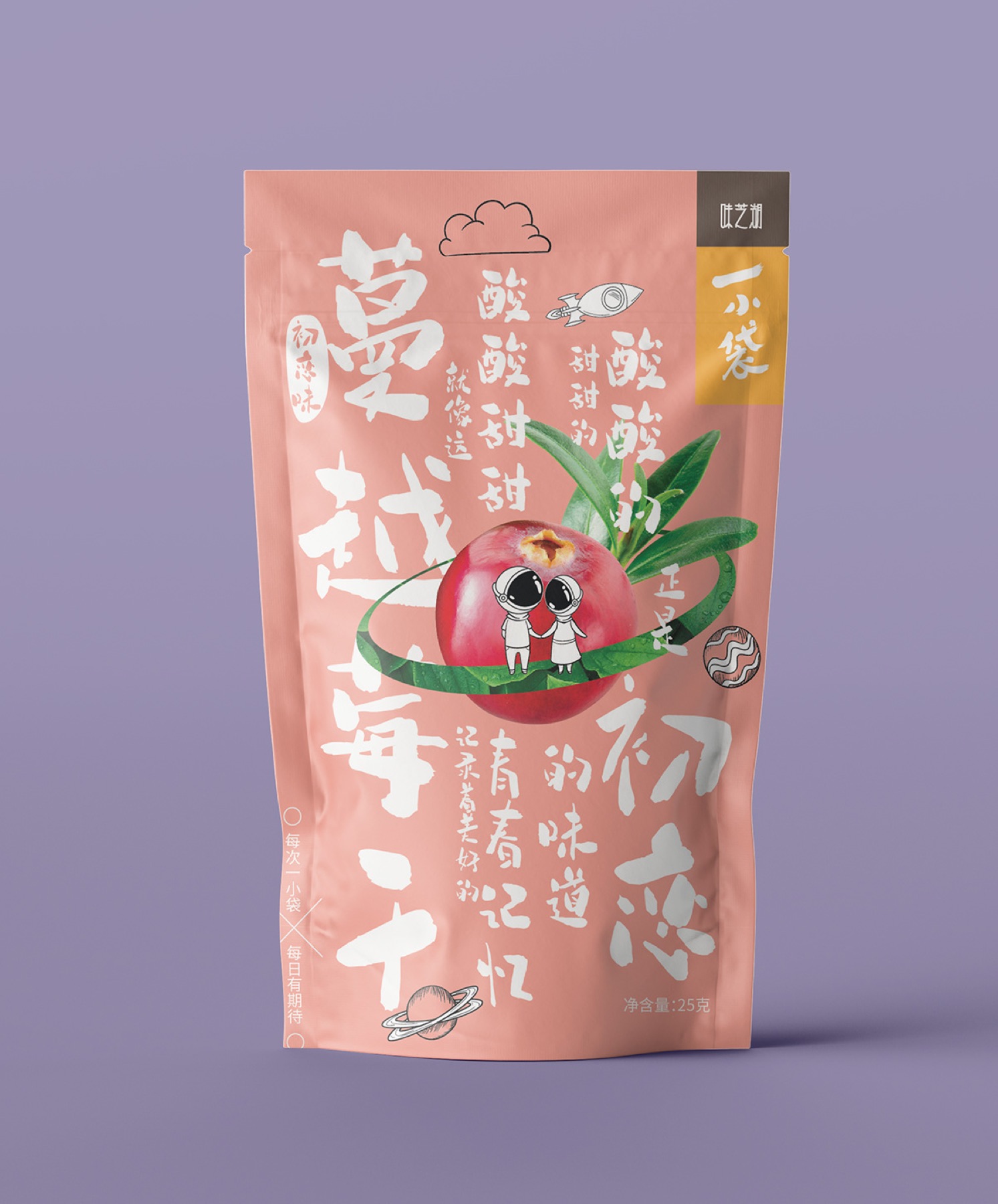
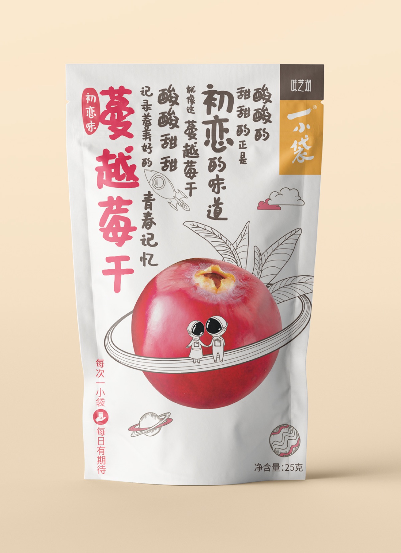
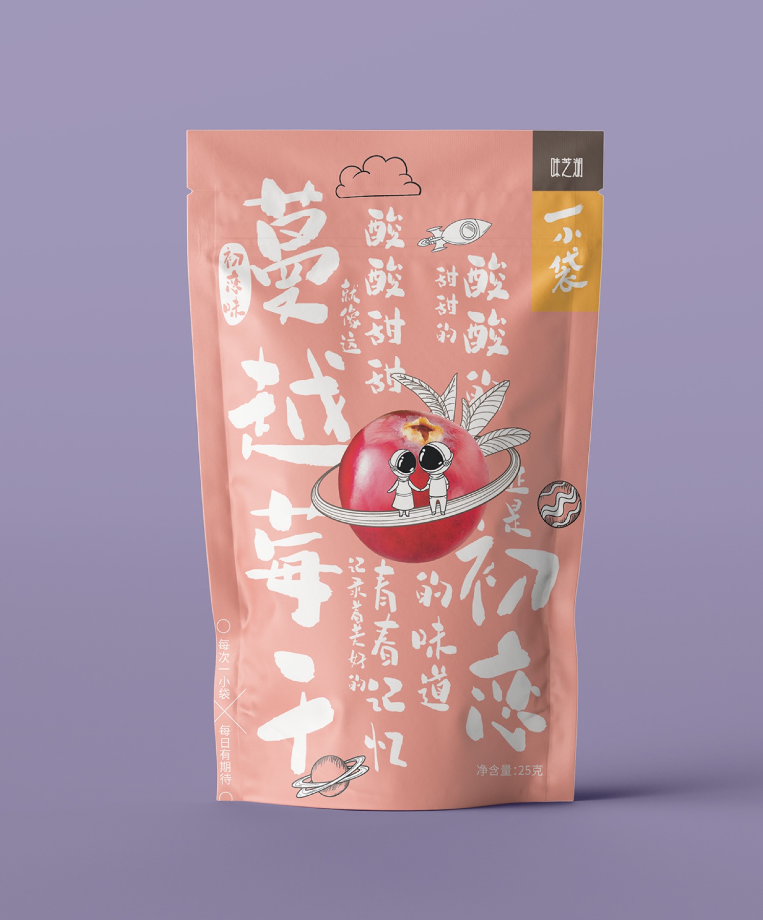
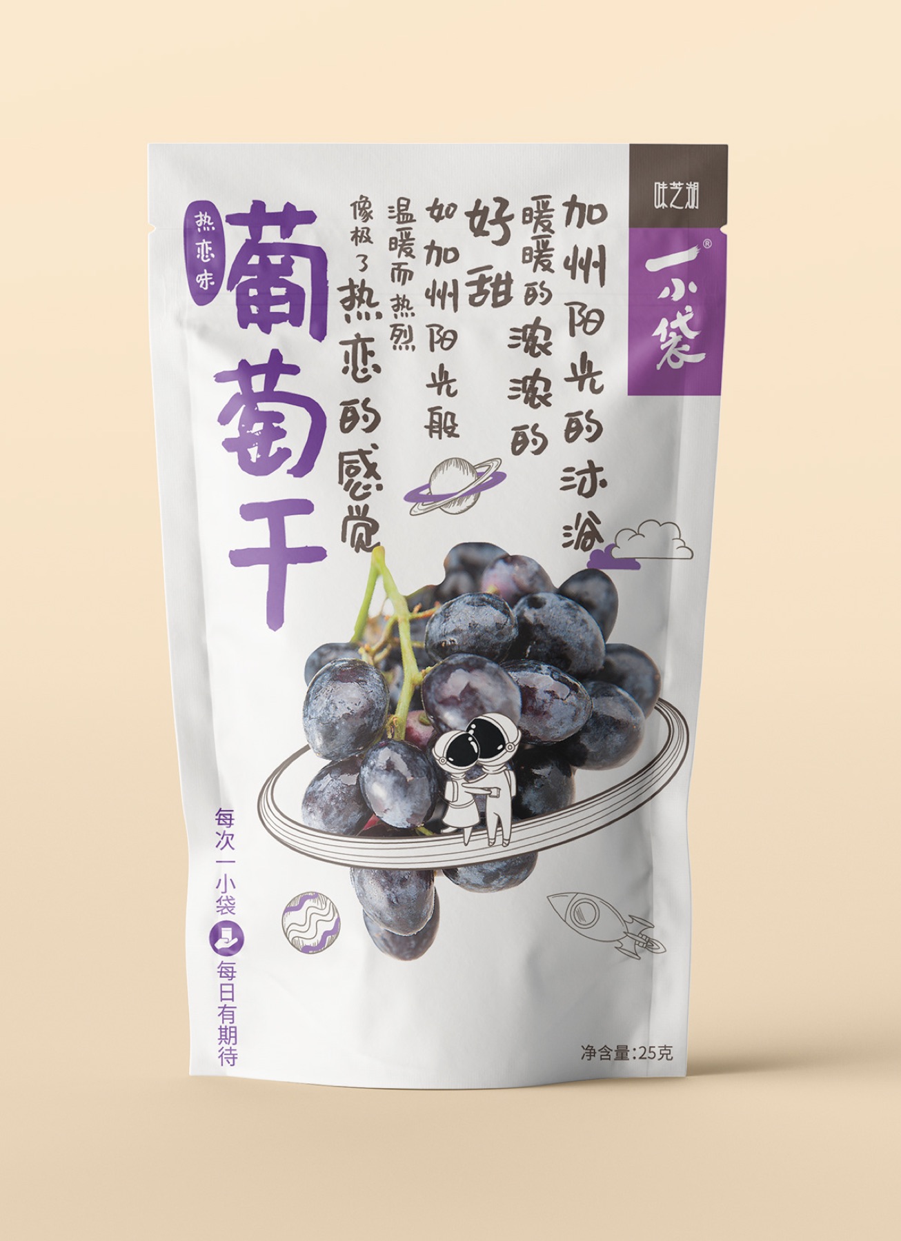
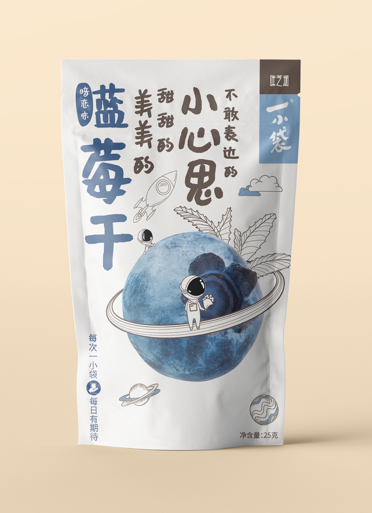
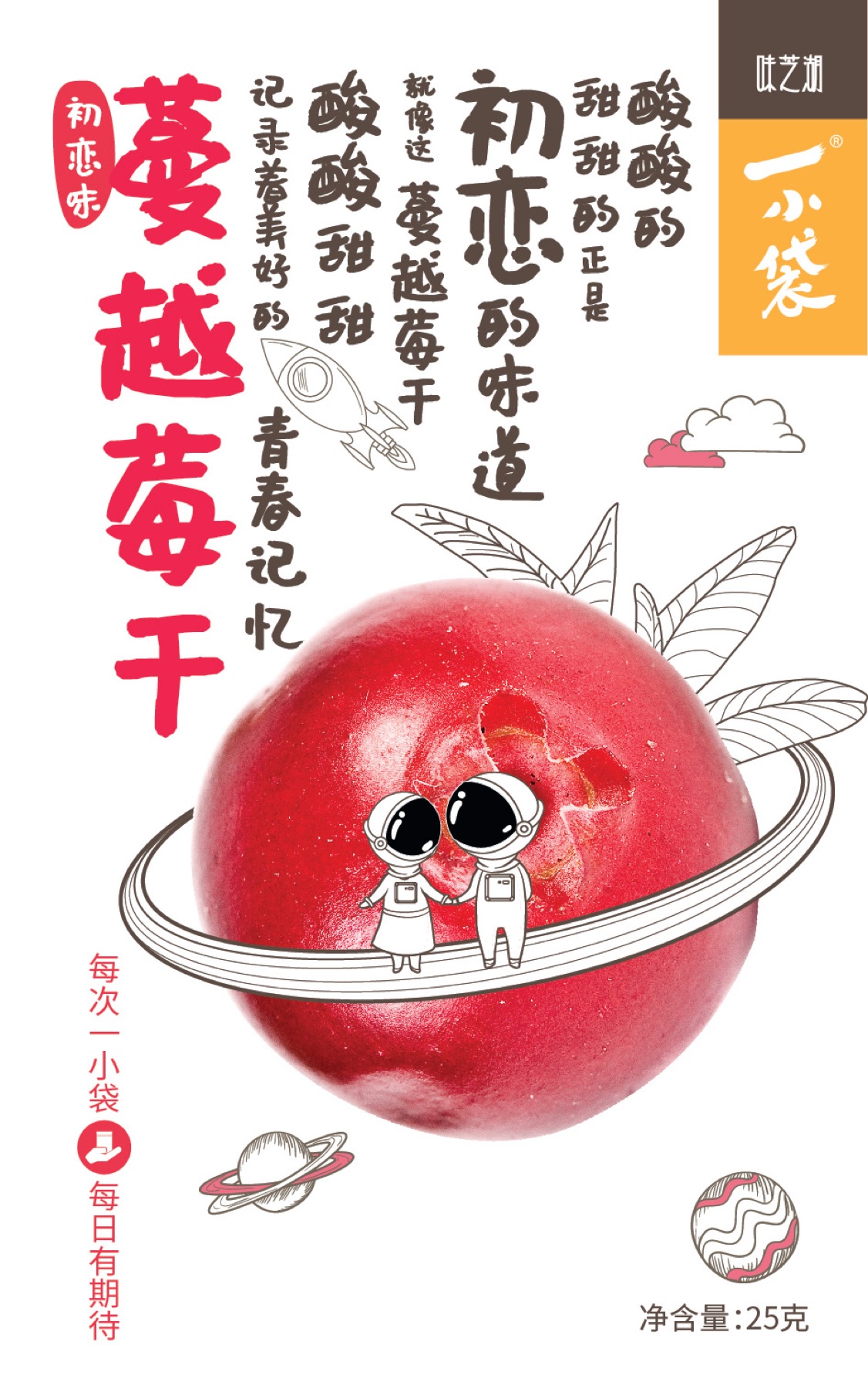
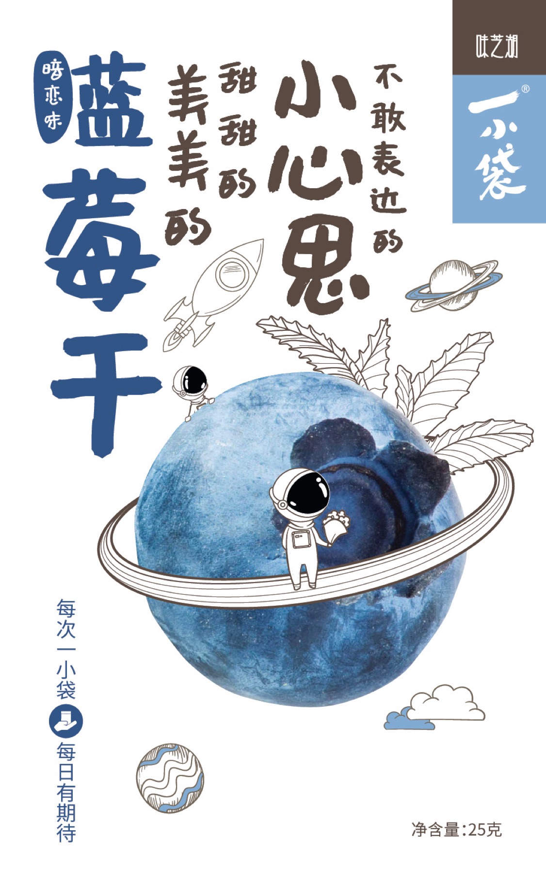
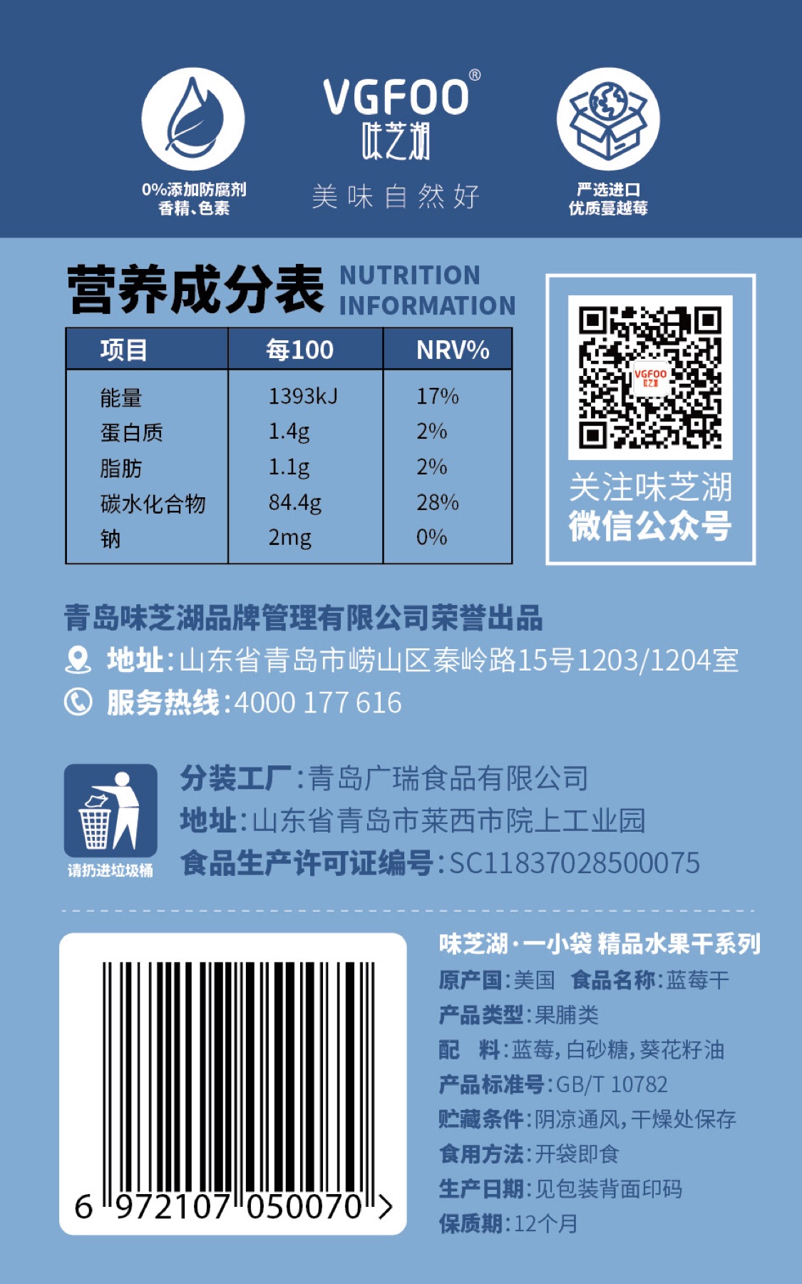
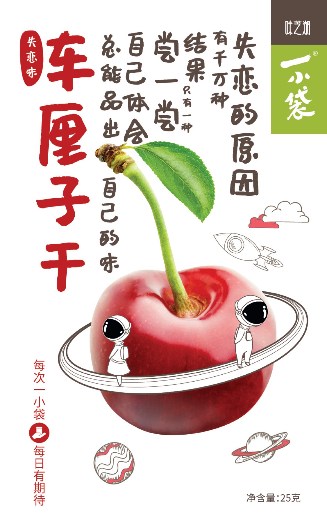
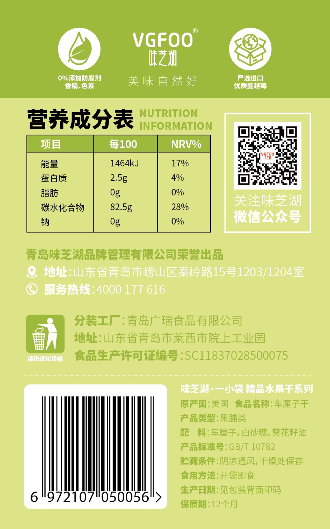
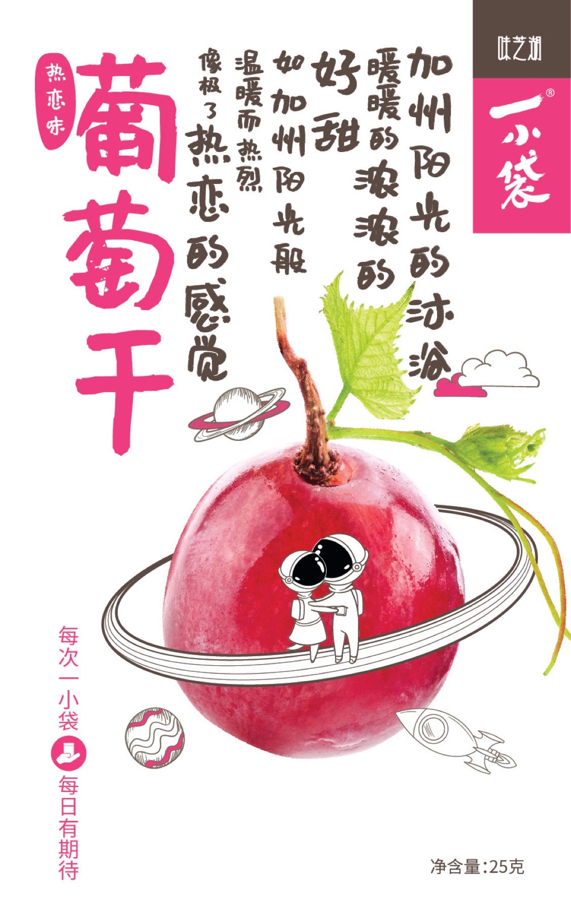
This independent retail study expands the original packages into a small planetary system. The fruit remains real and tactile, while orbital rings, tiny astronauts and flavour-colour blocks make the shelf feel like a place to explore rather than a wall of nutritional claims. Low plinths provide a calm orbit for tasting, and the white packaging keeps the lively drawings from becoming visual noise. The system treats each flavour as a distinct little world but gives the range enough shared structure to be read at a glance. It makes the product feel playful without asking shoppers to suspend their taste in actual fruit.
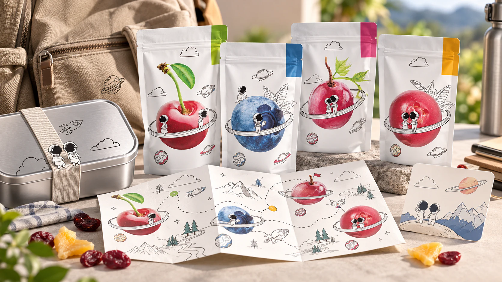
The Daily Expedition
This independent product-system study translates the original packaging into a companion for a day away from the desk. A reusable lunch tin, slim pouches and a fold-out tasting map carry the same fruit-planets and casual line drawings, but organise them as a small route rather than a static illustration. The map gives each flavour a destination and lets the astronaut characters become quiet guides. The intent is deliberately modest: an ordinary snack break can still offer a moment of play. Packaging is most persuasive when it earns a place in someone’s day instead of demanding an entire fantasy world.
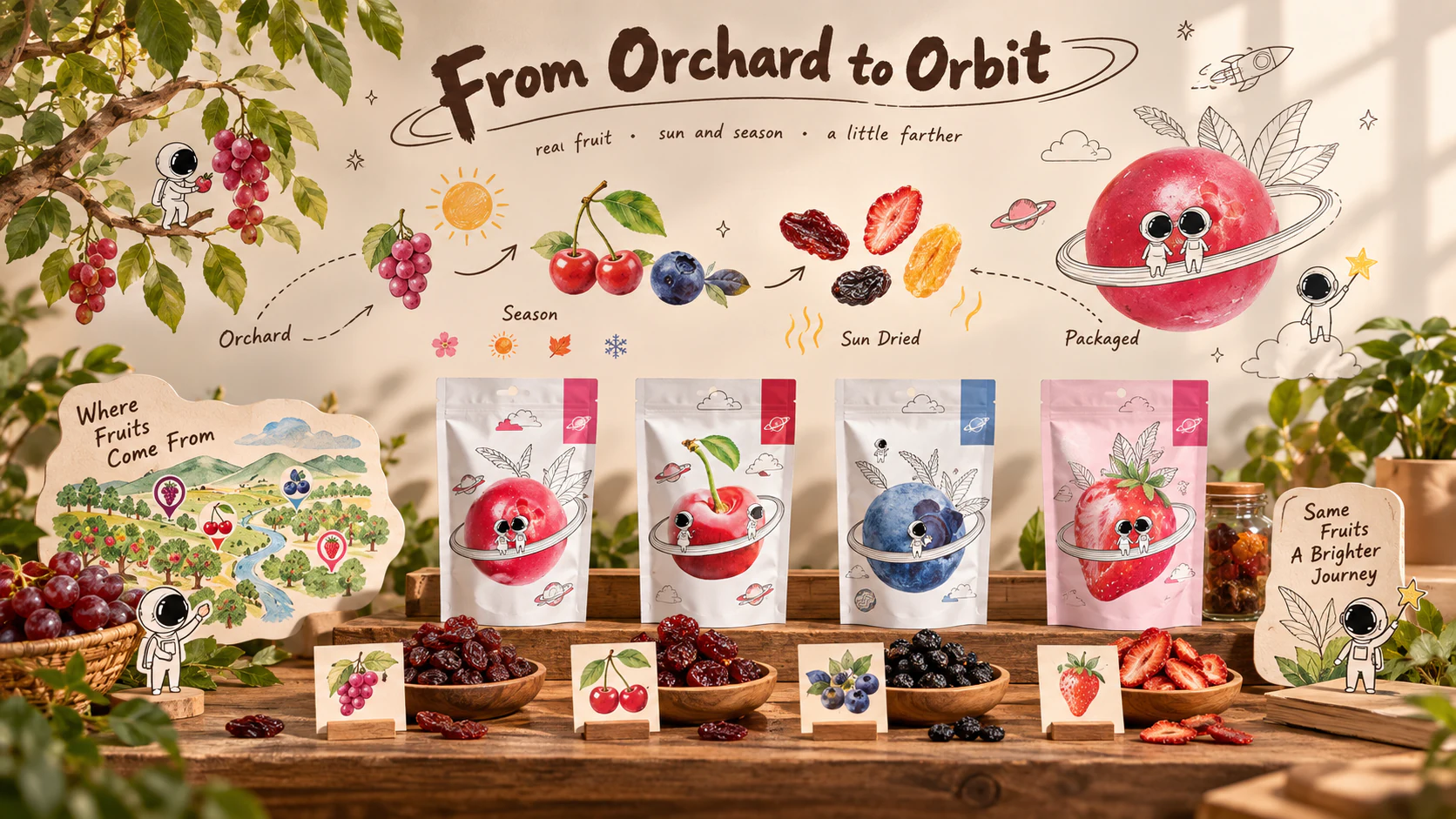
From Orchard to Orbit
This independent origin-story study lets the brand explain where its fruit comes from without adopting the language of a laboratory report. Botanical marks, seasonal signs and a hand-drawn orbit route connect orchard, fruit, drying and pack. The small astronauts do not replace the grower story; they make its sequence easy to enter. Real samples, flavour cards and the existing white packs remain central, so the illustration operates as an invitation to look closer rather than a decorative cover. It is a useful example of how a playful brand can still speak honestly about ingredients, time and place.
The Fruit Flight Log
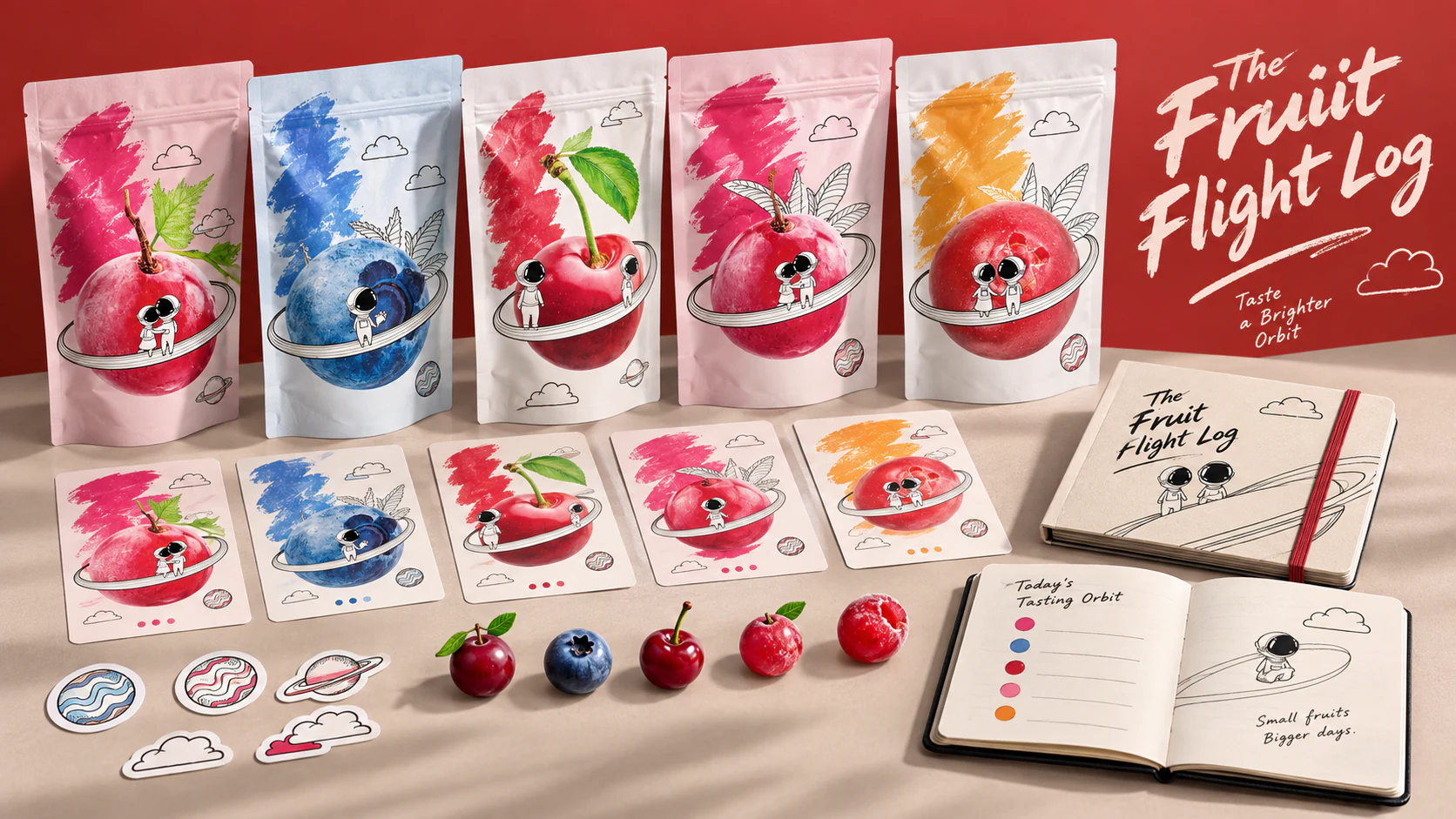
This independent participation study turns repeat tasting into a low-key collection ritual. Flavour cards, orbit stickers and a small notebook extend the pack art without making it feel like a promotional gimmick. Each fruit keeps its own colour and character, while the shared ring, cloud and planet details give the collection a common sky. The log can record a favourite snack, a trip, a lunchbox discovery or simply a new flavour. It brings the brand’s sense of curiosity into a tangible object, proving that a playful visual language can reward return visits without shouting for attention.
Mission: Try a New Planet
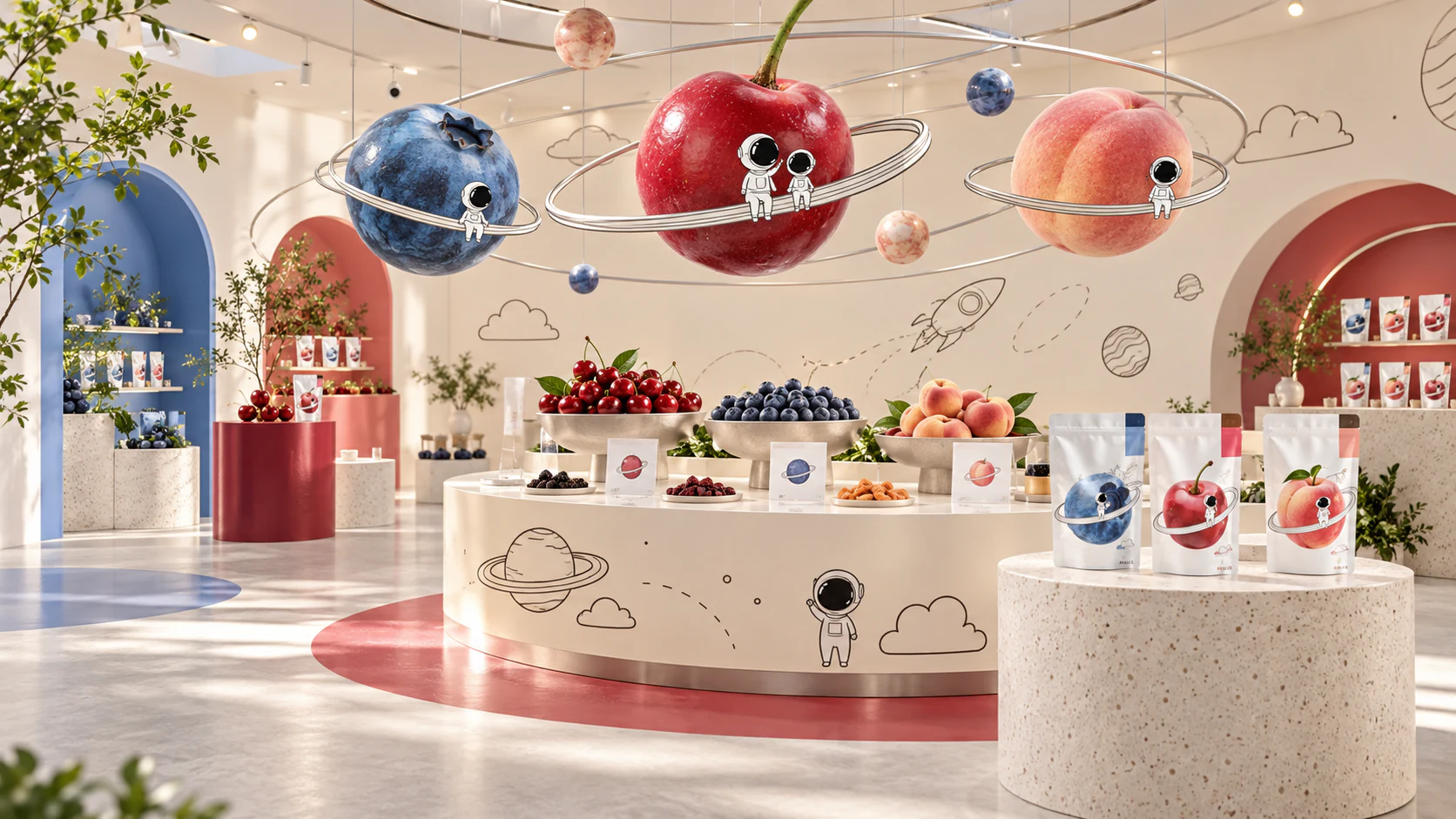
This independent experiential retail study takes the product’s tiny illustrated universe seriously enough to build a room around it. The fruit planets become suspended objects, orbital lines guide a tasting bar and hand-drawn rockets mark small moments of discovery. The space remains light, tactile and grown-up: cream surfaces, restrained flavour colours and real fruit keep the fantasy grounded. Rather than treating the characters as a mascot parade, the design uses them sparingly to connect separate touchpoints. The pop-up becomes a place where the original packaging language can be encountered at human scale, then carried home in one small pouch.
The Refill Orbit
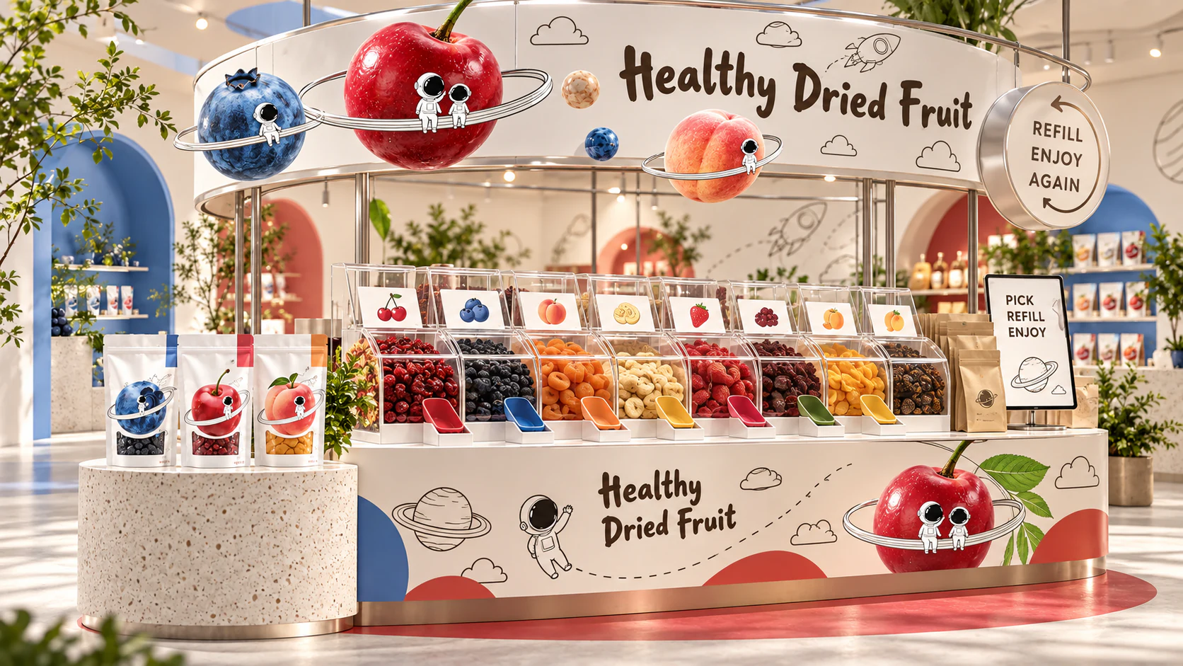
This independent retail extension turns the circular brand language into a refill station. Product, measure and container move through one simple loop, reducing packaging while making choice visible. Colour distinguishes fruit families without making health claims, and the modular vessels keep the display orderly as stock changes. The brand becomes a useful ritual rather than another label.
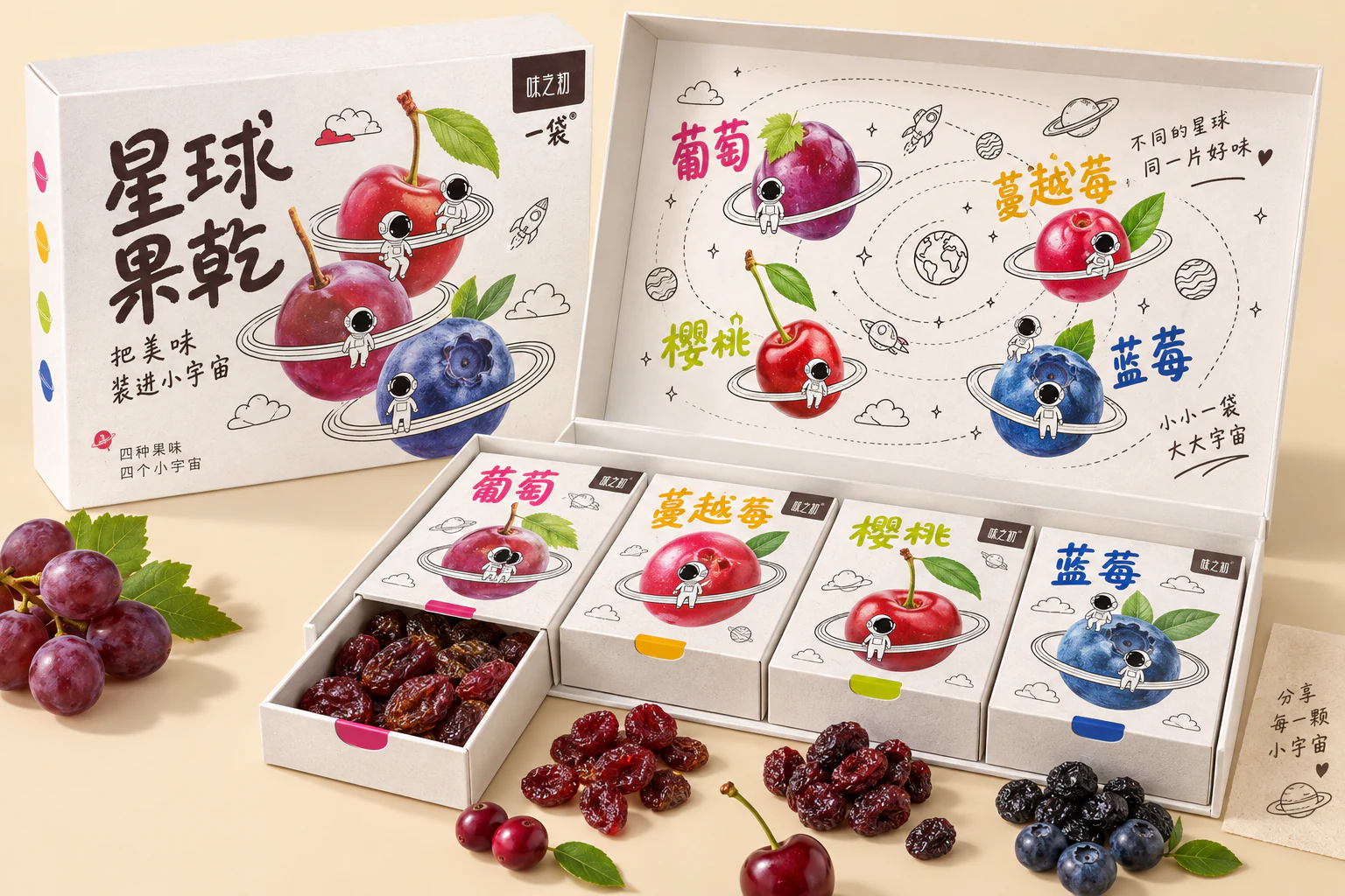
A Small Solar System to Share
This independent sharing-box concept develops the original fruit planets and small astronaut drawings into a sequence of discoveries. Four removable compartments keep flavours distinct, while an orbital map connects them when the lid opens. The real fruit remains the visual centre; line drawing supplies the imaginative scale. Colour helps people find their favourite quickly, and the box structure lets each portion travel separately. The pleasure comes from a modest shift in perspective: an ordinary snack becomes a tiny destination. Packaging proportions and material choices shown here are exploratory, ready for sampling rather than presented as manufactured products.