


Mr Guru Client Kit
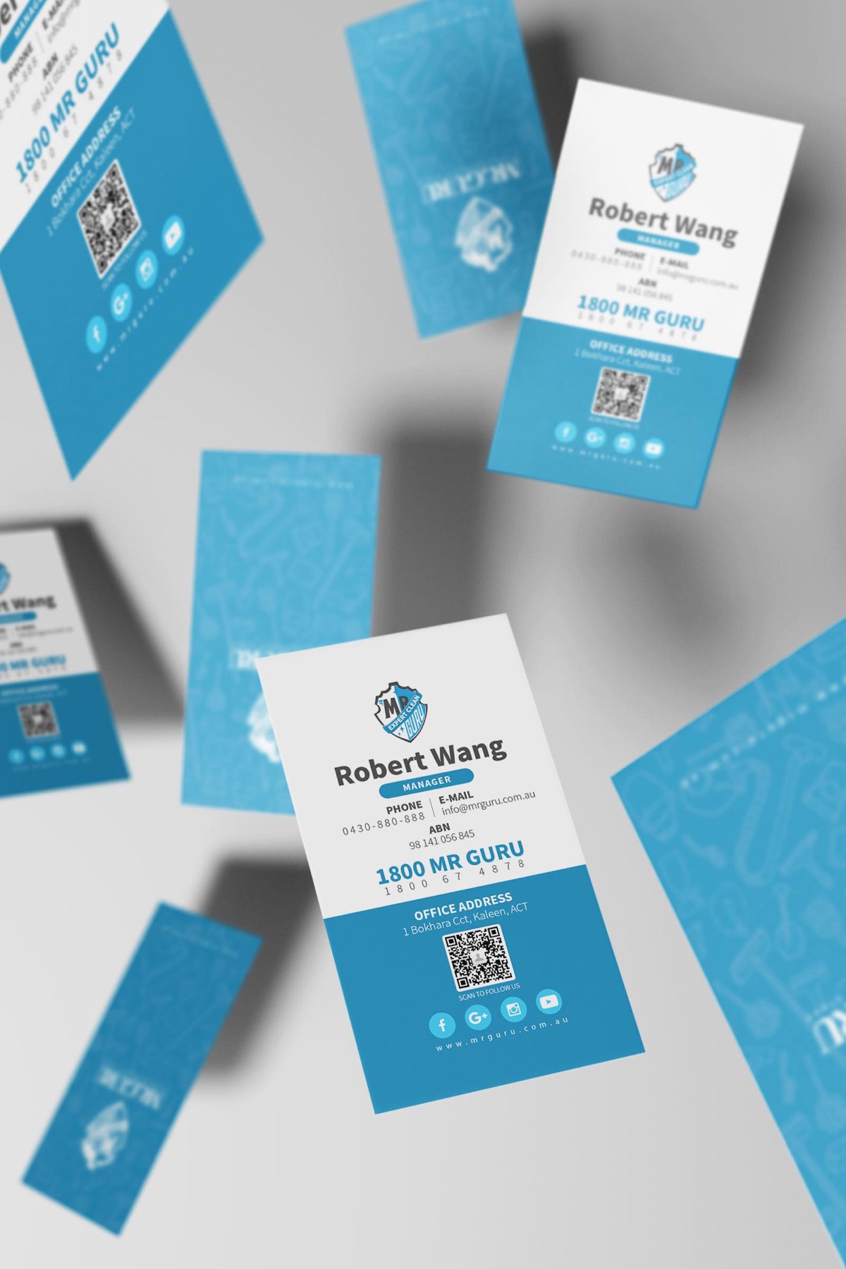
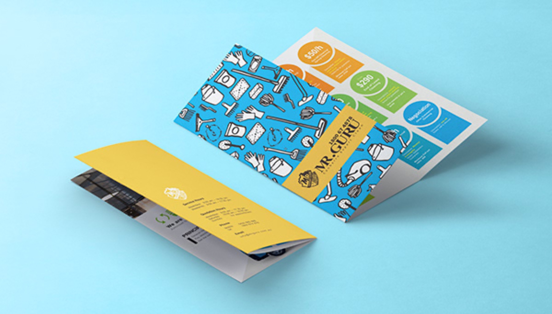
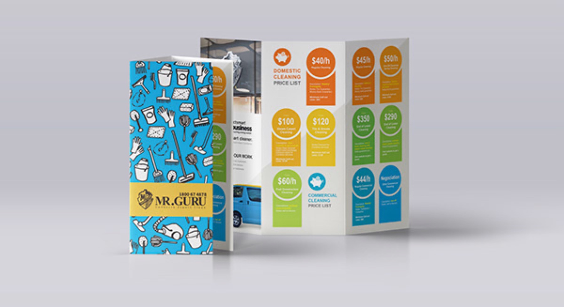
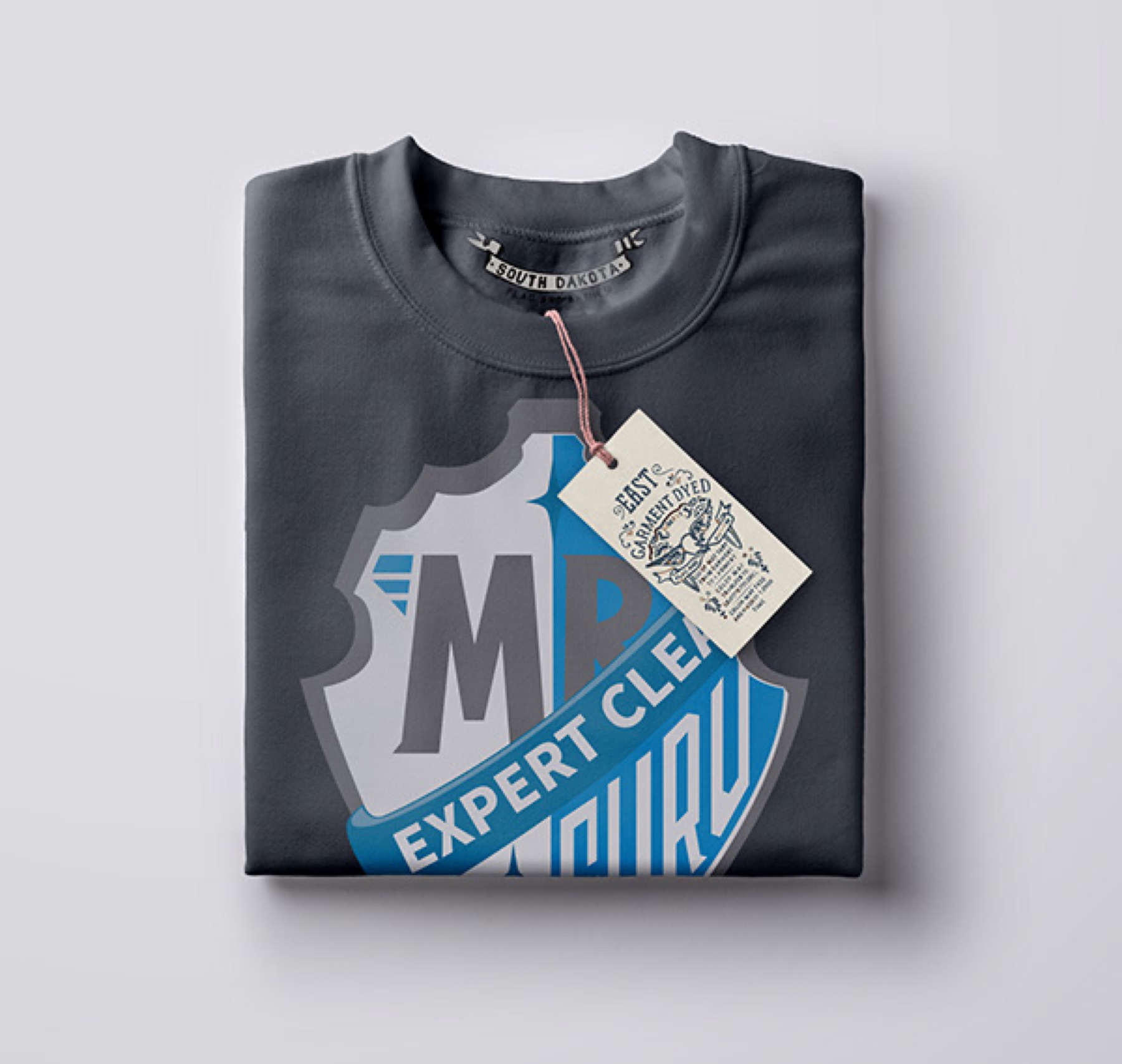
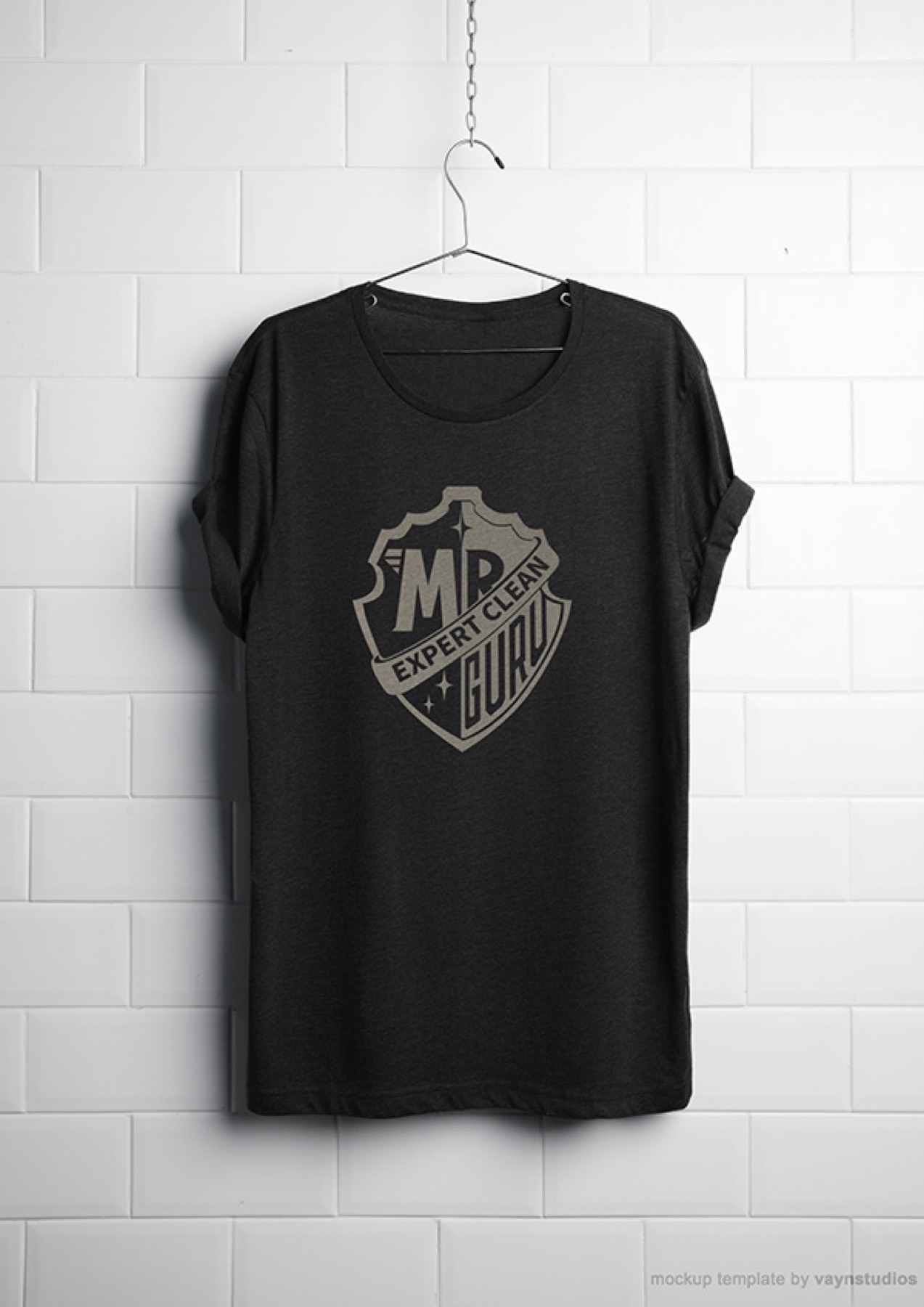
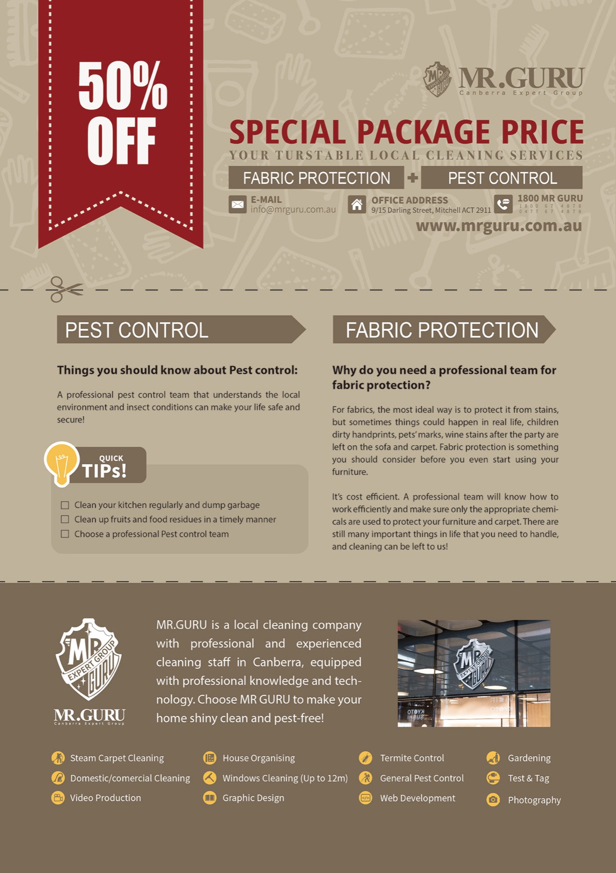
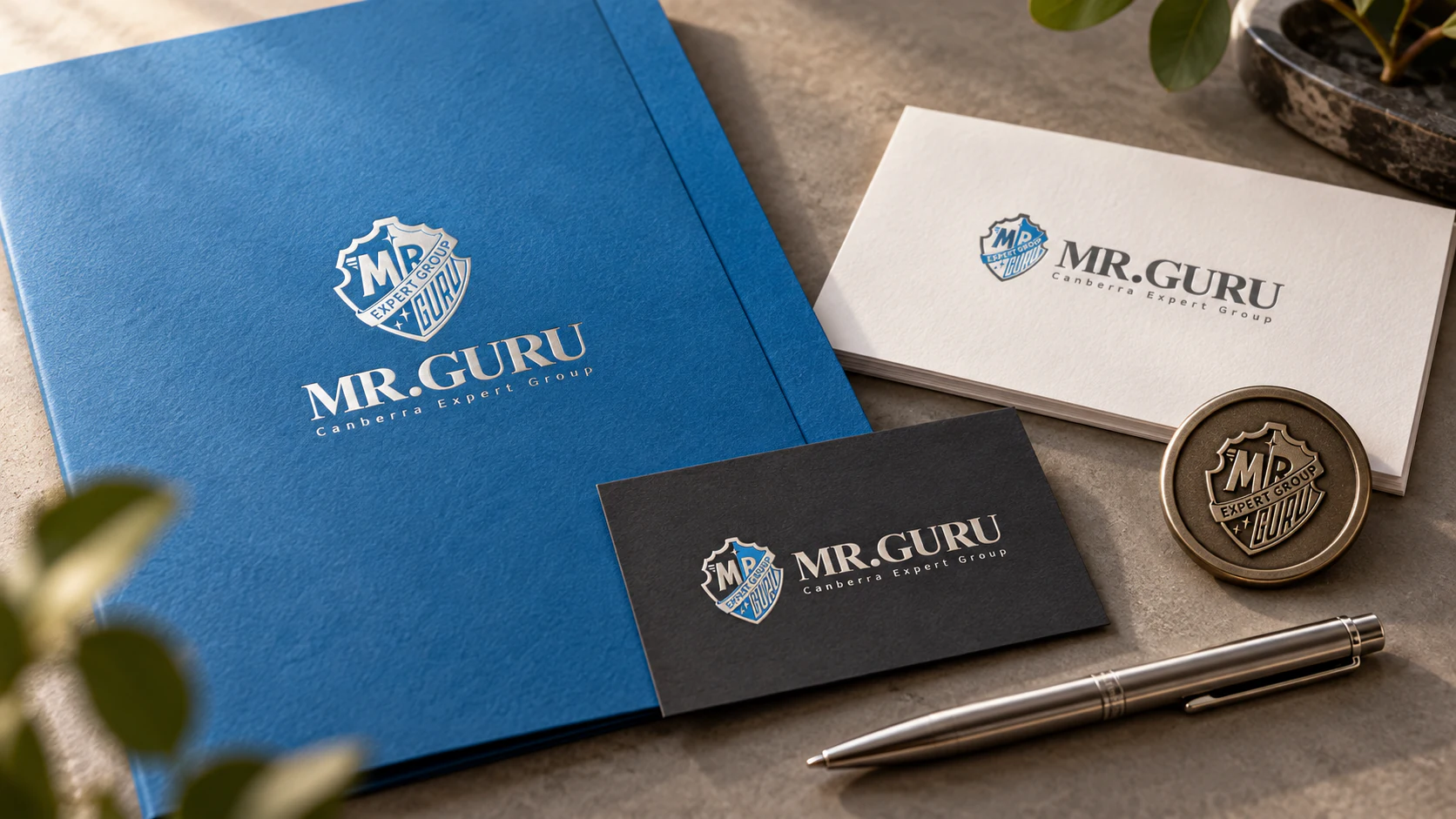
An independent print application study for the existing Mr Guru identity: a document folder, correspondence card, appointment card and embossed seal. The exercise keeps the original blue, charcoal and crest details restrained, allowing material quality and clear hierarchy to do the work.
The Standard Kit
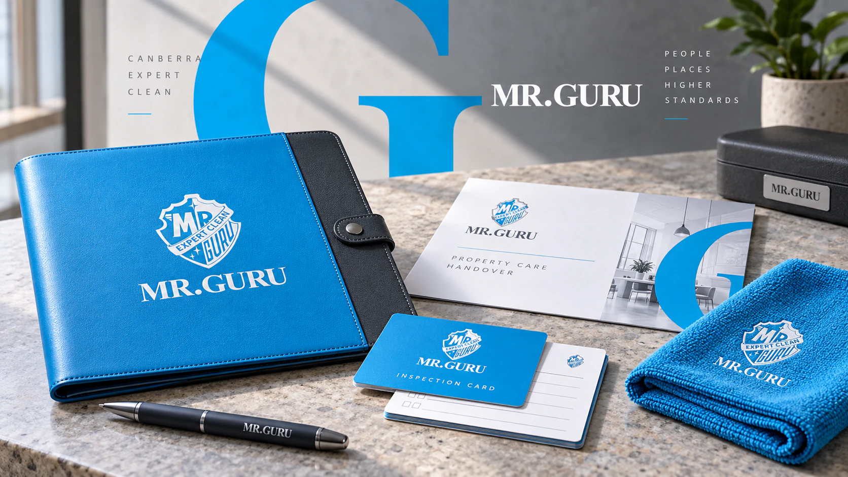
This independent service-design study treats the brand as a promise that must survive the handover, not merely a logo on a uniform. A service folio, inspection card, cloth and completion note give the blue, charcoal and white identity a practical scale. The large cropped G works as a quiet frame, while the crest supplies the sense of care usually found in a maker’s mark. Material choices matter here: stitched leather, substantial paper and reusable objects make the service feel considered before any room is entered. The kit turns a routine visit into a clear, human exchange between expertise and trust.
Ready Before You Arrive
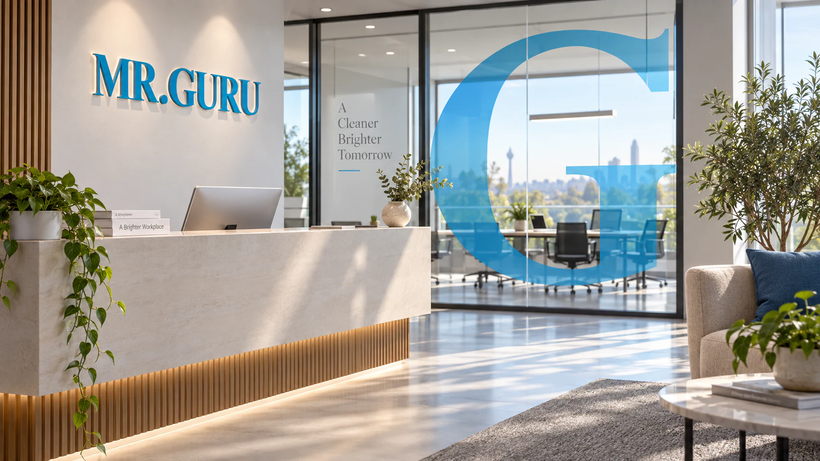
This independent environmental study considers the result of the service rather than the act of selling it. In a prepared workplace, the identity appears only where reassurance is useful: a reception sign, a large translucent G on glass and small notes at the threshold. White space, daylight and the familiar blue do most of the emotional work. The image is deliberately not full of cleaning products; the brand promise is a room that feels ready for people to begin. It demonstrates how a practical service identity can carry confidence without performing authority too loudly.
Proof of Care
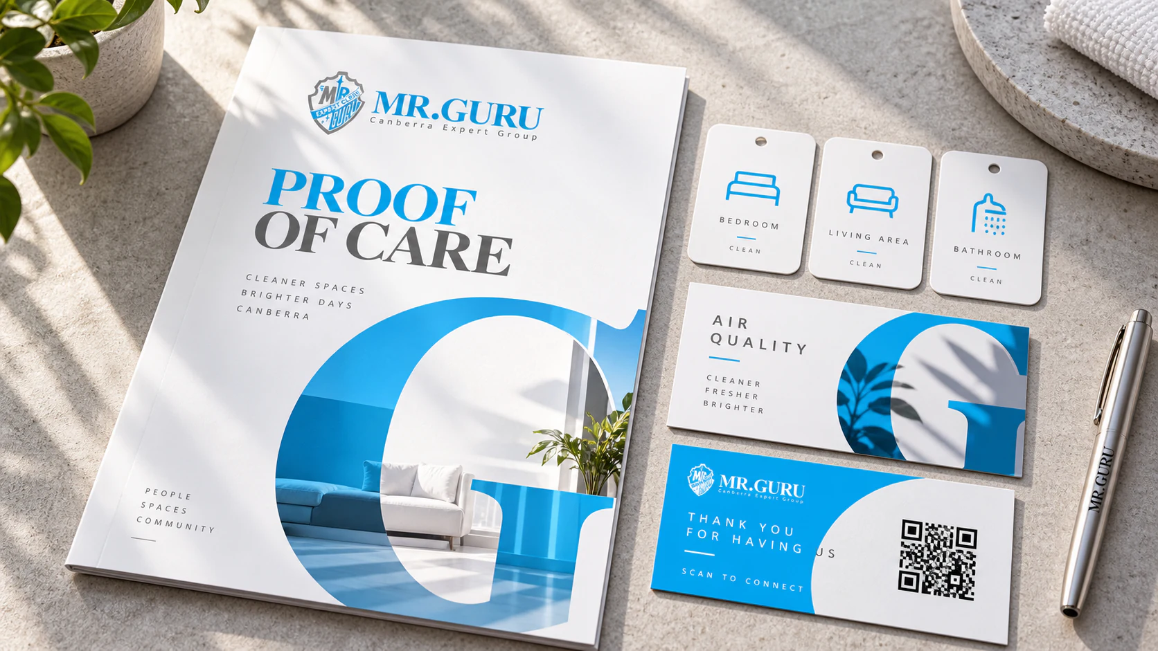
This independent client-communication study makes care visible without turning it into paperwork theatre. Room tags, a concise completion report and a small handover card carry the Mr Guru language with a deliberately light touch: white space keeps information calm, blue signals active attention and the cropped G connects individual records to the wider system. The aim is transparency rather than a claim of perfection. A good service leaves behind enough evidence for a client to understand what happened, what is next and who to contact, then gets out of the way. That is a useful kind of branding.
The Quiet Route
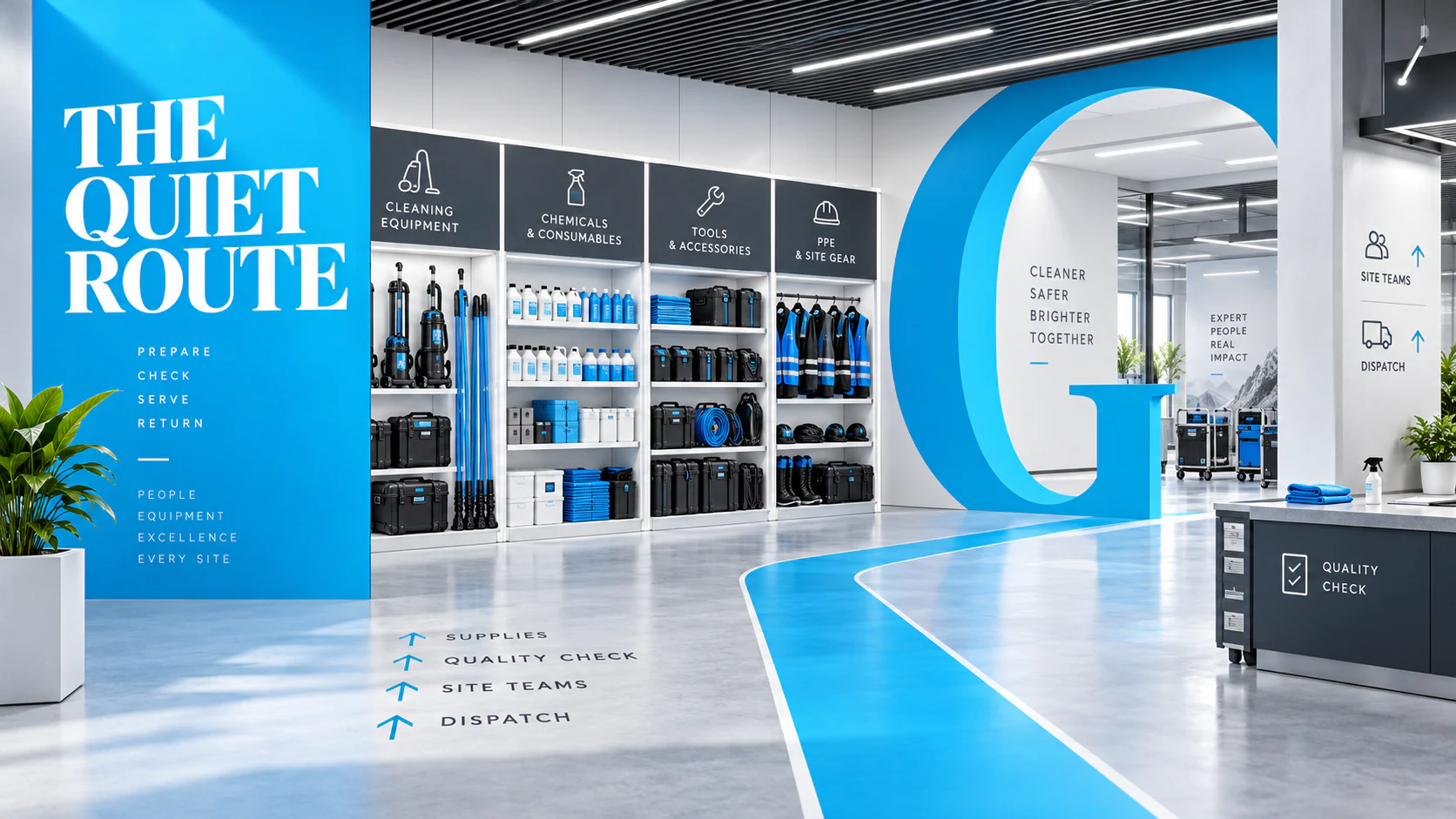
This independent operations study brings the brand into the part clients rarely see: the service hub. Equipment, consumables, quality checks and dispatch points are given a readable order through a cyan route, charcoal panels and an architectural G form. The system is intentionally calmer than a retail environment. Its job is to reduce hesitation for the people preparing work, checking supplies and moving between sites. By using the same visual rules in the back room and the client-facing material, the identity gains credibility. The promise of a clear, well-kept place begins with the organisation behind it.
The Office That Arrives
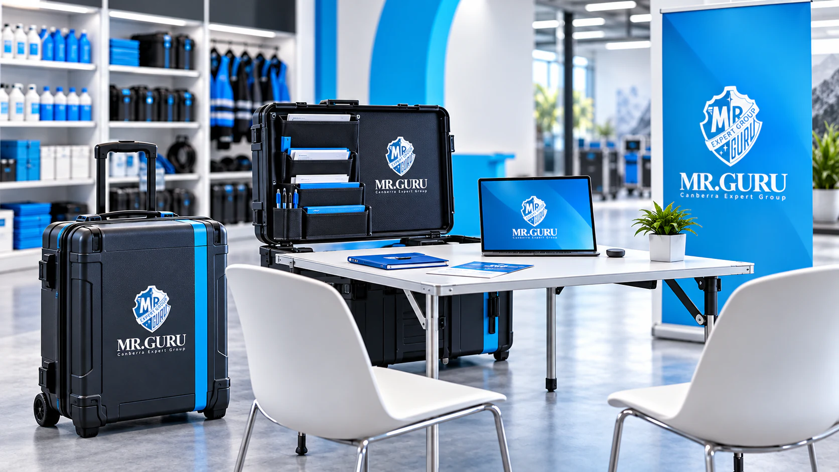
This independent service extension compresses the identity into a mobile consultation kit. Documents, samples, display surfaces and digital touchpoints unfold from one transportable system. The result feels established but not corporate, allowing a small practice to arrive with clarity and leave without clutter. Brand consistency is produced by organisation as much as by graphics.