

A Quiet Fruit System
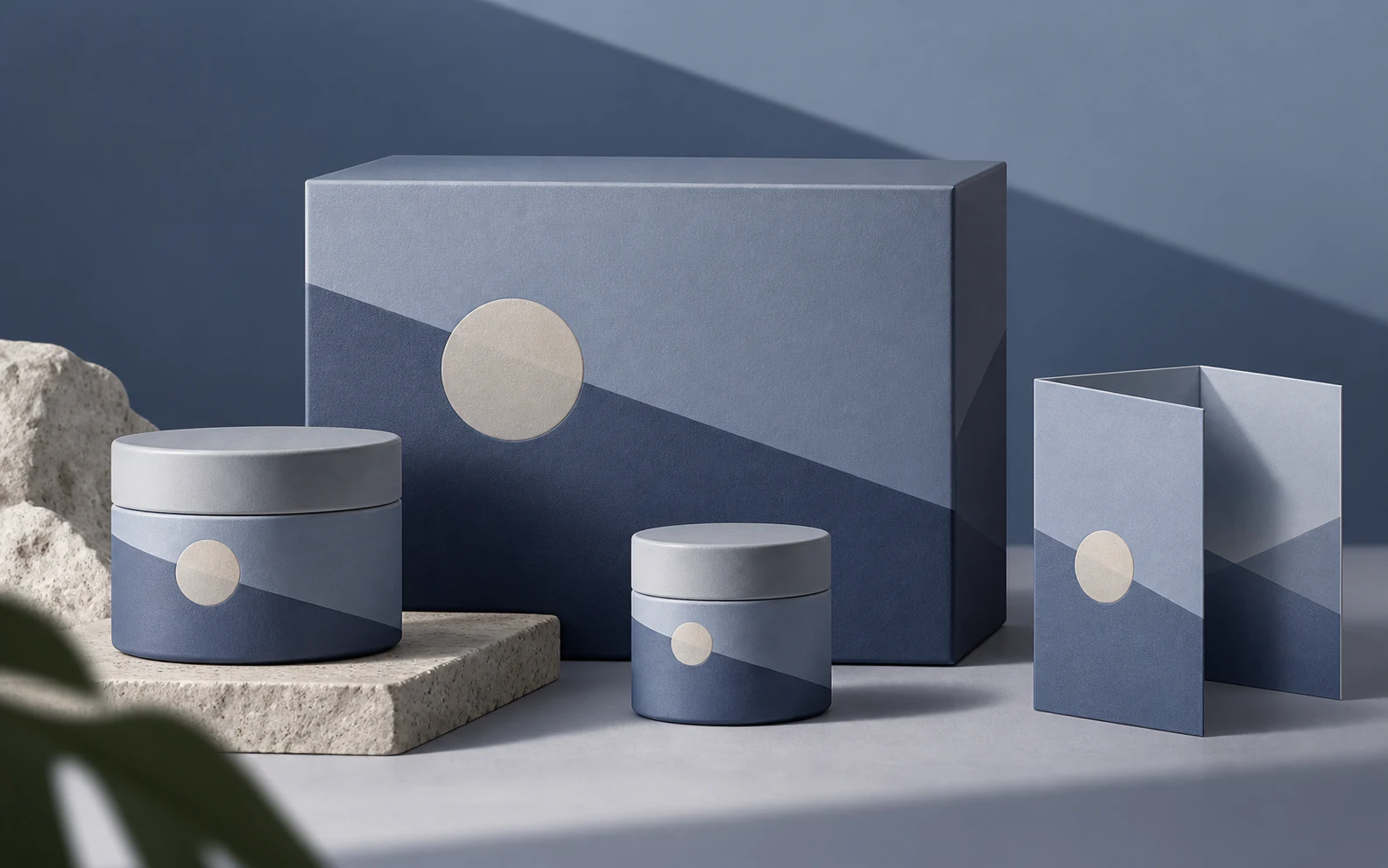
This independent packaging study develops the project's restrained geometry into a family that can change scale without losing composure. A soft blue-grey field carries the atmosphere, while the pale disc acts less like a literal fruit illustration than a point of ripeness, balance and attention. Diagonal planes shift across the box, jars and insert, allowing the range to feel related without making every surface identical. Natural stone and raking light introduce the tactile world that minimal packaging sometimes forgets. The system leaves room for the product to speak. Quiet design is not the absence of personality; it is confidence with the volume turned to a useful level.
Fly Through Dunhuang Art ExhibitionNext project